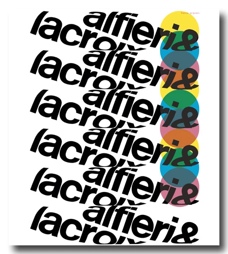


Alfieri & Lacroix (to be pronounced as ‘Lah-crwàh‘) holds a significant role in the history of the Italian graphic industry.
Established in Milan in 1898 by Edoardo Lacroix and Emilio Alfieri, Alfieri & Lacroix was a major print house specialising in fine art printing. Lacroix handled the technical aspects, while Alfieri managed finances and administration. Since 1923, the management of the photoengraving department was managed by Dario Morani (a pharmacist, sportswriter and director of an avant-garde gallery in Pavia [a]), who later in 1942 [b] joined as general manager. In 1924, in addition to Morani, Antonio Crespi, who acquired the society from its founders, brought on board Antonio Boggeri, a musician and photographer and Crespi’s former military school classmate, to join the team.
Boggeri learned to manage the printout in its complete process, from design to the final product, and by 1933 he founded the legendary Studio Boggeri, a masterpiece in graphic design history and one of the world’s premier design studios. The studio boasted collaborations with luminaries such as Albe Steiner, Aldo Calabresi, Armando Milani, Bob Noorda, Bruno Monguzzi, Bruno Munari, Carlo Vivarelli, Enzo Mari, Erberto Carboni, Ezio Bonini, Fortunato Depero, Franco & Jeanne Grignani, Imre Reiner, Marcello Nizzoli, Max Huber, Remo Muratore, René Martinelli, Roberto Sambonet, Walter Ballmer, Xanti Schawinsky, and many others.
Alfieri & Lacroix pioneered a then-new form of printing technique known as zincography, or photogravure. In the postwar era, Morani needed to restore the printing house’s status as a high-quality commercial firm that remained technologically cutting-edge. To achieve this, he enlisted the expertise of another collaborator from Studio Boggeri: Franco Grignani.
Boggeri held the belief, as reported by the Ticino-born Bruno Monguzzi, that perfection, akin to the Swiss credo, was not enough in graphics (referred to as ‘the cobweb theory‘). In his own way, Grignani managed to “de-sterilize the rigor”, and in a joyful and unrepeatable period within the so-called ‘milanesi terribili’, contributed to the amalgamation of two cultures: “the Swiss, logical and constructive, and the Italian, poetic and libertarian” [Bruno Monguzzi, 2011]. Grignani was aware that “normally, graphic composition in Italy and Switzerland (taken as a model) tended towards a distribution of elements in a position of rest. But communication is, by its very nature, dynamic.” [I].
“Though some trends in the world of design, in the teaching that is done in the schools, are for stressing the need for balance among similar spaces, to produce a feeling of contemplative motionlessness, all the rules of strict form and all balanced structurings yield silence.”
[from the text read on the occasion of ‘Vision 65‘, the first ‘World Congress on New Challenges to Human Communication’, Carbondale, U.S.A., 1965]
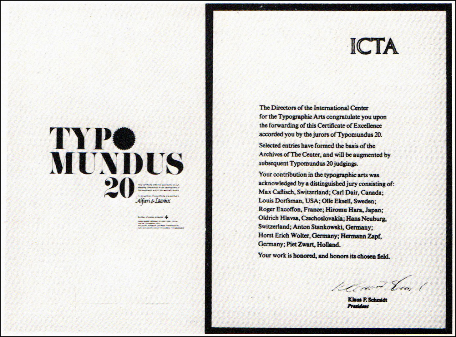
With a modern promotional concept, the advertising campaign carried out by Franco Grignani (all in black with often no more than three colours) garnered recognition from several graphic magazines around the world. It earned him the gold medal of the 11th National Advertising Award for specialized advertising for technical magazines (‘XI Premio Nazionale della Pubblicità per l’annuncio specializzato per riviste tecniche’) [from ‘notiziario Sipra’ n° 9/10, 1961 and ‘Il Poligrafico Italiano’ n° 2, 1962 & 1967] in 1961, and, in 1967, the highly coveted recognition merit of the I.C.T.A. – International Center for the Typographic Arts – of New York for ‘Typomundus 20‘.
“It is difficult to distinguish who deserves the greatest credit for a style that has subverted every current concept of advertising. The speech set out by Grignani in the pages by Alfieri & Lacroix dates back to 1950. It was a disruptive speech. Faced with the possibilities of carrying out an advertising campaign for a graphics industry, Grignani felt the need to operate outside the box and to propose an experimental research. And the fact that he believed in that does not surprise, today, any of those who know his sensitivity as an artist.
[…] When I went to meet him [Dario Morani, Ed.], asking him to tell me about this extraordinary recognition by I.C.T.A., he replied: «You need to talk to Grignani, the credit belongs to him».
Steno Baldi, ‘All’Alfieri & Lacroix il riconoscimento dell’I.C.T.A.’, inside “Estetica Grafica”, July 1967, quoted in [b]
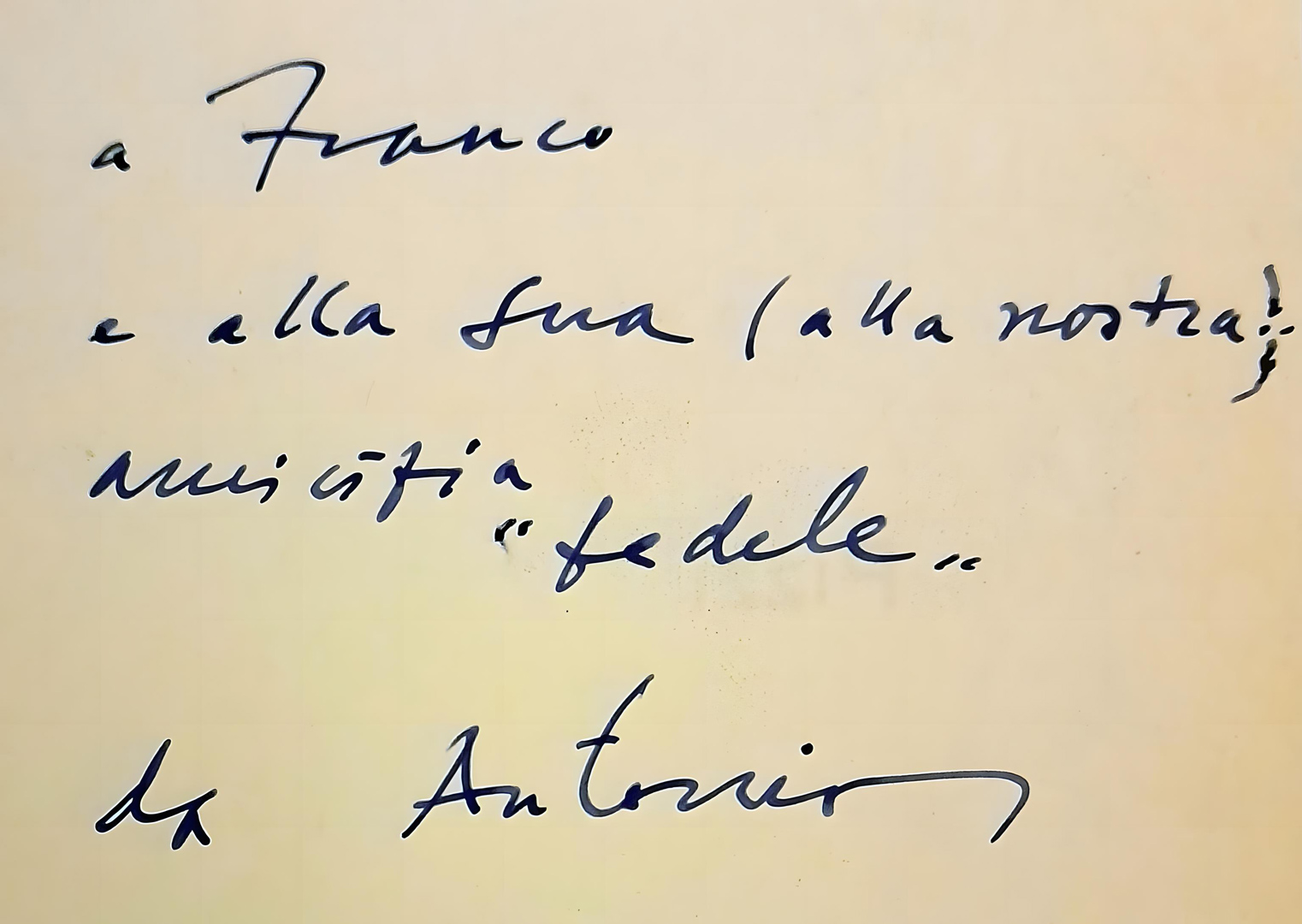
But Grignani immediately stated: «Without Morani I would have done nothing. It’s thanks to him that I was able to work with freedom».”
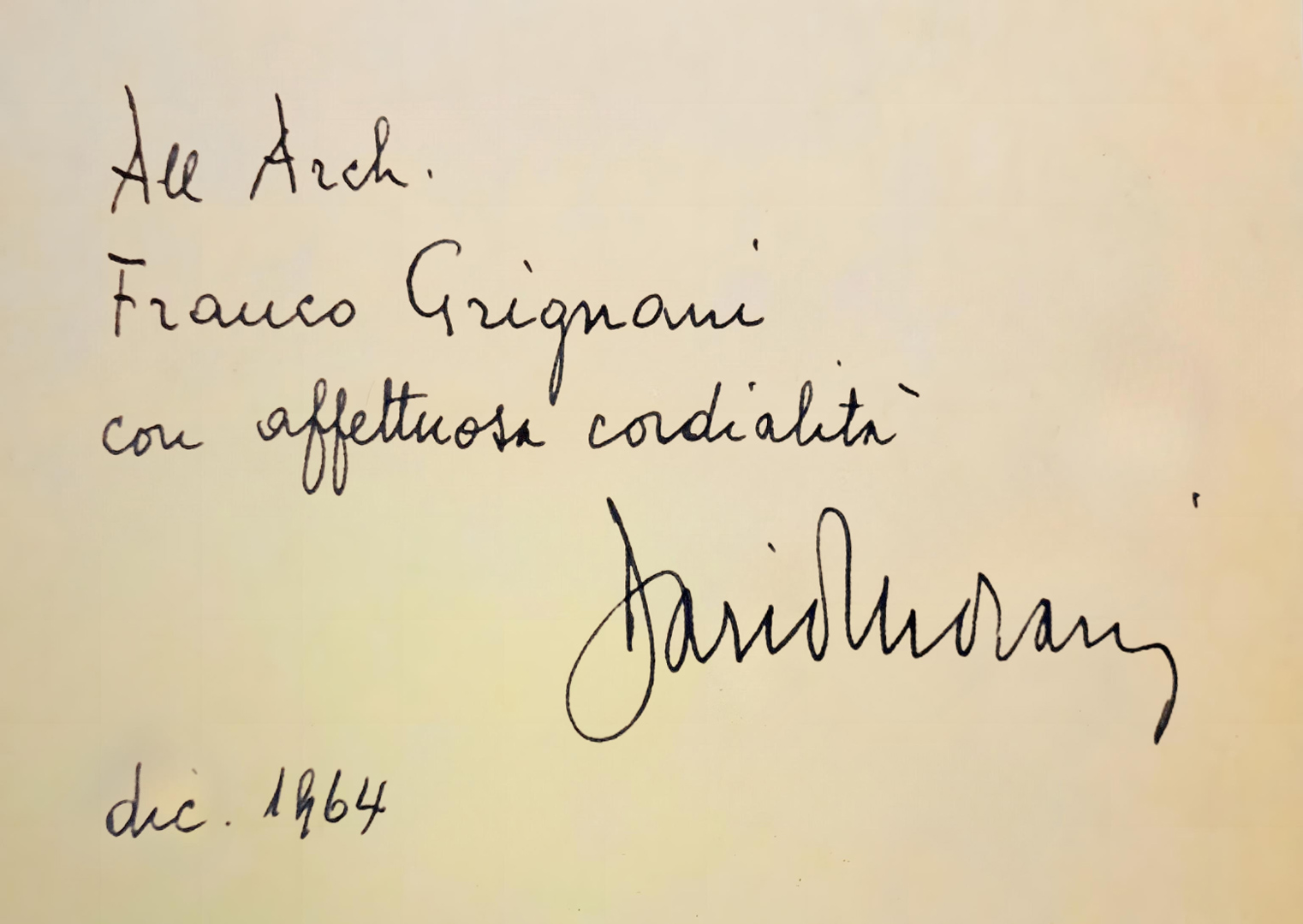
The one with Morani was really a strong friendship, and the condolence letter sent to his wife upon his death in 1980 reflects this sentiment: «We will always remember him because he was also a model of immense humanity» (Jeanne and Arch. Franco Grignani) [II].
Various A&L ads were showcased at solo and group exhibitions in the USA in the 1960s. An advertising poster for Alferi & Lacroix from 1964 was awarded “from the Central Office of Art Studios“ at the first Warsaw International Poster Biennale in 1966 and it is currently at MoMA in NY.
“Grignani neither had to promote the product nor the name of his client, but his only task was to demonstrate the whole variety of possibilities and applications which the technical facilities of his client’s modern enterprise offer the artist.”
[Raimondo Hrabak in Gebrauchsgraphik issue n° 4, 1962]

“The phenomenon is rare, perhaps even unique: a series of graphic designs intended to advertise a large company in the graphic industry and having little or no direct reference to the product, but making continual allusion to the medium used”, wrote in 1966 the art critic Gillo Dorfles in the Swiss magazine Graphis issue n° 126, 1966 (a periodical committed to presenting and promoting the work of exceptional talent in international graphic design, advertising, photography, art, and illustration).”[…] Anyone who glances through the complete series of these designs is getting an authentic lesson in the use and manipulation of the graphic medium for the purpose of investing it with aesthetic and informatory value. […] to my mind the really outstanding aspect of his work is the metaphoric quality he lends to every composition. The graphic sign is almost always shifted from its normal connotation to another, so that it assumes a metaphorical, transposed, metonymical meaning which may either evoke a smile or, by its elements of surprise, may effectively put over a piece of information. […]
No other documentation could demonstrate quite as impressively to the reader just what potentialities a letterpress and offset printing establishment can offer to an artist who is gifted and perspicacious enough to make full use of them.”

In 1965, at the aforementioned first ‘World Congress on New Challenges to Human Communication’ (‘Vision 65‘), Grignani recounted: “In 1952 I was asked by a large Italian printing establishment, Alfieri and Lacroix, to devise a programme of advertising. This firm, after it came through the war, had been built up again and had doctored its war wounds. It was established in 1890 and had always been considered a pioneer in the printing field for having been the first to introduce certain technical procedures up to that time unknown in Italy. When it was made over new it needed to get back to its position of leadership. A commercial publicity house would have had few developmental connections and this would have been reflected under the heads of quality of work, service and drawing power, and the competition could have talked along just the same lines. Needing to find my directions in the advertising world and among technicians and graphists, that is, in a category of people with specialized training, I suggested that I be allowed a certain latitude in which to manipulate a bit, so as to dig into the typographic business and prepare an entirely new language based on experimental graphics. Here was the problem: What was this new typography to be? How could I visualize the new scripts as regards speed and reading time? What should the form and design of the letters be like? What should this new symbolic language be? Alteration of vision as seeking and as expressive comment? How to define the boundaries between signs and space? How to create and then refer to my symbols? How to conduct studies on tensions and on graphic induction? This kind of graphics taught me freedom and courage; it also aided the experimentation of other graphists. I obtained the ‘Golden Palms’ for the quality and originality of my work and it brought Alfieri and Lacroix very great prestige.”

Later, in 1984, he pointed out: “typography was born to be read through the stripping of the sign away from its visual form, codifying letters, and extracting their meaning. The written word, in this case, is not remembered as an image but remains only a word, realized as an idea. The same is true for the typeface for a page of a book or newspaper, where the emptiness and fullness of the letters, the alignment or length of the line, the body or size of the type, the interlining or the space between the lines, the margins of the page, combine to providing those basic ingredients that make reading easy and inviting. However, my professional interests, aesthetic and creative, have always been directed, experimentally, towards a typography of highly visual appeal in favour of communication in an environment saturated with signs, such as, for example, in the advertising sector, where the sentences have been chosen to be short and impactful, sometimes assuming the role of figurative representation.”
Grignani also penned the copy, establishing a contrapuntal relationship between the words and visual images. “The graphic designer’s work is as it were the musical accompaniment of the copy-writer’s message, it is its dramatization and pictorial translation […] [remaining] aware of the fact that the effect of advertising rather rests on the expressive force of the picture than on the word”, added Raimondo Hrabak in the aforementioned article in Gebrauchsgraphik issue n° 4, 1962. The reference to the futurist ‘paroliberismo‘ (‘liberating words’) is evident, extending beyond the creation of more or less experimental images, establishing a true poetic dialogue [III]:
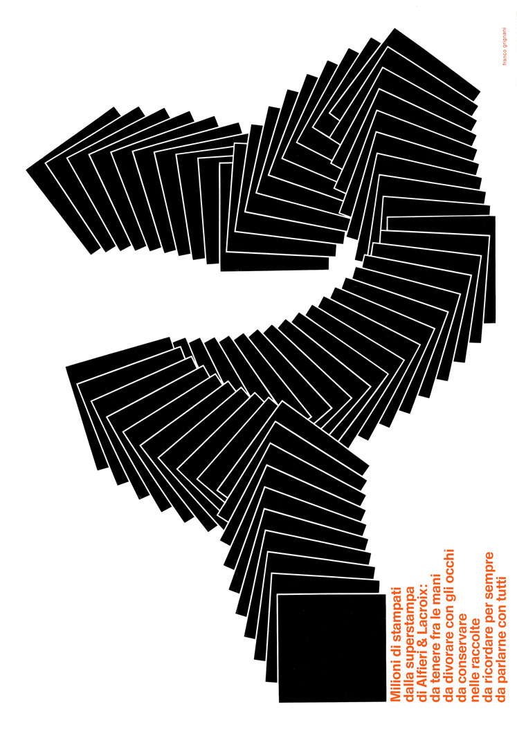 | “Millions of printed works from the super printing of Alfieri & Lacroix: to hold in your hands to devour with your eyes to keep in collections to remember forever to talk about with everyone” |
| “Typolytozincography is a neologism only for Alfieri & Lacroix; it means a complete cycle of graphic production. Alfieri & Lacroix was the first in Italy to make the coloured clichè, and now, in the century of technology, it is still the first as regards to method, organization, equipment and quality of printing.” | 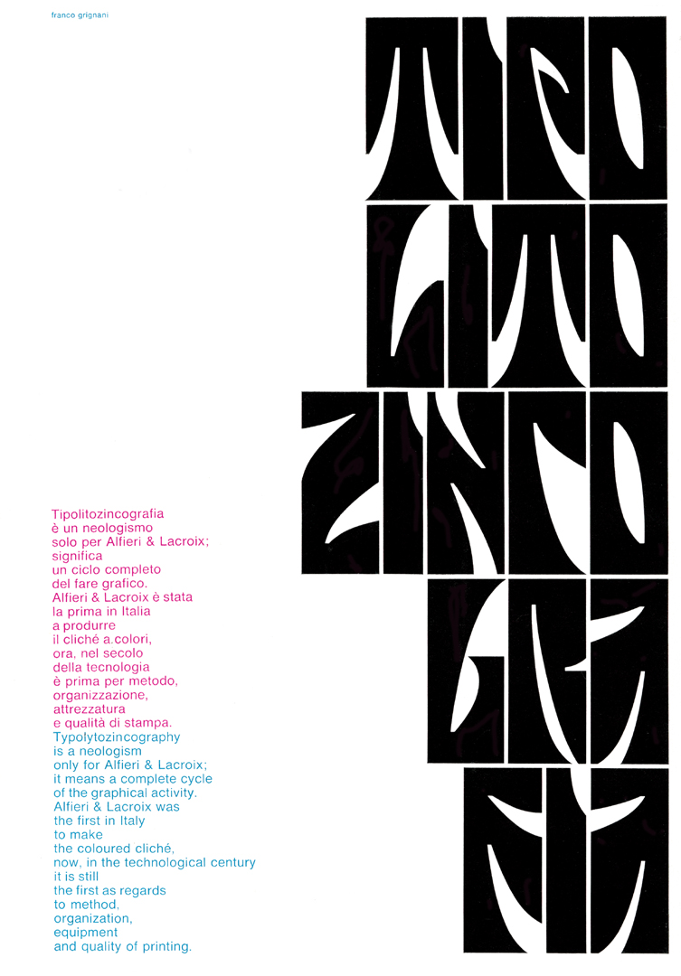 |
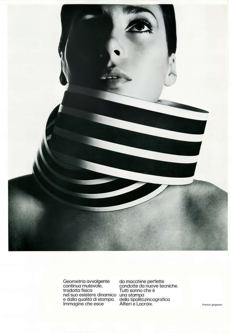 | “Enveloping, continuous, ever-changing geometry, physically translated in its dynamic existence and by print quality. Image emerging from perfect machines guided by new techniques. Everyone knows it’s a print from Alfieri & Lacroix, typolithozincography.” |
| “Seeing beyond is tied to the experimental mind of man ; it is therefore evident that there exists a super-sign reality that graphics enhance and make fantastic—fantastic like the print quality of Alfieri & Lacroix.” | 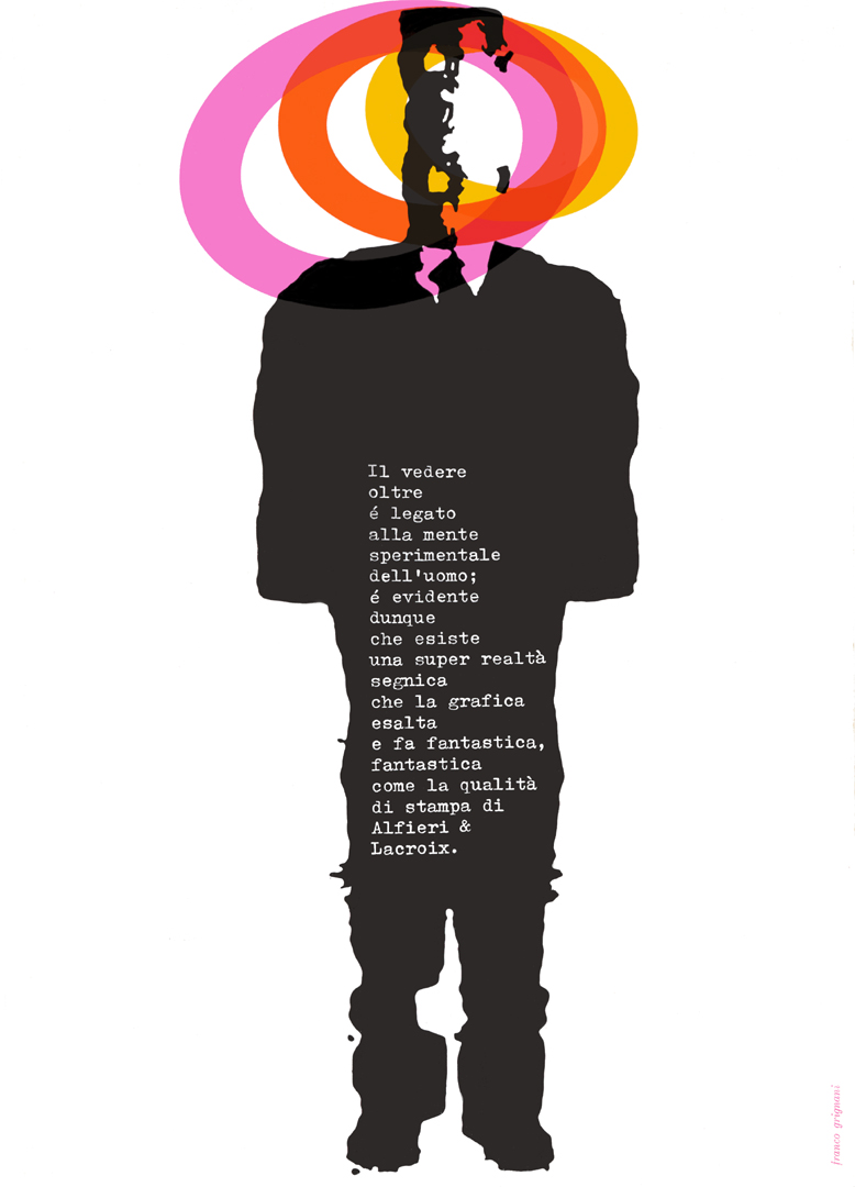 |
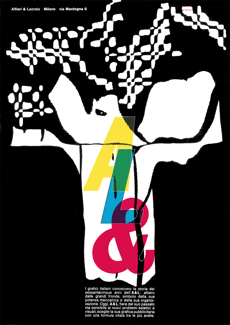 | “Italian graphic designers know the history of the sixty-five years of A & L: a tree with large branches, a symbol of its mechanical power and organization. Today, A & L, proud of its past yet sensitive to new aesthetic and visual problems, chooses its graphics advertising with a formula cited among the boldest.” |
| “GRAPHICS bump break huge rubble nightmare CREATES collapse black stormy heavy ooh! useless wall horrid roar disaster EMOTION structure escape gasp load boulder ruin” | 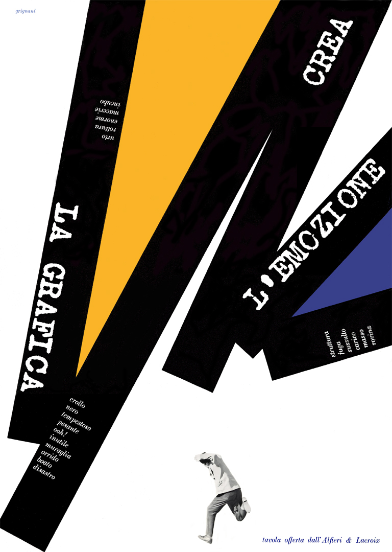 |
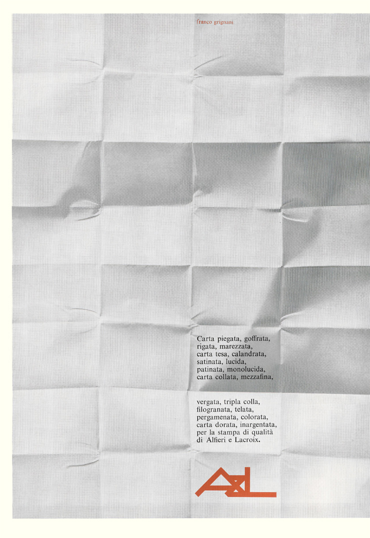 | “Folded, embossed, striped, moiré, stretched, calendered, satin-finished, glossy, coated, semi-glossy, glued, half-fine, laid, triple-glued, watermarked, textured, parchment-like, coloured, gold-plated, silver-plated paper, for the high-quality printing of Alfieri and Lacroix.” |
| “Yesterday, Optical Art was born, as announced by the American magazine LIFE on December 28th. In this space, every month and for years, Alfieri & Lacroix has been presenting visual challenges in a highly suitable field: graphic design. Alfieri & Lacroix is dynamic and modern, combining communication issues with the most rational and comprehensive organization for high-quality printing.” | 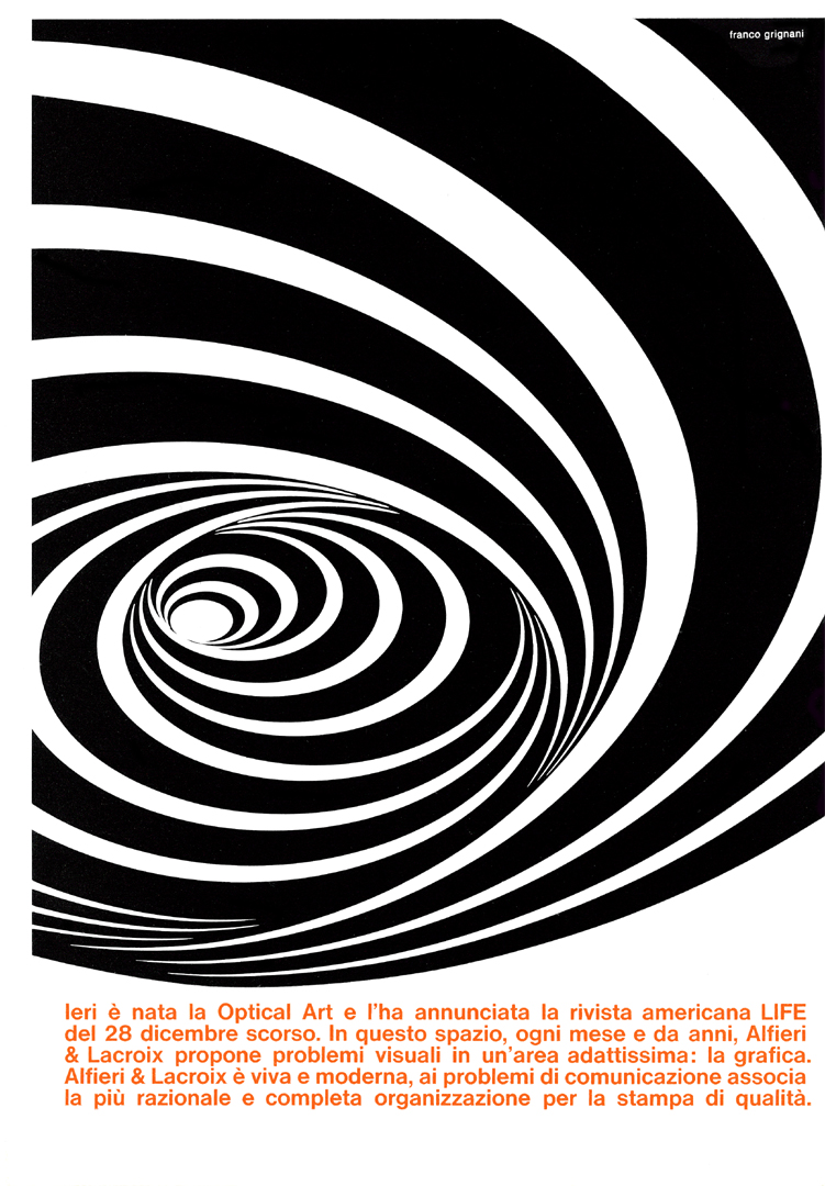 |
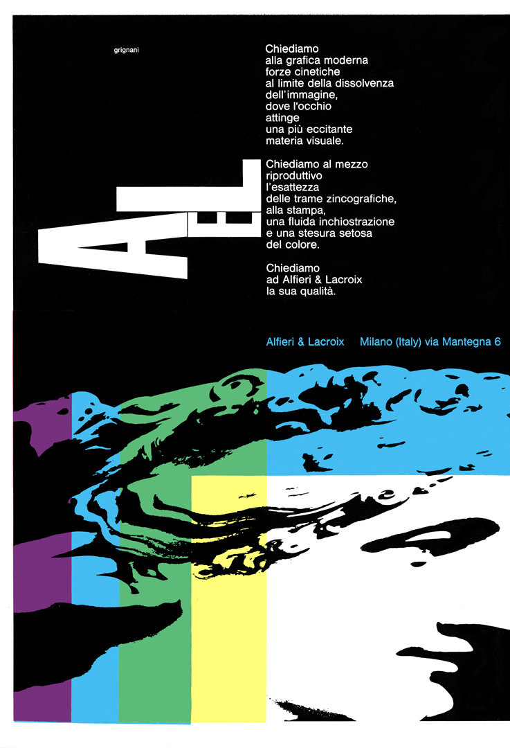 | “We ask modern graphics for kinetic forces at the edge of image dissolution, where the eye draws from a more exciting visual matter. We ask the reproduction process for the precision of zincographic screens, the printing for a fluid inking and a silky application of colour. We ask Alfieri & Lacroix for its quality.” |
| “TOMORROW MORE THAN TODAY The future of typography is the future of mankind, and we never stop; seventy years of life, growth, organization, equipment, innovation, and progress. Yesterday, today, tomorrow: Alfieri & Lacroix, always bringing the new, the best, security, reliability, quality, and support for solving every graphic challenge.” | 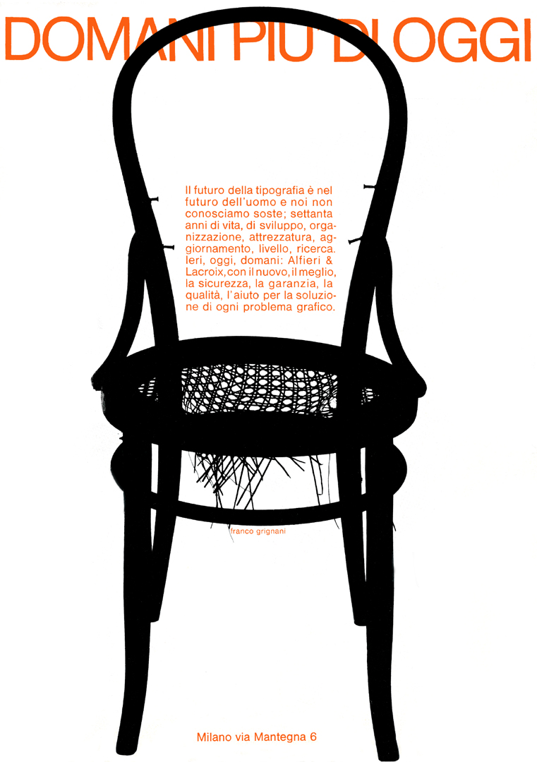 |
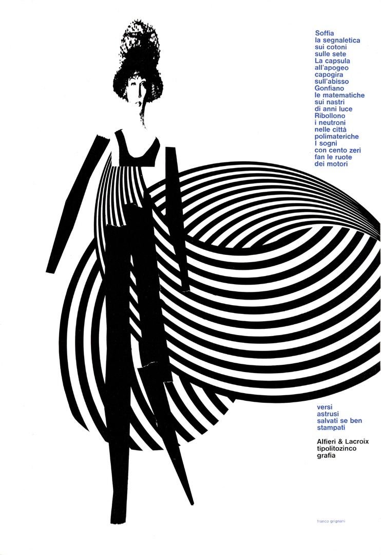 | “The signage blows over cotton and silk The capsule at apogee spins dizzy over the abyss Mathematics swell on ribbons of light-years Neutrons boil in polymaterial cities Dreams with a hundred zeros turn the wheels of engines enigmatic verses preserved—if well printed” |
| “This too is a symbolic, allusive, imaginative, emotional, and evocative tale: The beauty of typography lies in its becoming, in the relationships of sign and space, in its precise imprint, in its rhythmic colours—an orderly and secure work on the presses of Alfieri & Lacroix.” | 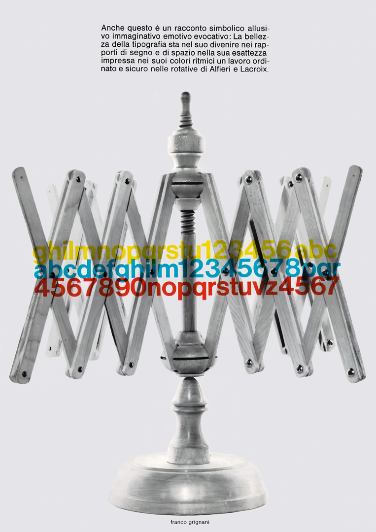 |
 | “The sign was born with man, first carved onto cave walls, now printed at unimaginable speeds on fine paper, whether tiny or gigantic, enriched by the allure of colour. To express its subtle language, advertising graphics find powerful support in modern typography. A major graphic organization ensures lasting effectiveness for your promotional message through crisp, elegant typefaces and faithfully reproduced images.” |
| “The fate of a poorly printed piece is irreversibly sealed. In advertising, an efficient idea and a well-conceived artistic approach are not enough. These elements are subordinate to graphic execution because poorly executed printing is visually irritating and repels interest. The extensive resources of an experienced and highly advanced printing complex ensure the precision of results that, through the crisp elegance of typefaces and the fidelity of colours, will make your promotional message appreciated and remembered.” | 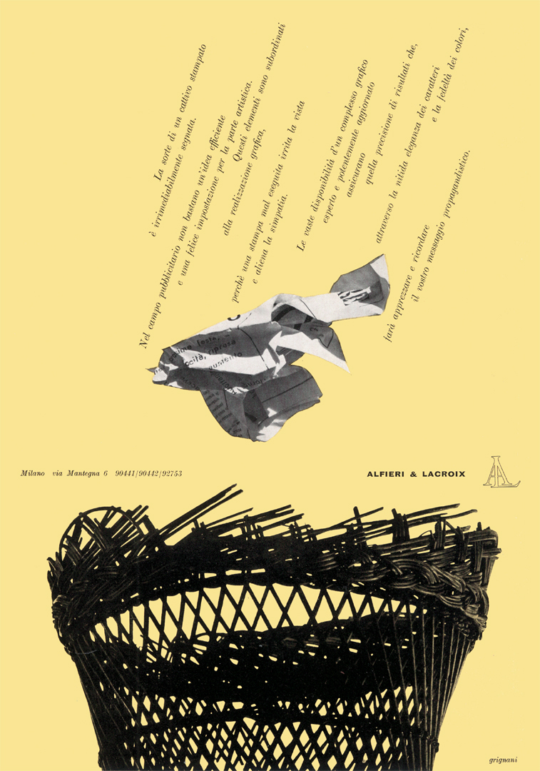 |
 | “He said!!! and the loaves multiplied… It was printed and the signs the writings the images multiplied by the thousands, from the presses of Alfieri & Lacroix, by the millions, from the presses of Alfieri & Lacroix, typolithozincography in Milan” |
| “Advertising communication is rooted in sensory experiences lived and catalogued throughout an individual’s life, with formal traces interfering with each other based on their similarities, sometimes, the structural ambiguity of certain graphic signs used reactively can generate infinite interpretations, but a simple, exact, and vivid reality is the quality in the printing of Alfieri & Lacroix.” | 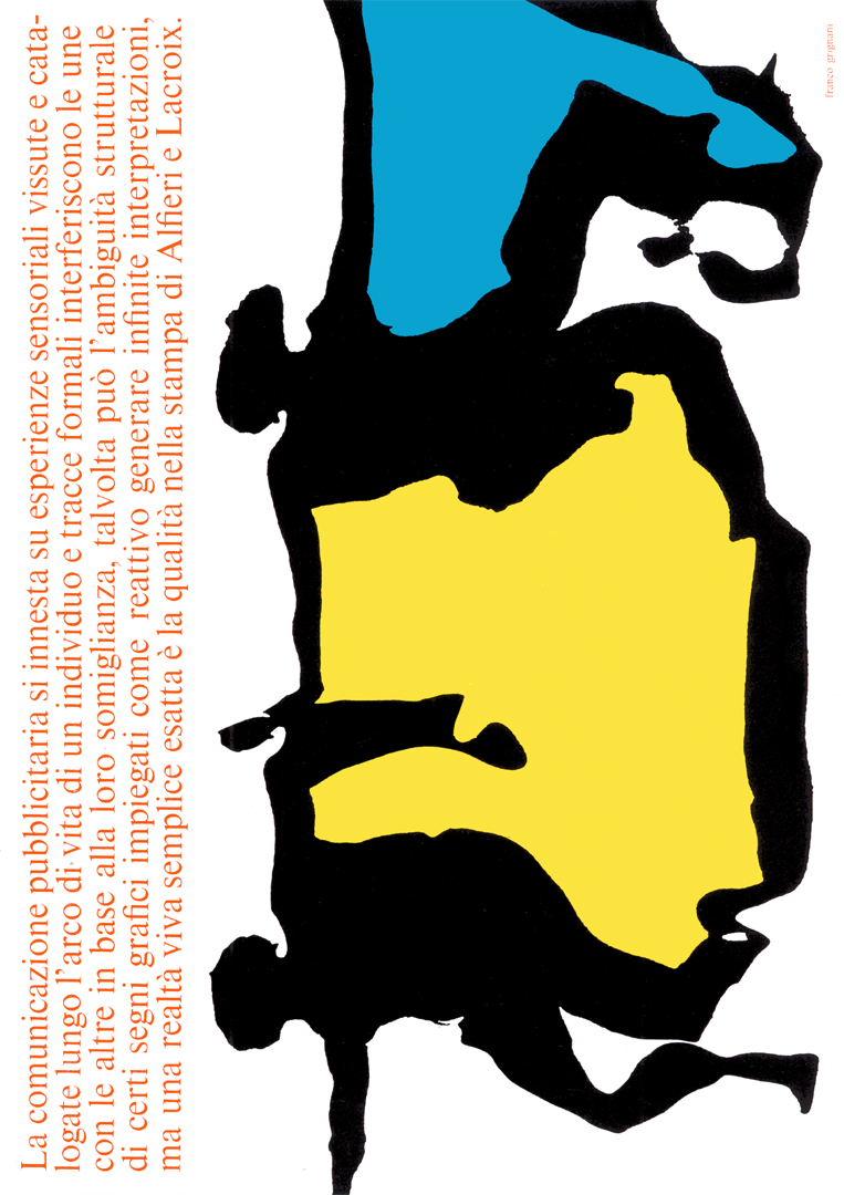 |
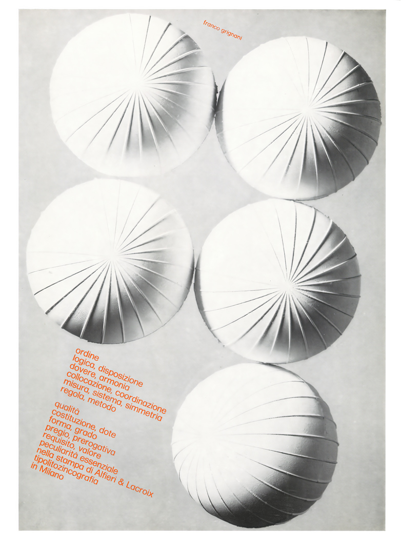 | “order logic, arrangement duty, harmony placement, coordination measure, system, symmetry rule, method quality composition, gift form, degree merit, prerogative requirement, value essential peculiarity in the printing of Alfieri & Lacroix typolithozincography in Milan” |
| “AT THIS POINT ARE WE STILL ARTISTS? CREATIVITY AND TECHNIQUE COME INTO PLAY TRANSFORMING TOOLS EXPLORATIONS AND SENSATIONS LIVING TYPOGRAPHY ENGAGES WITH THESE CHALLENGES AND SOLVES THEM, JUST AS ALFIERI & LACROIX MASTERS THE TECHNICAL ASPECTS OF PRINTING TO DELIVER QUALITY, ALWAYS” | 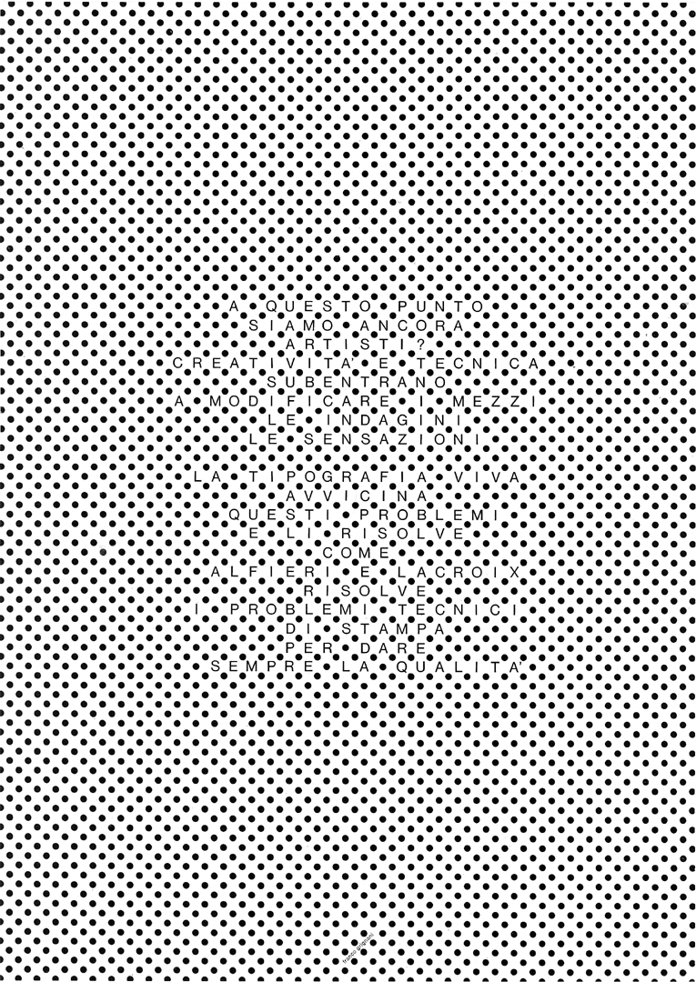 |
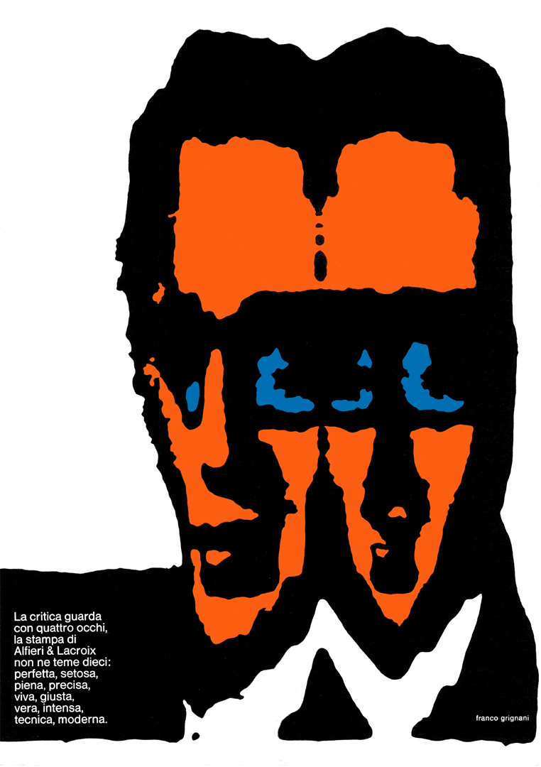 | “Criticism observes with four eyes; Alfieri & Lacroix’s printing fears not even ten: perfect, silky, full, precise, vivid, accurate, true, intense, technical, modern.” |
| “now man walks on lines speeds on arrows flutters with a polka-dot tie admires textured paintings types on a machine gives geometry as a gift and knows the print quality of Alfieri & Lacroix the graphic man” | 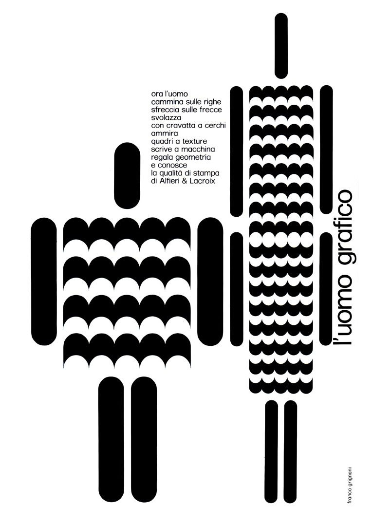 |
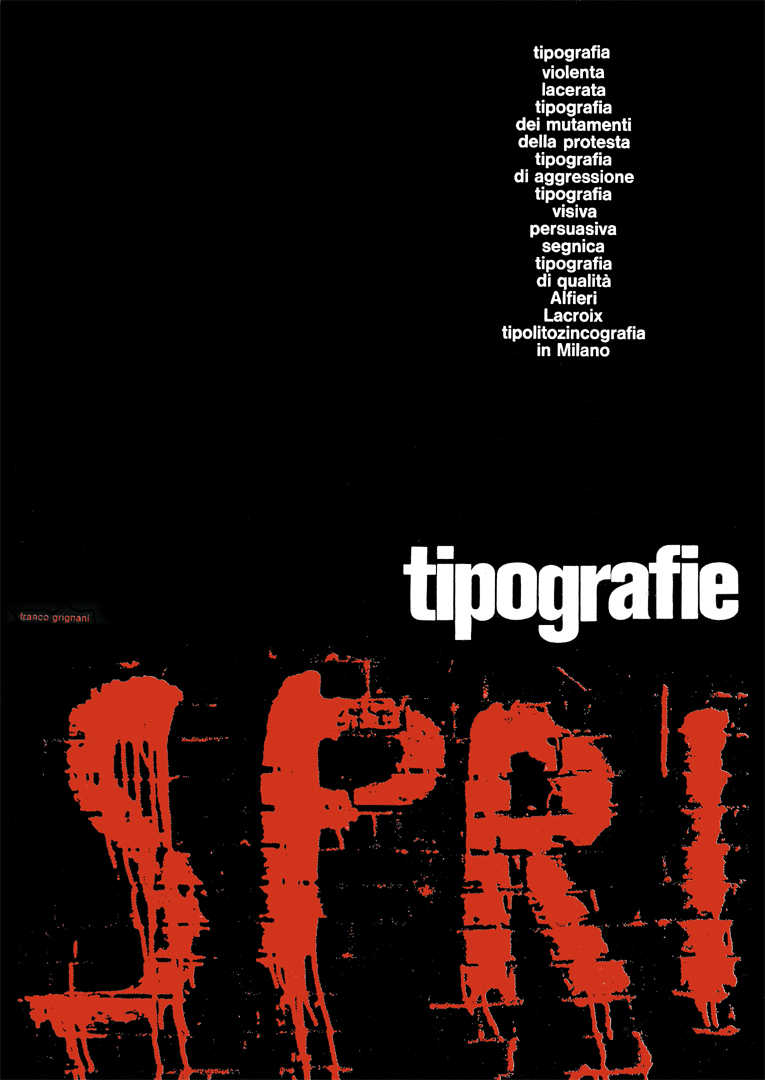 | “violent, torn typography—typography of change and protest typography of aggression visual persuasive iconic typography quality typography by Alfieri & Lacroix typolithozincography in Milan” |
| “Modern graphic design has always sought to introduce plasticity into every visual composition. On paper, the illusion of the third dimension enhances the physical tangibility of objects; images projected into the eye take on material qualities, and through virtual movement, figurative influences are emphasized in the human subconscious. The same applies to the precise and consistent printing of signs and colours in their woven, velvety, or glossy textures, as well as the careful balance of typographic elements in repetition. This is printing at the quality standard of Alfieri & Lacroix.” | 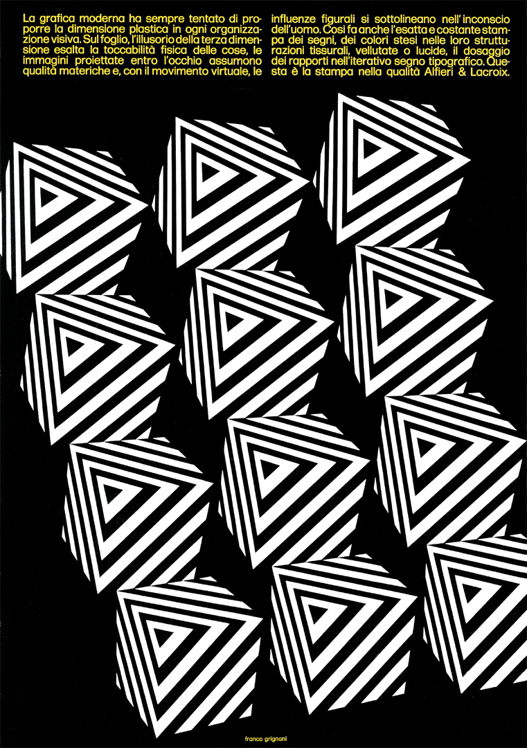 |
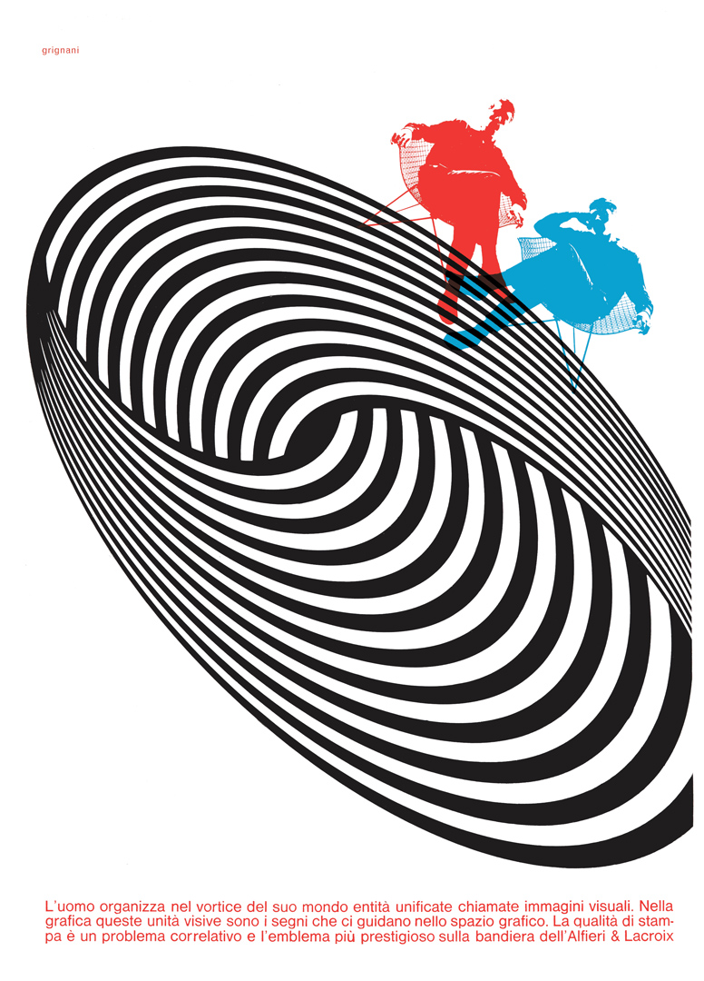 | “Man organizes unified entities called visual images within the whirlwind of his world. In graphic design, these visual units are the signs that guide us through the graphic space. Printing quality is a correlative issue and the most prestigious emblem on the flag of Alfieri & Lacroix” |
| “It seems that the resurgence of Liberty memories is shaking the foundations of modern graphic design. Let us observe the strength and freedom of invention manifesting in these typefaces; can we now forget that graphic design is, above all, a visual spectacle? Your challenges, with Alfieri & Lacroix, for the future of graphic design.” | 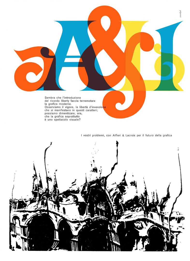 |
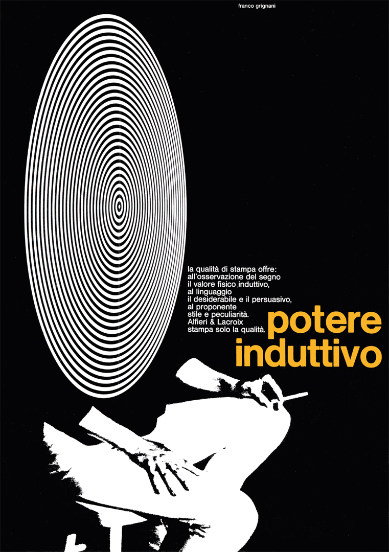 | “the quality of printing provides: to the observation of the sign, its physical inductive value; to language, the desirable and the persuasive; to the proposer, style and uniqueness. Alfieri & Lacroix prints only quality. inductive power” |
| “New technical and psychological processes are becoming part of the new graphic language so that the eye, already stimulated by shapes and images from the surrounding world, can capture a sign. The dynamic and tensile component, with its visual absorption, charges the sign with an apparent motion. This challenge of graphic creativity demands exceptional reproductive quality: Alfieri & Lacroix!” | 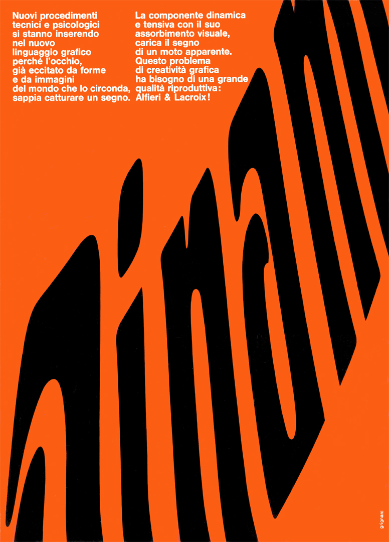 |
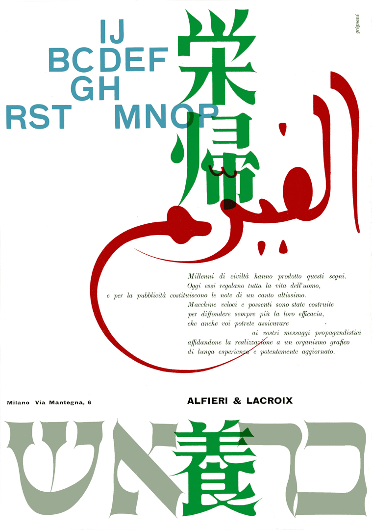 | “Millennia of civilization have shaped these signs. Today, they govern every aspect of human life and, in advertising, they become the notes of a lofty symphony. Powerful, high-speed machines have been designed to further amplify their impact—an effectiveness you too can guarantee for your promotional messages by entrusting their production to a graphic organization with long-standing experience and cutting-edge technology.” |
| “the fear of abstract emotion how much beauty lies in the clear and pure sign that we recreate from the familiar image . graphic design invents a new space and a new time, it loves the absolute idea, the figurative emblem . we seek truth behind the façade of things worn out by words and the lazy, indifferent eye the equipment of Alfieri & Lacroix for the solution of any graphic problem” | 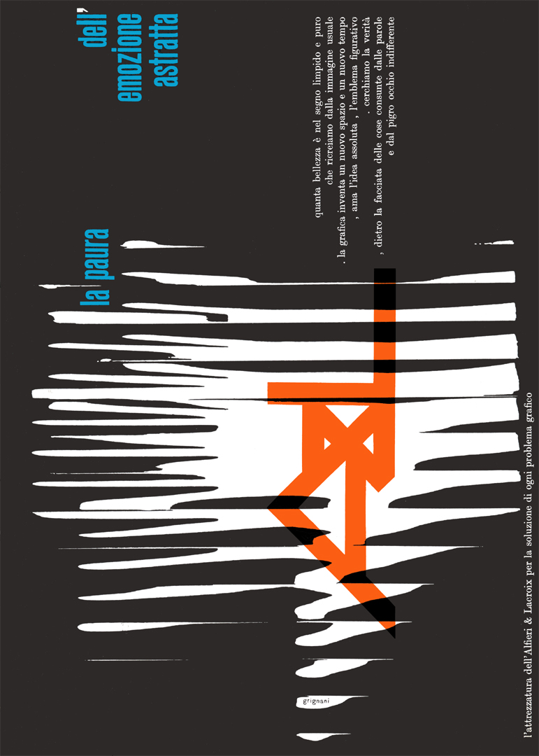 |
further related posts & pages:
- A virtual exhibit on Alfieri & Lacroix
- lecture held by Greg D’Onofrio in NY focused on Grignani’s use of type and graphics in advertising design from the late 1940s through the 1970s
- Franco Grignani and the US
- Gallery – advertising & covers
[a] from “Futurismo Pavese” [“Futurism in Pavia”], ticinum edizioni, 1983
[b] from “Dario Morani”, Pavia, 1982
[pics and original Italian texts from AIAP / CDPG Centro di Documentazione sul Progetto Grafico, courtesy of Lorenzo Grazzani]
[I] ITA original text from the magazine ‘arte e società’, issue 6/7, 1973: “Normalmente la composizione grafica in Italia e in Svizzera (presa a modello) tendeva verso una distribuzione di elementi in posizione di quiete. Ma la comunicazione è di per se stessa dinamica.”
[II] ITA original text from the book “Dario Morani”, Pavia, 1982: “Lo ricorderemo sempre perchè è stato anche un modello di immensa umanità.”
[III] ITA original texts of the ads:
- “Milioni di stampati dalla superstampa di Alfieri & Lacroix: da tenere fra le mani, da divorare con gli occhi, da conservare nelle raccolte, da ricordare per sempre, da parlane con tutti”
- “Tipolitozincografia è un neologismo solo per Alfieri & Lacroix; significa un ciclo completo del fare grafico. Alfieri & Lacroix è stata la prima in Italia a produrre il cliché a colori, ora, nel secolo della tecnologia è prima per metodo, organizzazione, attrezzatura e qualità di stampa.”
- “Geometria avvolgente continua mutevole, tradotta fisica nel suo esistere dinamico e dalla qualità di stampa. Immagine che esce da macchine perfette condotte da nuove tecniche. Tutti sanno che è una stampa della tipolitozincografica Alfieri e Lacroix.”
- “Il vedere oltre è legato alla mente sperimentale dell’uomo; è evidente dunque che esiste una super realtà segnica che la grafica esalta e fa fantastica, fantastica come la qualità di stampa di Alfieri & Lacroix.”
- “I grafici italiani conoscono la storia dei sessantacinque anni dell’A & L: albero dalle grandi fronde, simbolo della sua potenza meccanica e della sua organizzazione. Oggi, A & L, fiera del suo passato ma sensibile ai nuovi problemi estetici e visuali, sceglie la sua grafica pubblicitaria con una formula citata tra le più ardite.”
- “urto, rottura, enorme, macerie, incubo, crollo, nero, tempestoso, pesante, ooh!, inutile, muraglia, orrido, boato, disastro, struttura, fuga, sussulto, carico, masso, rovina, LA GRAFICA CREA L’EMOZIONE”
- “Carta piegata, goffrata, rigata, marezzata, carta tesa, calandrata, satinata, lucida, patinata, monolucida, carta collata, mezzafina, vergata, tripla colla, filogranata, telata, pergamenata, colorata, carta dorata, inargentata, per la stampa di qualità di Alfieri e Lacroix.”
- “Ieri è nata la Optical Art e l’ha annunciata la rivista americana LIFE del 28 dicembre scorso. In questo spazio, ogni mese e da anni, Alfieri & Lacroix propone problemi visuali in un’area adattissima: la grafica. Alfieri & Lacroix è viva e moderna, ai problemi di comunicazione associa la più razionale e completa organizzazione per la stampa di qualità.”
- “Chiediamo alla grafica moderna forze cinetiche al limite della dissolvenza dell’immagine, dove l’occhio attinge una più eccitante materia visuale. Chiediamo al mezzo riproduttivo l’esattezza delle trame zincografiche, alla stampa, una fluida inchiostrazione e una stesura setosa del colore. Chiediamo ad Alfieri & Lacroix la sua qualità.”
- “Il futuro della tipografia è nel futuro dell’uomo e noi non conosciamo soste; settanta anni di vita, di sviluppo, organizzazione, attrezzatura, aggiornamento, livello, ricerca. Ieri, oggi, domani: Alfieri & Lacroix, con il nuovo, il meglio, la sicurezza, la garanzia, la qualità, l’aiuto per la soluzione di ogni problema grafico.”
- “Soffia la segnaletica sui cotoni sulle sete. La capsula all’apogeo capogira sull’abisso. Gonfiano le matematiche sui nastri di anni luce. Ribollono i neutroni nelle città polimateriche. I sogni con cento zeri fan le ruote dei motori versi astrusi salvati se ben stampati”
- “Anche questo è un racconto simbolico allusivo immaginativo emotivo evocativo: La bellezza della tipografia sta nel suo divenire nei rapporti di segno e di spazio nella sua esattezza impressa nei suoi colori ritmici un lavoro ordinato e sicuro nelle rotative Alfieri e Lacroix.”
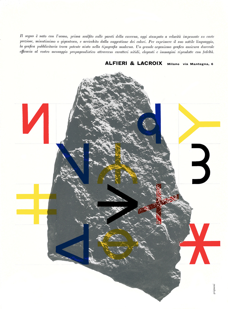
- “Il segno è nato con l’uomo, prima scalfito sulle pareti della caverna, oggi stampato a velocità impensate su carte preziose, minutissimo o gigantesco, e arricchito dalla suggestione dei colori. Per esprimere il suo sottile linguaggio, la grafica pubblicitaria trova potente aiuto nella tipografia moderna. Un grande organismo grafico assicura durevole efficacia al vostro messaggio propagandistico attraverso caratteri nitidi, eleganti e immagini riprodotte con fedeltà.”
- “La sorte di un cattivo stampato è irrimediabilmente segnata. Nel campo pubblicitario non bastano un’idea efficiente e una felice impostazione per la parte artistica. Questi elementi sono subordinati alla realizzazione grafica, perché una stampa mal eseguita irrita la vista e aliena la simpatia. Le vaste disponibilità d’un complesso grafico esperto e potentemente aggiornato assicurano quella precisione di risultati che, attraverso la nitida eleganza dei caratteri e la fedeltà dei colori, farà apprezzare e ricordare il vostro messaggio propagandistico.”
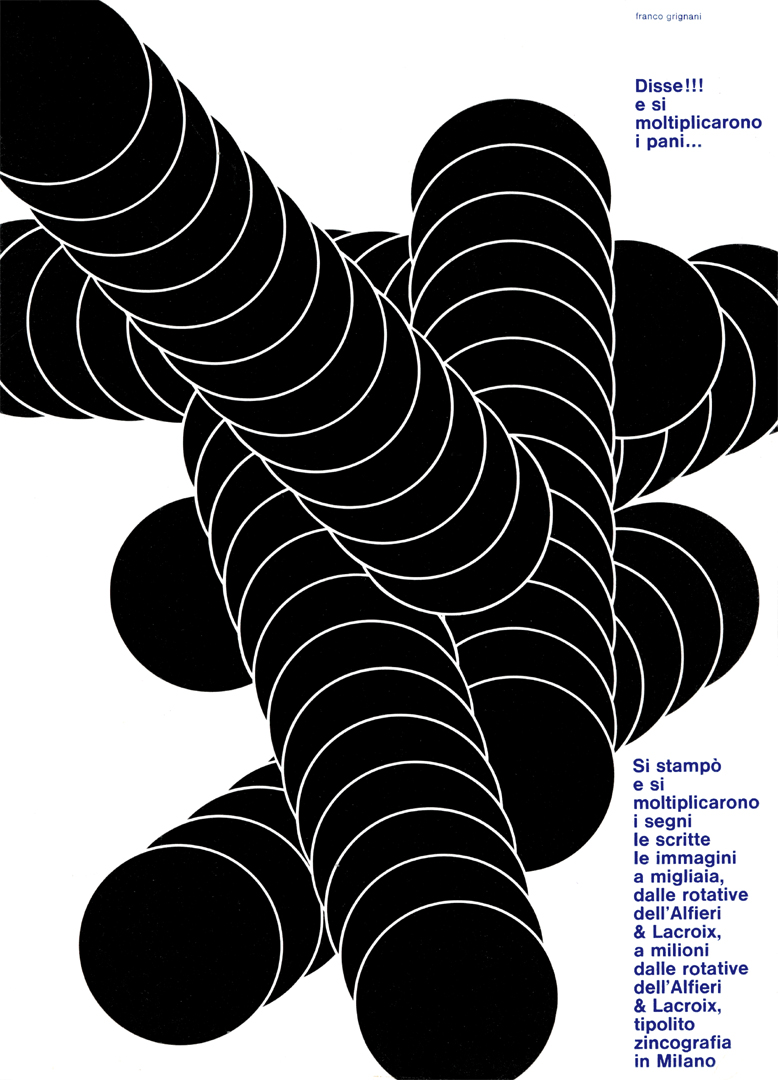
- “Disse!!! e si moltiplicarono i pani… Si stampò e si moltiplicarono i segni le scritte le immagini a migliaia, dalle rotative dell’Alfieri & Lacroix, a milioni dalle rotative dell’Alfieri & Lacroix tipolitozincografia in Milano”
- “La comunicazione pubblicitaria si innesta su esperienze sensoriali vissute e catalogate lungo l’arco di vita di un individuo e tracce formali interferiscono le une con le altre in base alla loro somiglianza, talvolta può l’ambiguità strutturale di certi segni grafici impiegati come reattivo generare infinite interpretazioni, ma una realtà viva semplice esatta è la qualità nella stampa di Alfieri e Lacroix.”
- “ordine logica, disposizione dovere, armonia collocazione, coordinazione misura, sistema, simmetria regola, metodo qualità costituzione, dote forma, grado pregio, prerogativa requisito, valore peculiarità essenziale nella stampa di Alfieri & Lacroix tipolitozincografia in Milano”
- “A QUESTO PUNTO SIAMO ANCORA ARTISTI? CREATIVITÀ E TECNICA SUBENTRANO A MODIFICARE I MEZZI LE INDAGINI LE SENSAZIONI LA TIPOGRAFIA VIVA AVVICINA QUESTI PROBLEMI E LI RISOLVE COME ALFIERI E LACROIX RISOLVE I PROBLEMI TECNICI DI STAMPA PER DARE SEMPRE LA QUALITÀ”
- “La critica guarda con quattro occhi, la stampa di Alfieri & Lacroix non ne teme dieci: perfetta, setosa, piena, precisa, viva, giusta, vera, intensa, tecnica, moderna.”
- “Ora l’uomo cammina sulle righe sfreccia sulle frecce svolazza con cravatta a cerchi ammira quadri a texture scrive a macchina regala geometria e conosce la qualità di stampa di Alfieri & Lacroix”
- “tipografia violenta lacerata tipografia dei mutamenti della protesta tipografia di aggressione tipografia visiva persuasiva segnica tipografia di qualità Alfieri Lacroix tipolitozincografia Milano”
- “La grafica moderna ha sempre tentato di proporre la dimensione plastica in ogni organizzazione visiva. Sul foglio, l’illusorio della terza dimensione esalta la toccabilità fisica delle cose, le immagini proiettate entro l’occhio assumono qualità materiche e, con il movimento virtuale, le influenze figurali si sottolineano nell’inconscio dell’uomo. Così fa anche l’esatta e costante stampa dei segni, dei colori stesi nelle loro strutturazioni tissurali, vellutate o lucide, il dosaggio dei rapporti nell’iterativo segno tipografico. Questa è la stampa nella qualità Alfieri & Lacroix.”
- “L’uomo organizza nel vortice del suo mondo entità unificate chiamate immagini visuali. Nella grafica queste unità visive sono i segni che ci guidano nello spazio grafico. La qualità di stampa è un problema correlativo e l’emblema più prestigioso sulla bandiera dell’Alfieri & Lacroix”
- “Sembra che l’introduzione del ricordo liberty faccia terremotare la grafica moderna. Osserviamo il vigore, la libertà d’invenzione che si manifestano in questi caratteri; possiamo dimenticare, ora, che la grafica soprattutto è uno spettacolo visuale? I vostri problemi, con Alfieri & Lacroix per il futuro della grafica”
- “la qualità di stampa offre: all′osservazione del segno il valore fisico induttivo, al linguaggio il desiderabile e il persuasivo, al proponente stile e peculiarità. Alfieri & Lacroix stampa solo la qualità potere induttivo”
- “Nuovi procedimenti tecnici e psicologici si stanno inserendo nel nuovo linguaggio grafico perché l′occhio, già eccitato da forme e da immagini del mondo che lo circonda, sappia catturare un segno. La componente dinamica e tensiva con il suo assorbimento visuale, carica il segno di un moto apparente. Questo problema di creatività grafica ha bisogno di una grande qualità riproduttiva: Alfieri & Lacroix!”
- “Millenni di civiltà hanno prodotto questi segni. Oggi essi regolano tutta la vita dell′uomo, e per la pubblicità costituiscono le note di un canto altissimo. Macchine veloci e possenti sono state costruite per diffondere sempre più la loro efficacia, che anche voi potete assicurare ai vostri messaggi propagandistici affidandone la realizzazione a un organismo grafico di lunga esperienza e potentemente aggiornato.”
- “la paura dell′emozione astratta quanta bellezza è nel segno limpido e puro che ricreiamo dalla immagine usuale . la grafica inventa un nuovo spazio e un nuovo tempo , ama l′idea assoluta , l′emblema figurativo . cerchiamo la verità , dietro la facciata delle cose consunte dalle parole e dal pigro occhio indifferente”
Last Updated on 28/03/2025 by Emiliano