
As Patricia Belen and Greg D’Onofrio have recently highlighted in a book associated with a recent exhibition in New York titled ‘Italian Types, Graphic Designers from Italy in America’, “the arrival of ambitious and original thinkers from the European avant-garde signalled the transformation of a new, modern design landscape in America. Artist and graphic designers brought with them visionary ideas and an enthusiastic spirit to the design hubs of New York, Chicago, Los Angeles, and Philadelphia – cities of opportunity, intellectual and progressive attitude, innovative clients and design networks.”
Unlike other Italian graphic designers, however, Franco Grignani never relocated to America, making only one trip in 1965. However, interest in his work was conveyed through “specialized magazines, books, and samples distributed to many graphic design schools” [from ‘graphic designers in Europe/4’, NY, 1973], along with some notable group or solo exhibitions:
Group exhibits:
- New York, MoMA, “Modern Art in Your Life”: October 1949
Conceived to celebrate the 20th anniversary of the MoMA, the exhibition “was designed to show that the appearance and shape of countless objects of our everyday environment are related to, or derived from, modern painting and sculpture, and that modern art is intrinsic part of modern living.“
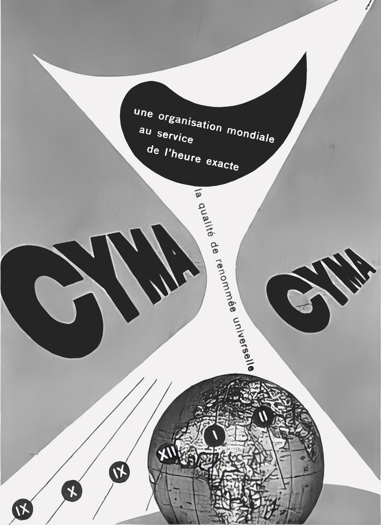
Franco Grignani was present in the ‘typography and advertising design’ section, with a poster for Cyma watches from 1946 included in the catalogue: “[free form] can serve to attract the eye to whatever it encloses. Designers use to make lettering stand out (advertisement for Cyma watches) […] [these] are special applications of a new but now generally accepted style.“
- Los Angeles, UCLA Art Gallery: 1959
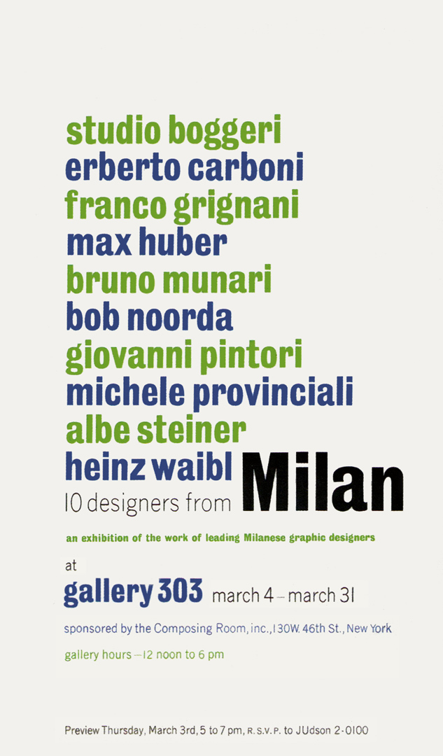
- New York, Gallery 303, “10 designers from Milan”: March 1960
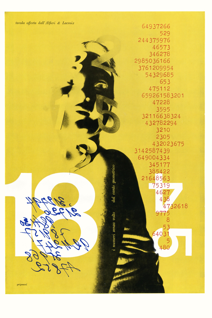
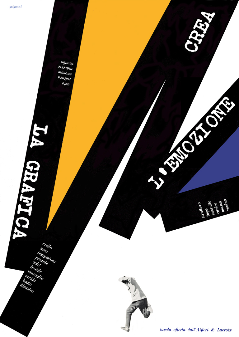
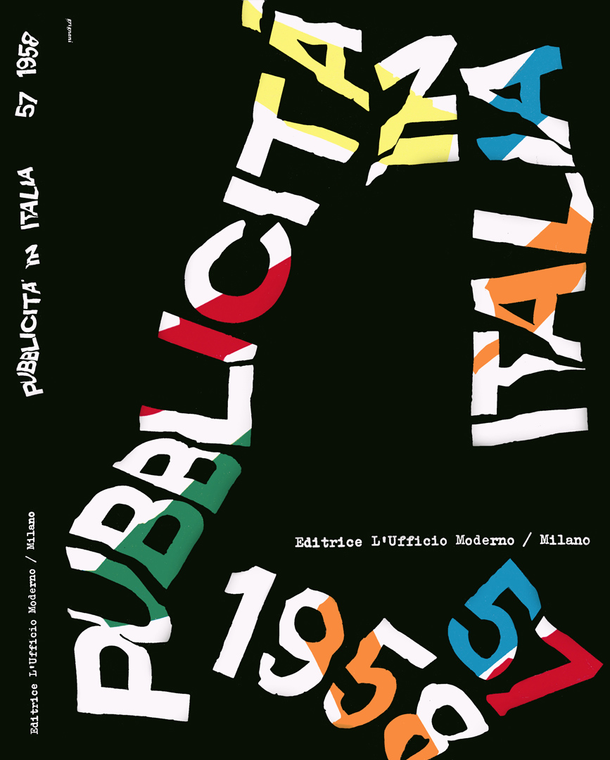
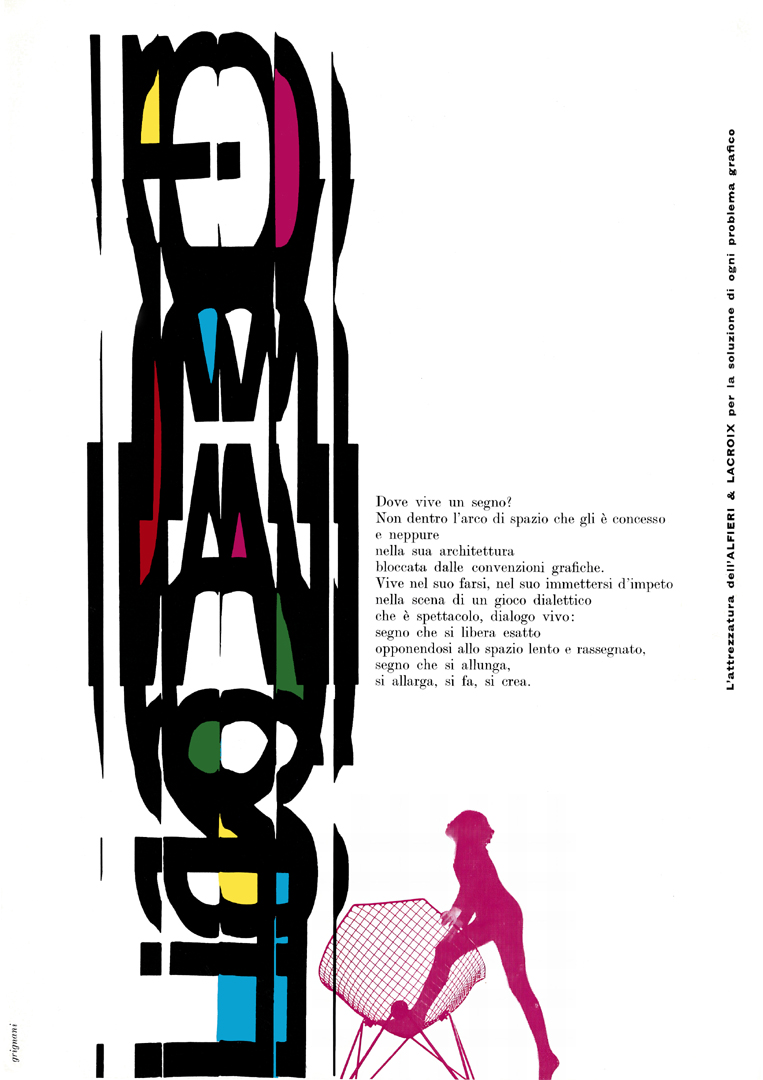
Organized by Max Huber, this exhibit was sponsored by the ‘Composing Room‘, a recognized leader in photo-typesetting that produced enviable exhibitions and talks to explore, document, and promote the most innovative design of the mid-century. This was the first exhibition in the US to showcase an extensive selection of graphic works from postwar Italian designers. Included in the show (poster above by Aaron Burns) were catalogues, book jackets, magazine and album covers, posters, ads, and packaging from leading Italian clients, such as – in the case of Grignani – Alfieri & Lacroix:
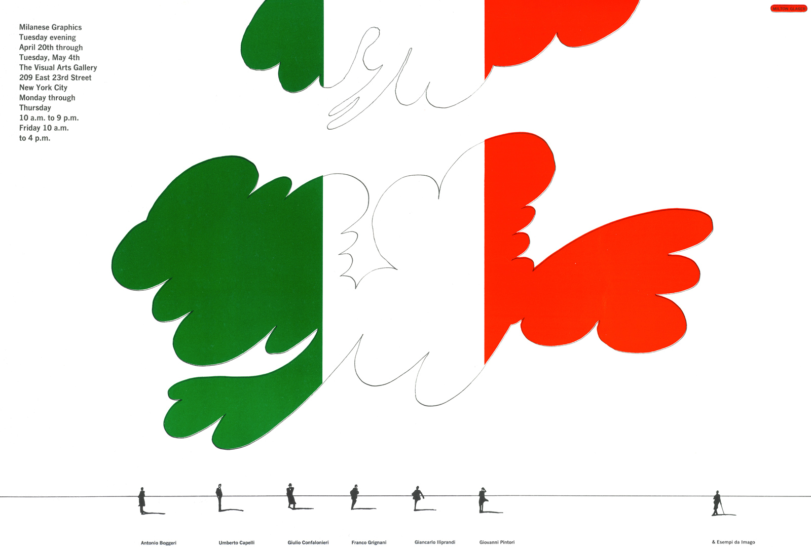
- New York, The Visual Arts Gallery, “Milanese Graphics”: April 1965
Renamed ‘SVA Chelsea Gallery’ in 2004, the School of Visual Arts in New York offered a wide range of exhibitions. ‘Milanese Graphics’ displayed works by Antonio Boggeri, Umberto Capelli, Giulio Confalonieri, Franco Grignani, Giancarlo Iliprandi, Giovanni Pintori, as well as examples from the magazine Imago (poster above by Milton Glaser).
- Carbondale, University of Carbondale, Illinois Mitchell Art Gallery, “Vision 65”: October 1965
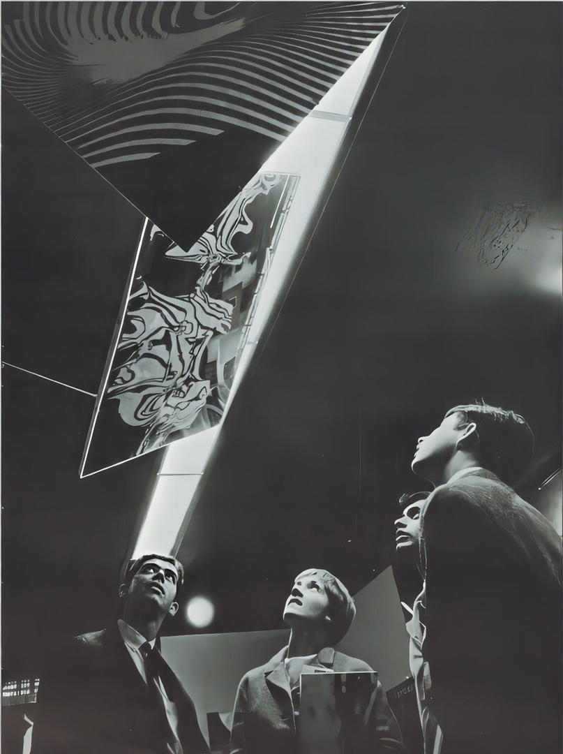
In conjunction with his participation at the ‘Vision 65‘ conference (officially called ‘Vision 65: World Congress on New Challenges to Human Communication’), held at the Southern Illinois University of Carbondale from October 21 to 23, 1965, Franco Grignani was also featured in the collective exhibition at the Mitchell Art Gallery in Carbondale, where posters, graphics, and other objects designed by the conference speakers were showcased, “featuring what it is considered some of the best examples of typography produced in the last 50 years” [from The Daily Egyptian, 21 Oct. 1965]. Works from Typomundus 20 were exhibited too.
The same exhibition then moved to Chicago:
- Chicago, Container Corporation of America (CCA) Gallery, “Vision 65”: 1965
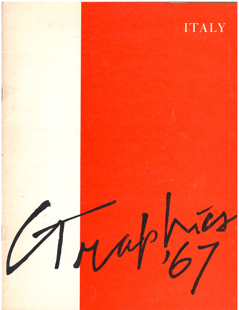
- Lexington, Kentucky, University of Kentucky Art Gallery, “Graphics ’67 Italy”: November 1966
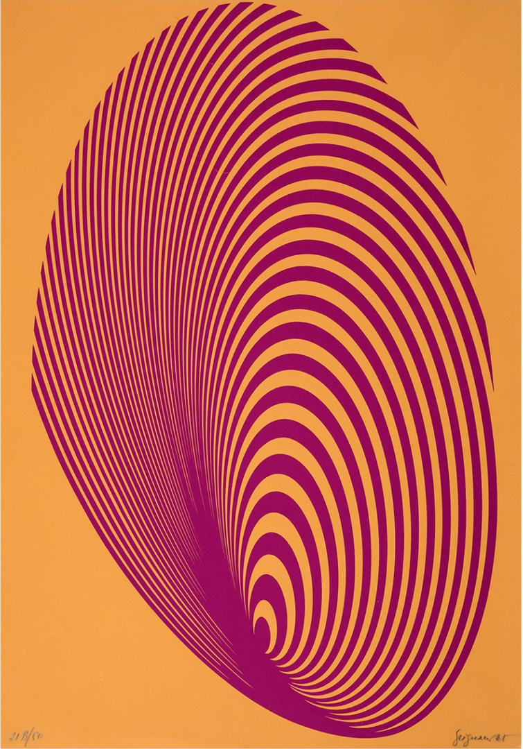
This was a loan exhibition with works (from 42 Italian artists, with each contributing two pieces) chosen by Umbro Apollonio, who was at that time permanent curator of the Historical Archive of Contemporary Art in Venice (The Biennale Archive). The exhibition focused strongly on new approaches in “programmed and Op art and neo-constructivism” and reflected “the continued participation of the contemporary Italian artist on the international level at the creative pace established there soon after World War II” (Edward Bryant, director of the gallery). Franco Grignani showcased two serigraphs from 1965, and one of his pieces was chosen to promote the entire event in The Courier-Journal of Louisville, Kentucky (20 Nov. 1966):
- New York, American Institute of Graphic Arts, AGI’s graphic designers: November 1966
The work of the many eminent graphic artists united in the Alliance Graphique Internationale (AGI), of which Grignani had been an early member since 1952, was presented to the American public for the first time at close quarters at Lincoln Center. Works covering the period 1924-1966 were displayed on a continuous wall of corrugated board in chronological order. Notably, instead of conventional photographs, self-portraits of the participating artists adorned the perimeter of the exhibition area. The portrait of Franco Grignani used in the header image of this blog was featured in the exhibition, with the inscription “this is my portrait” on the back of the photo.
- New York, The Mead Library of Ideas, AGI’s graphic designers: May 1967
This exhibition was part of a series displaying graphic designs by the members of the AGI following the November showcase. The Mead Library of Ideas was a gallery maintained by the Mead Paper Company in New York’s Pan Am Building, showcasing the finest examples of contemporary graphic design.
Solo exhibits:
- Bedford Springs, Pennsylvania: October 1958
This was a solo exhibition of “graphic art by Franco Grignani, famed Italian graphic designer” (The Pittsburgh Press, 18 Oct. 1958), held throughout the 14th annual conference of the American Society of Industrial Designers (ASID, which later became the Industrial Designers Society of America – IDSA – in 1965, “the single voice of industrial design in the US”), with the aim to “discuss the profession’s responsibility to the consumer and producer and the direction which industrial design may expect to take in the future”.
The other solo shows were all held in Chicago, throughout the whole 1960s; in the mid-twentieth century, Chicago graphic design had a strong sense of identity together with a reputation mostly for clean, ordered corporate graphics, influenced in part by the presence of the New Bauhaus since 1937.
- Chicago, Normandy House Gallery: November 1960
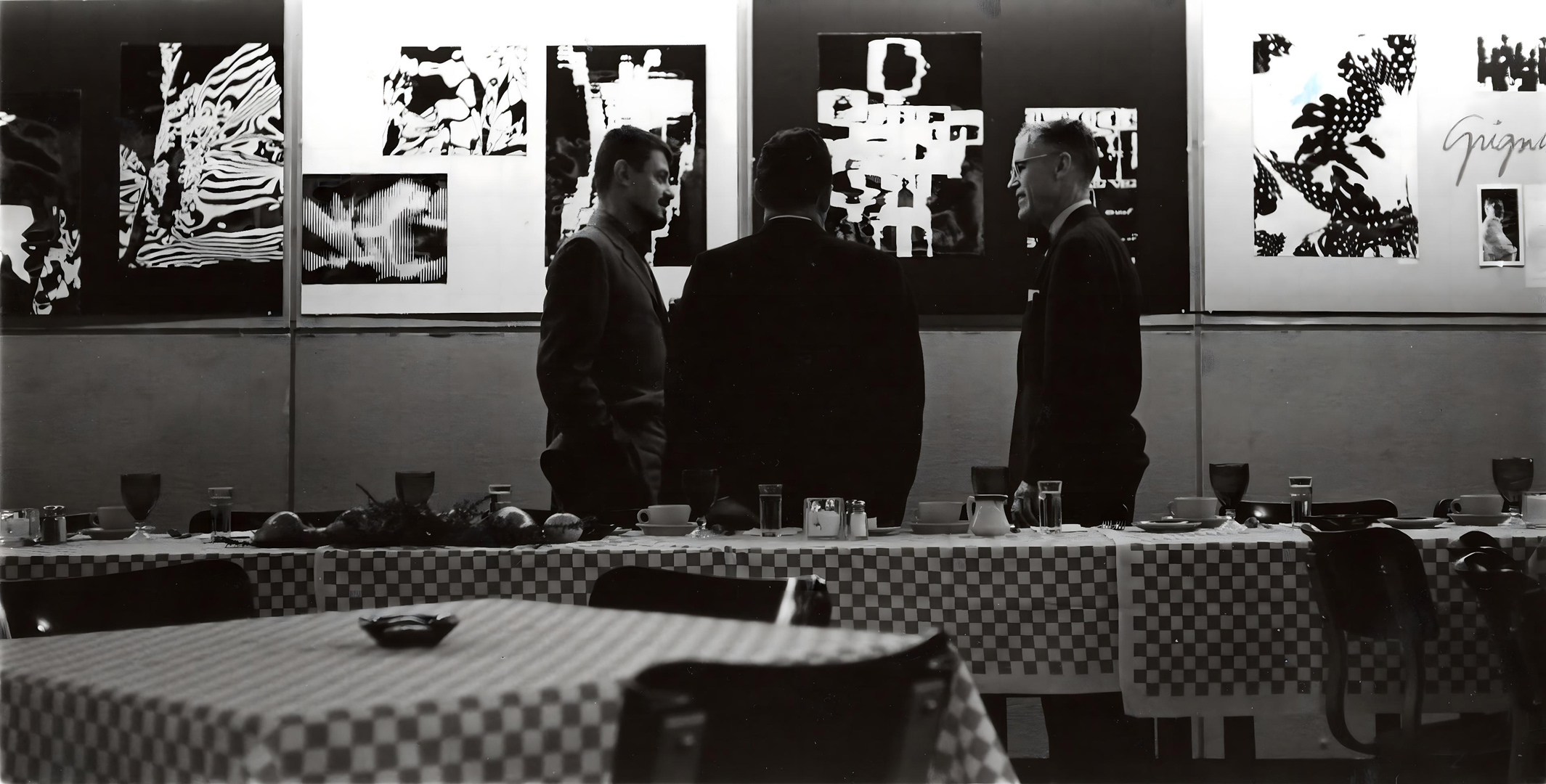
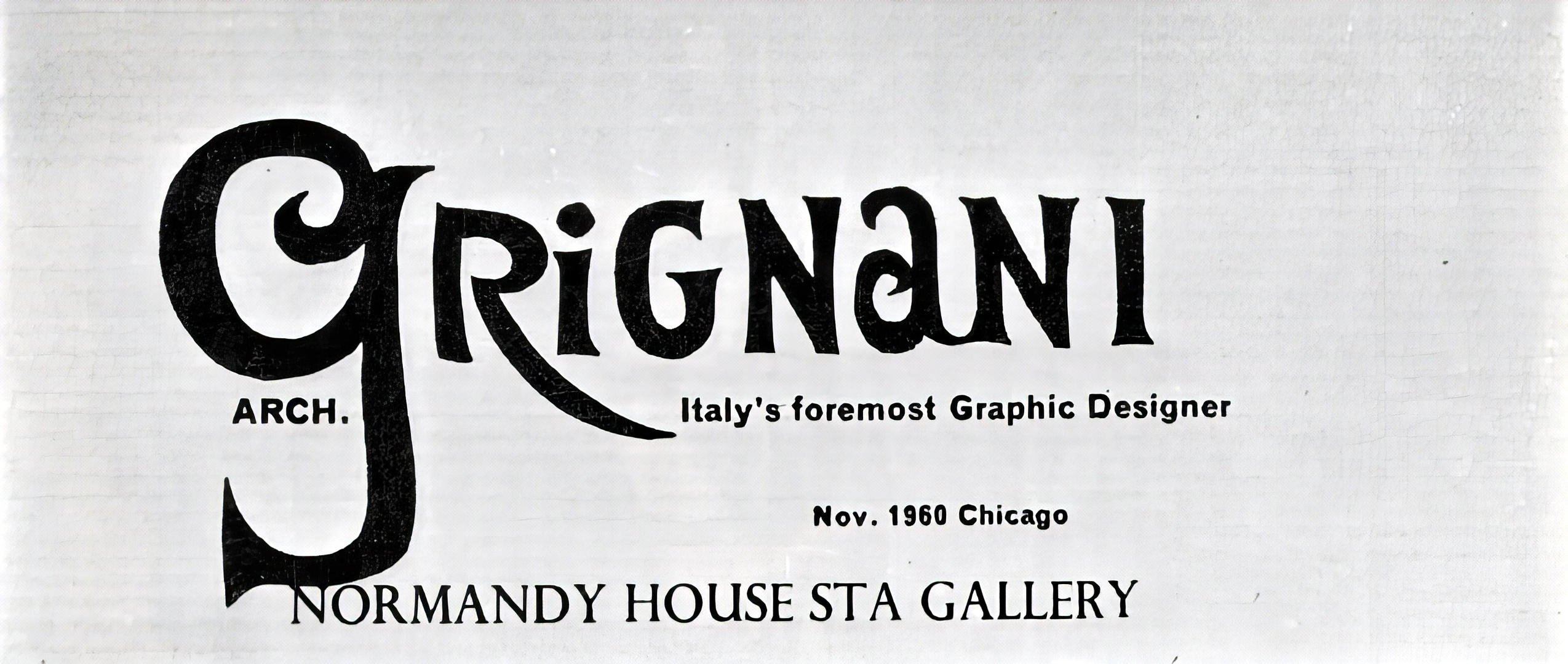
This exhibition took place in a gallery situated within a renowned historic restaurant (often visited by professional groups of architects and academics), where exhibitions sponsored by the Society of Typographic Arts (STA) of Chicago have been held since 1955. The experimental photographs featured in the exhibition garnered attention from the Japanese magazine Idea, which dedicated a seven-page article to them in issue n° 47, June 1961.
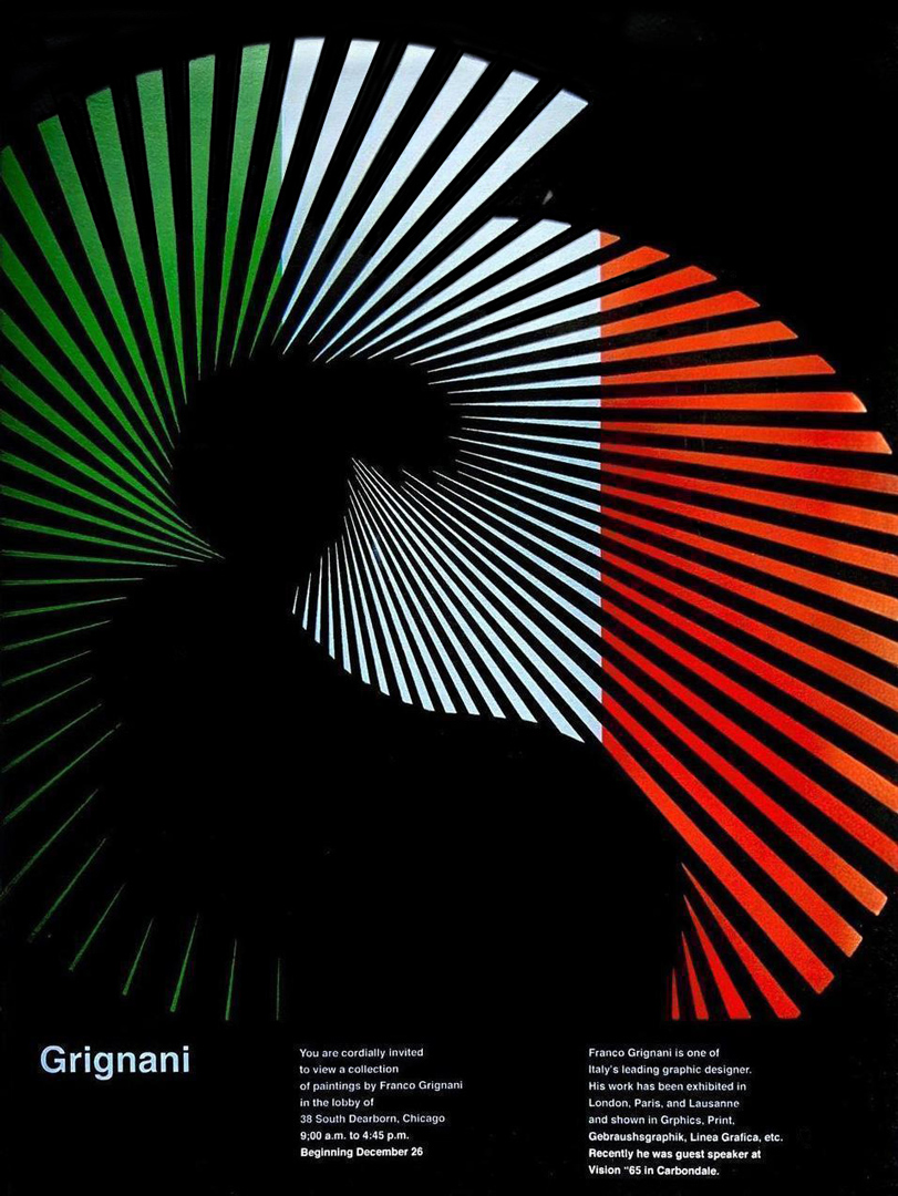
- Chicago, Container Corporation of America (CCA) Gallery: December 1965
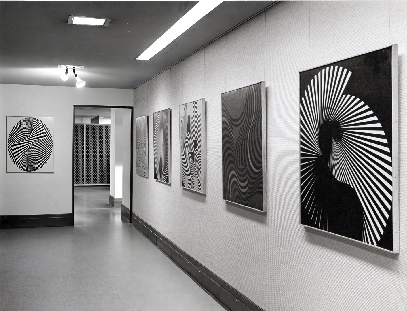
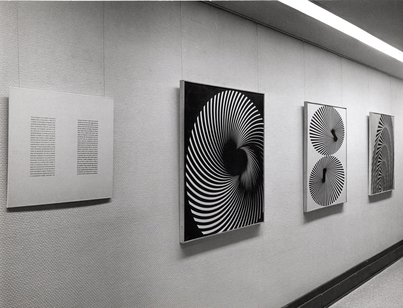
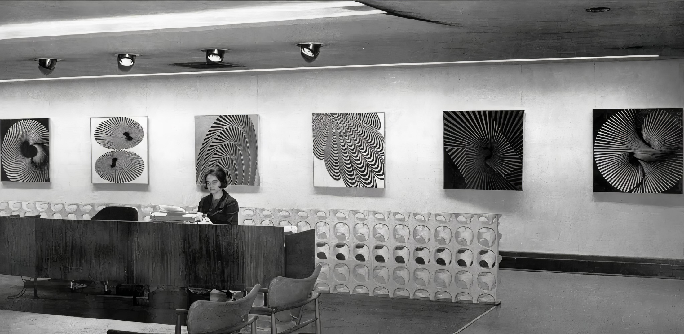
Established in 1926, the CCA was a leading company in the production of corrugated boxes for manufacturers. Despite dealing in everyday paperboard packages, the company distinguished itself through successful advertisement campaigns that showcased a sophisticated and innovative approach, transcending the conventional boundaries between industry and art. CCA’s commitment to design, support for modern art, and enthusiasm for experimentation set it apart. Functioning as a patron of graphic arts and design, CCA demonstrated a particular interest in European artists, whose work often reflected a more experimental spirit compared to prevailing trends in the U.S.
The 1965 solo exhibition – occurring just a few weeks after the aforementioned ‘Vision 65: World Congress on New Challenges to Human Communication’ in Carbondale – featured some of the most recent optical paintings. These works were subsequently exhibited in Florence in April 1966:
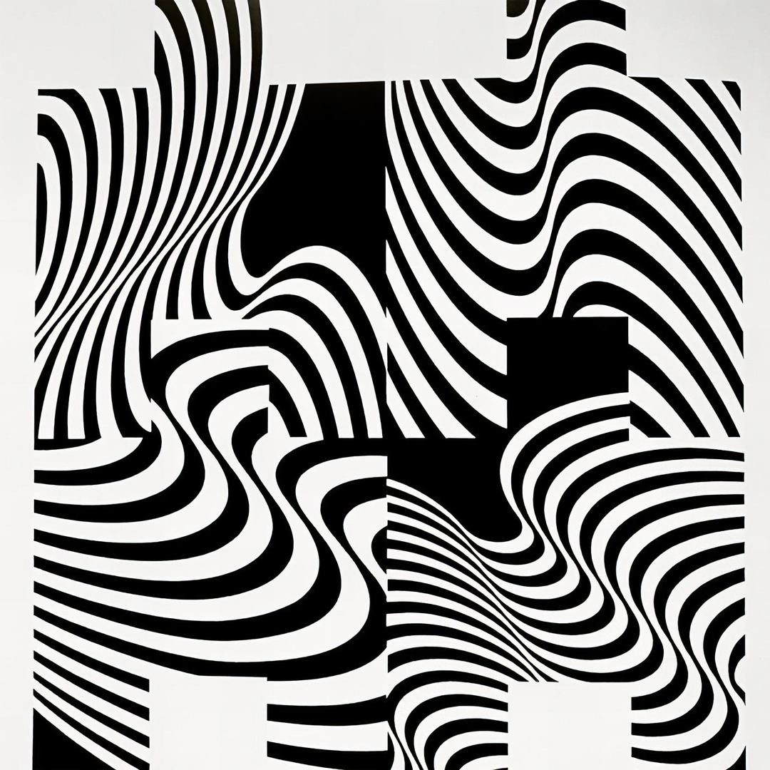
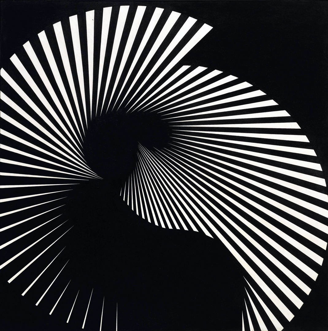
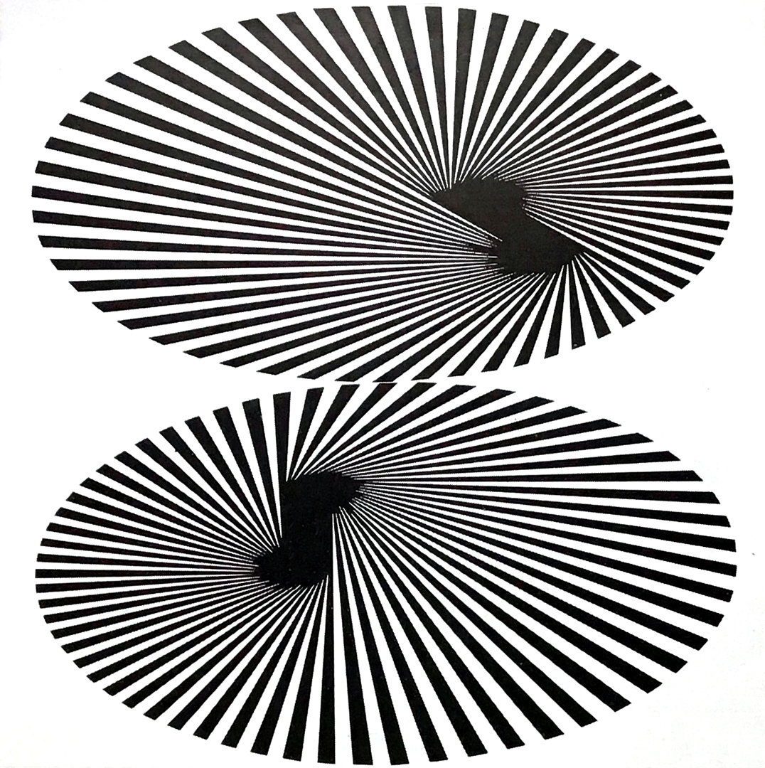


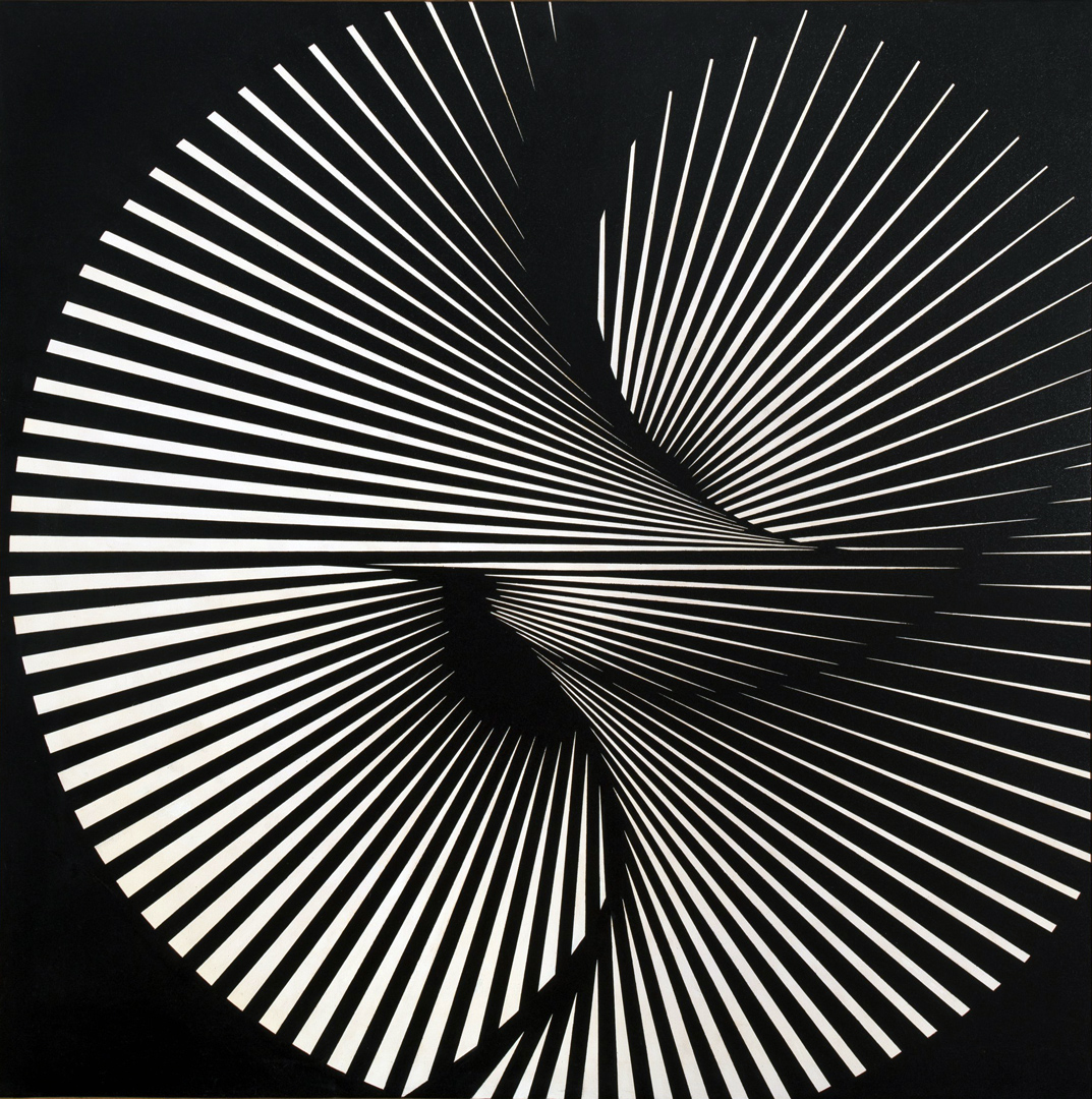
The exhibition poster was displayed in the British magazine Modern Publicity 1966/67.
- Chicago, 500d Gallery: April 1966 and April 1970
Invited to exhibit here shortly after the ‘Vision 65‘ conference, the ‘500d Gallery’ (later renamed the ‘Ryder Gallery’ in 1973) was one of the first in the Midwest to focus on fine graphic and typographic art. Established in 1964, it featured the works of both local and international graphic designers. Located in Chicago, initially below the typesetting firm Frederic Ryder Company Advertising Typographers, it was founded by its CEO “in the interest of graphic design”. It closed around 1985.
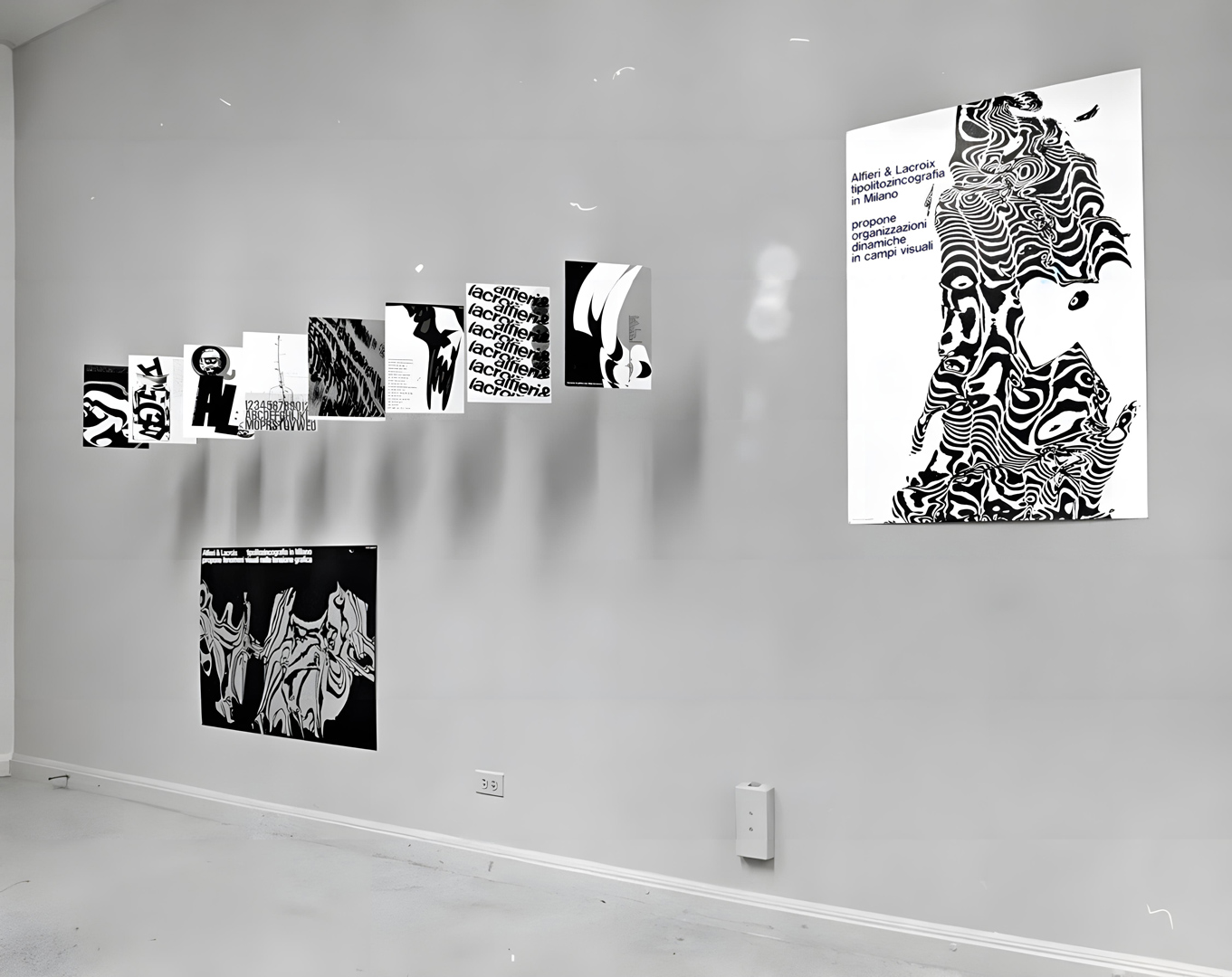
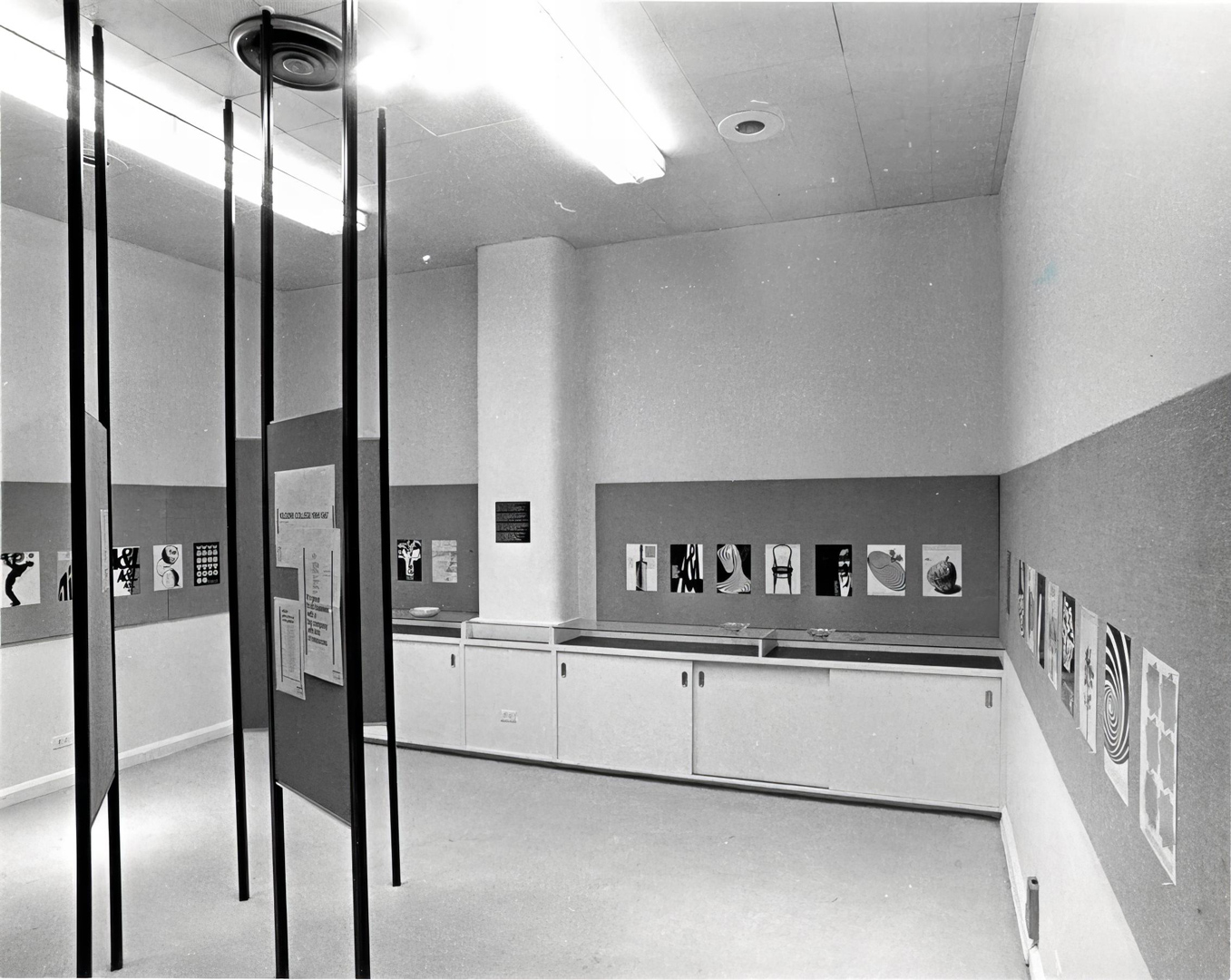
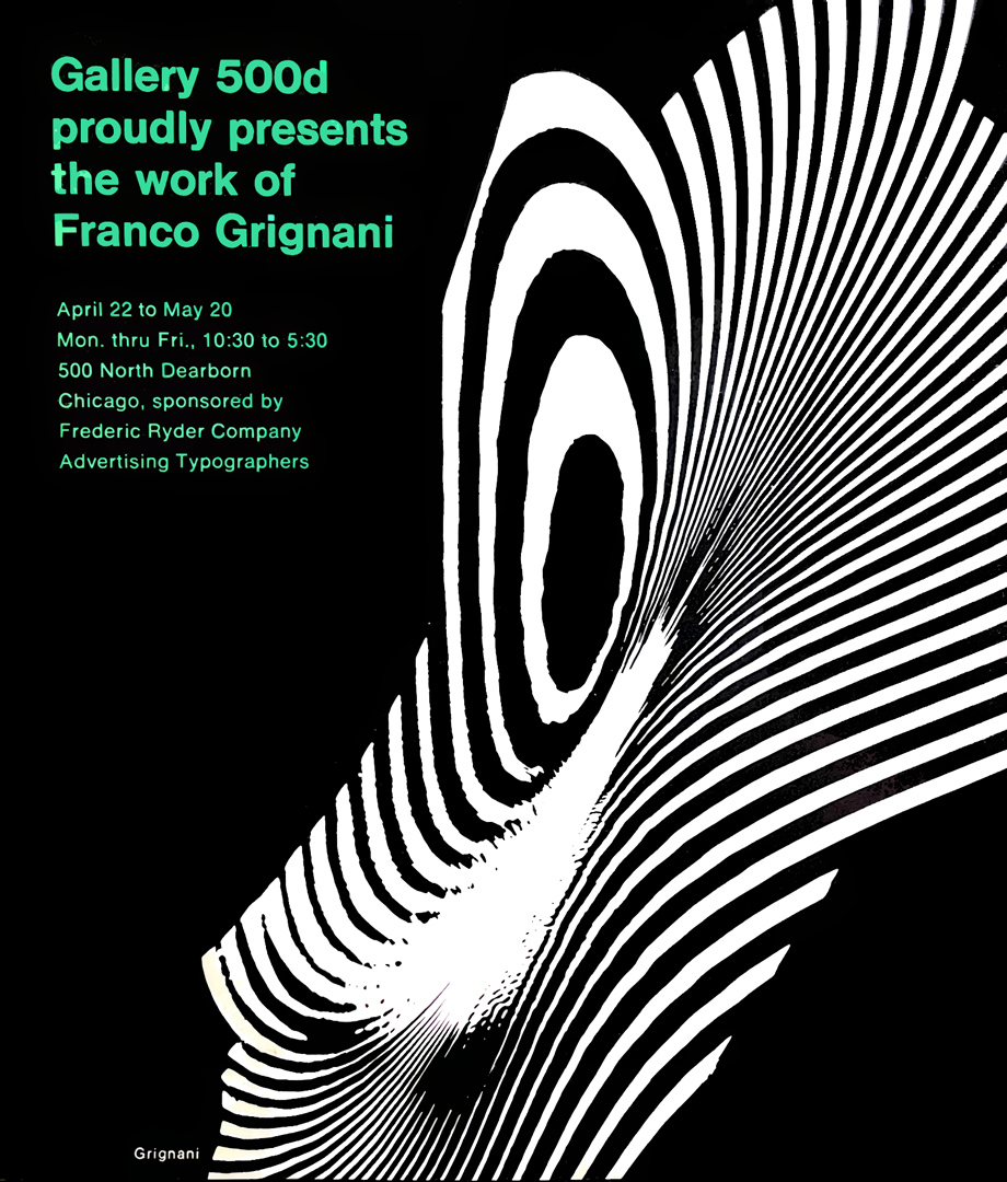
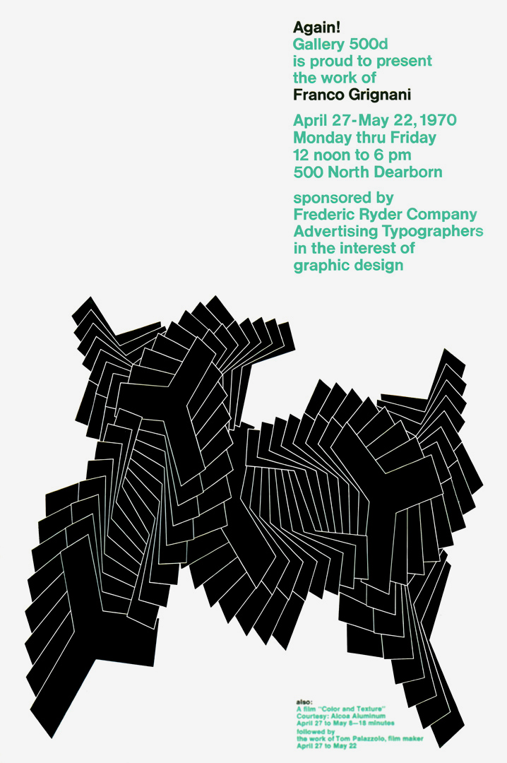
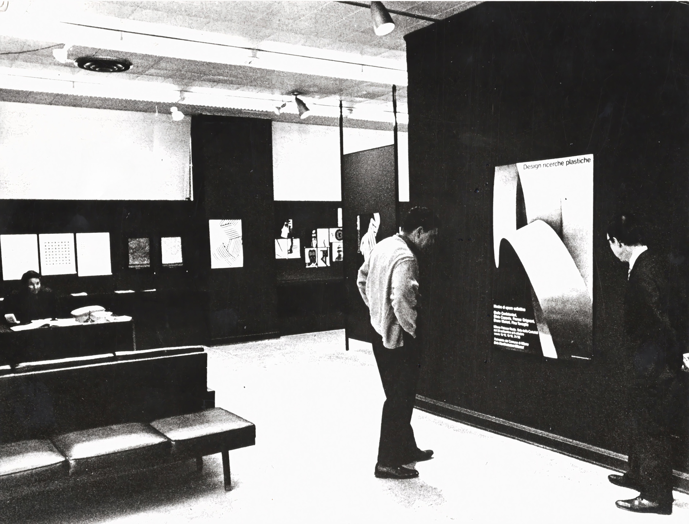

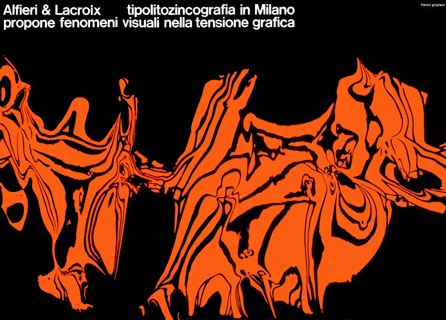
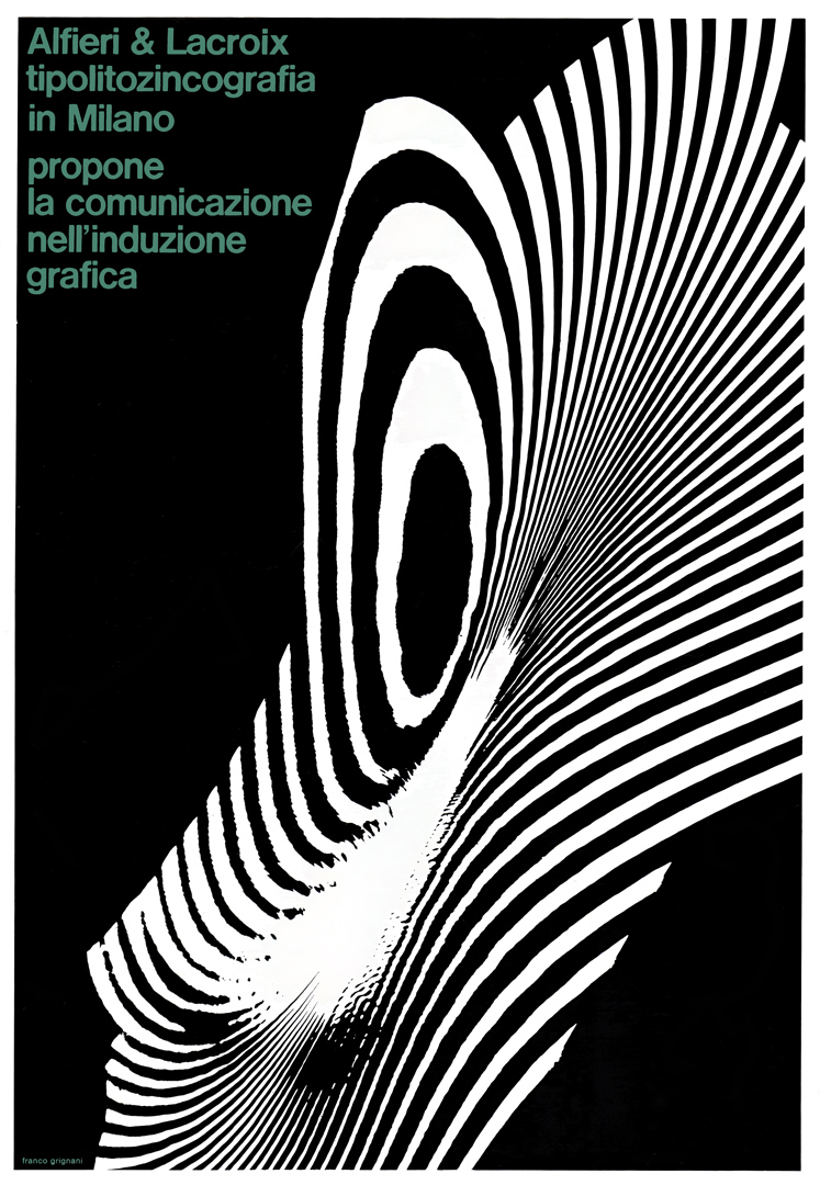
Both solo exhibitions featured posters from the successful advertising campaign for Alfieri & Lacroix. However, the 1970 exhibition went further by showcasing materials from some of Grignani’s recent exhibitions in Italy and abroad:
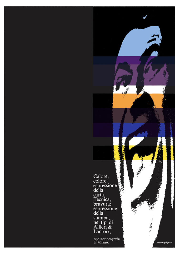
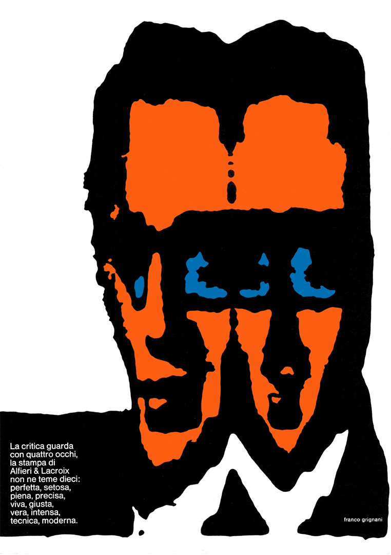
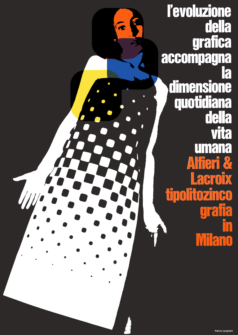
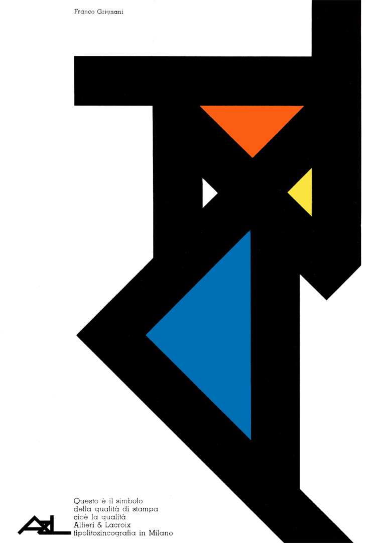
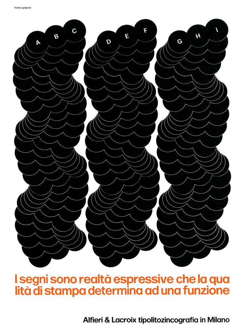
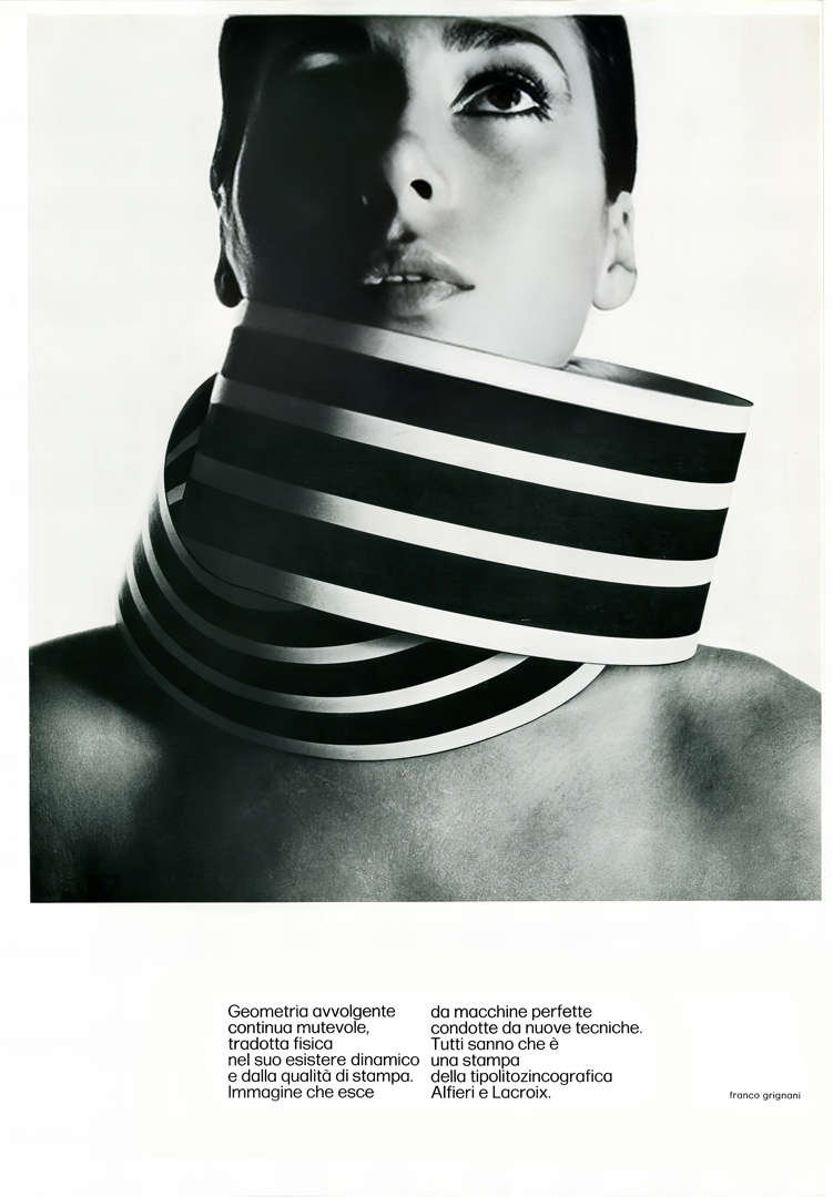

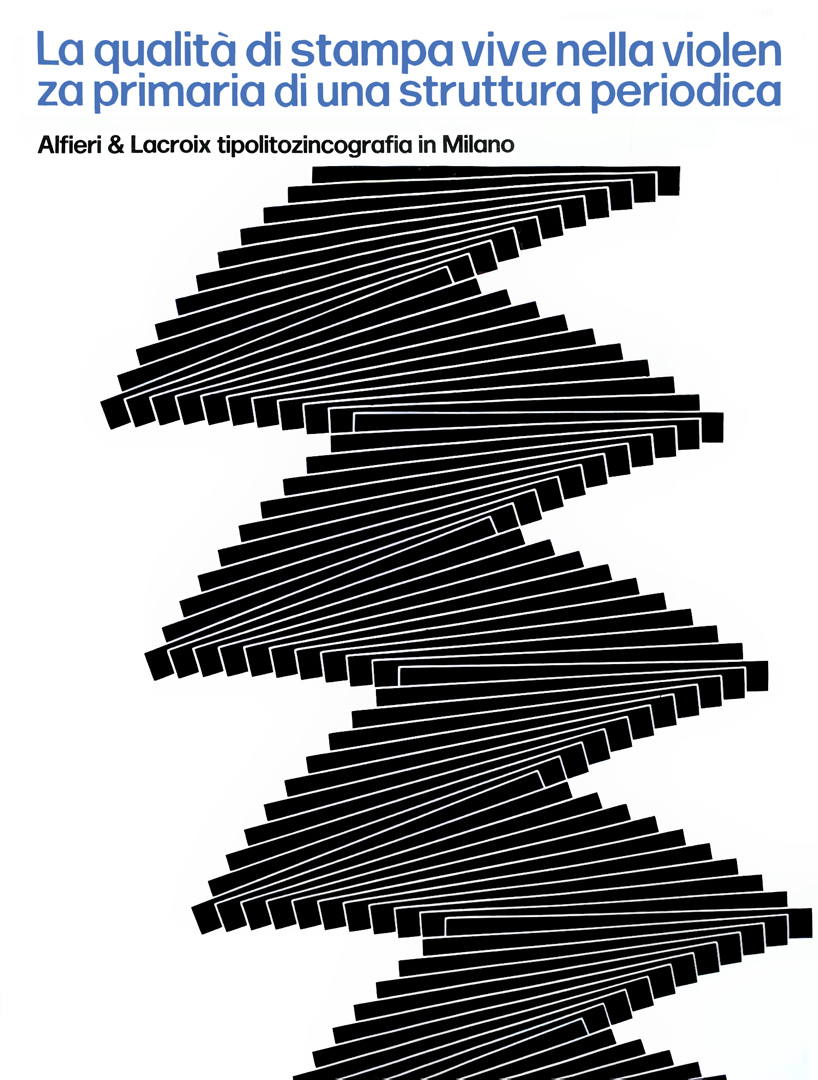
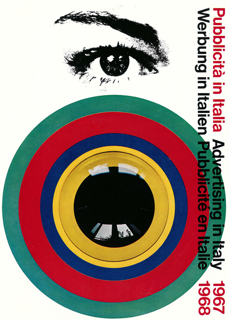
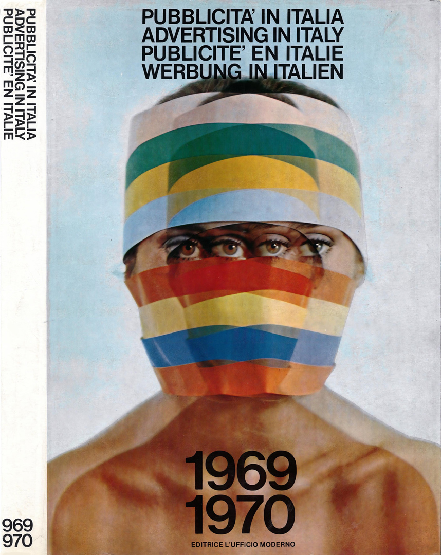
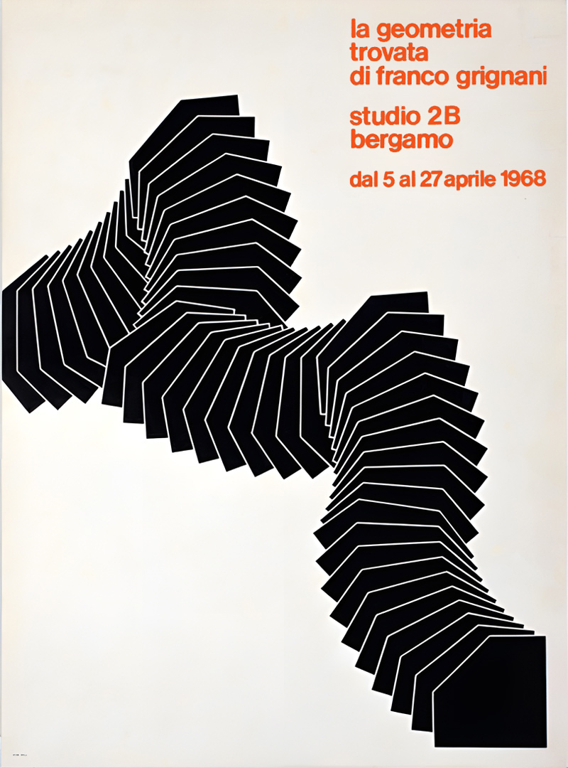
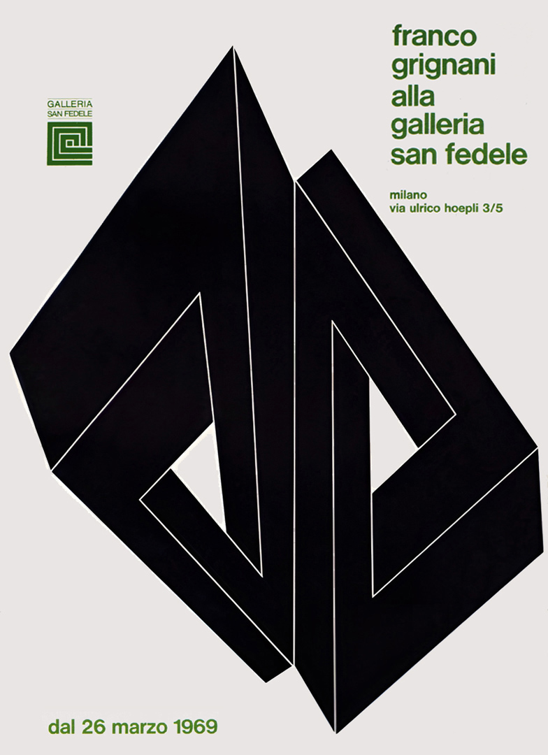

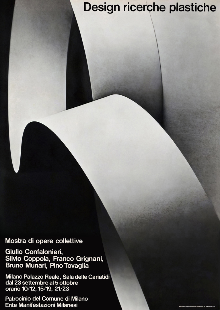
A colour film showcasing aluminium finishes was presented during the exhibition.
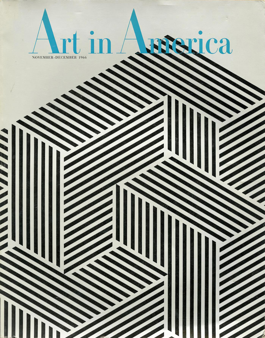
A significant opportunity for Grignani arose when he was commissioned to design the cover for the renowned international magazine Art in America (November 1966 issue). Lee Addison Ault, the publisher of Art in America, entrusted him with this project shortly after their meeting at the ‘Vision 65‘ conference [from ‘Linea Grafica’, n° 6, Nov. 1965]:
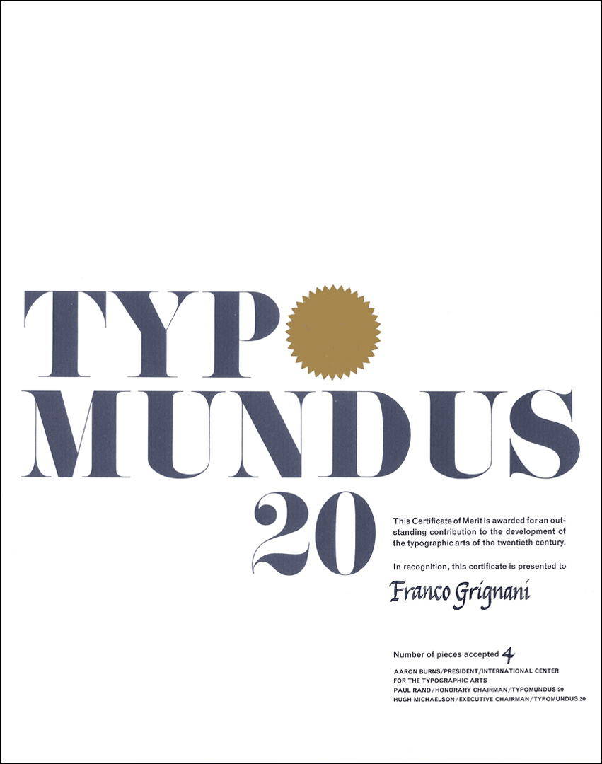
In 1967 Grignani received the highly coveted recognition merit of the ICTA (the International Center for the Typographic Arts of New York), for ‘Typomundus 20‘:
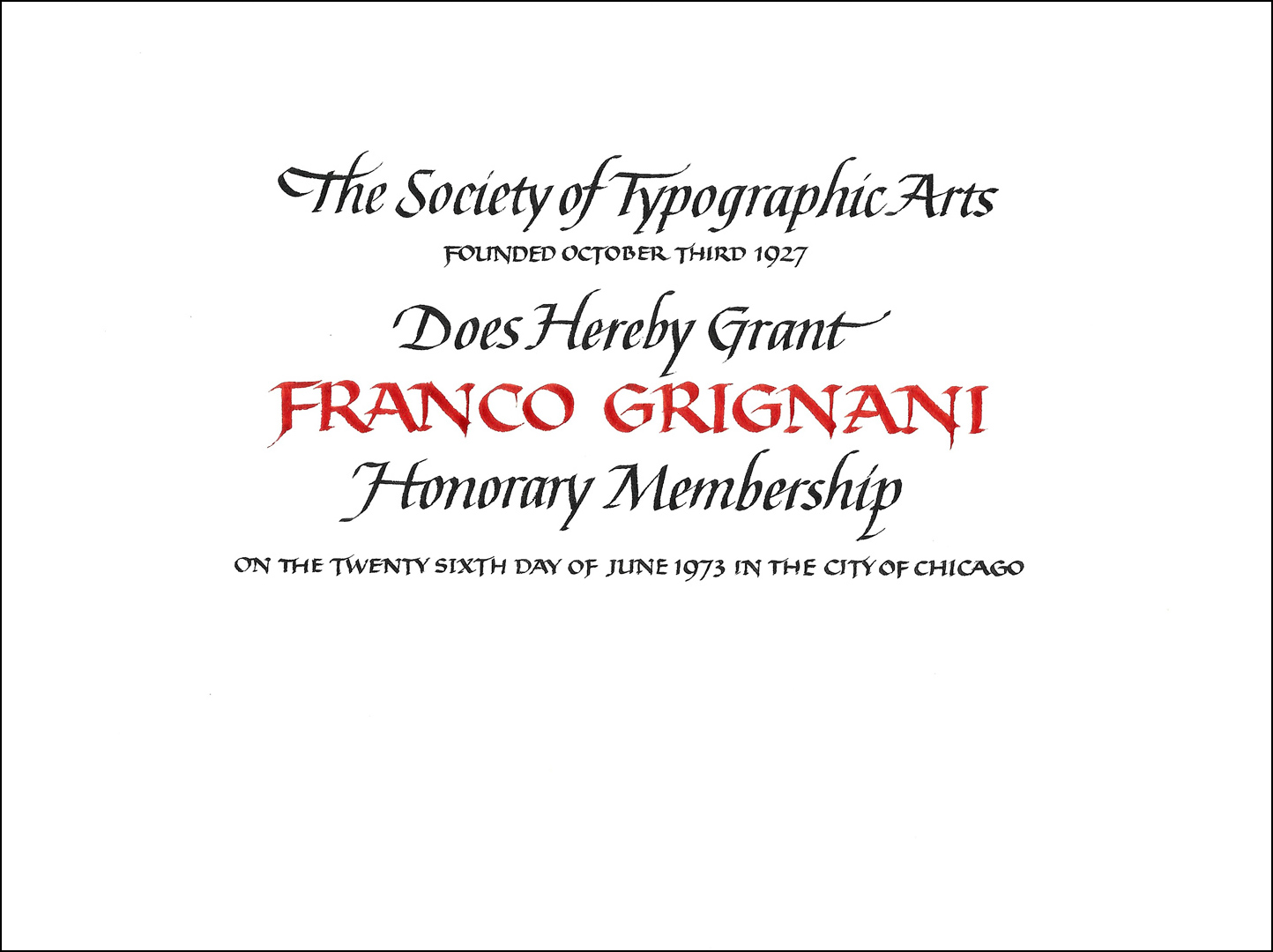
In 1973 he was elected Honorary Member of the STA, the Society of Typographic Arts of Chicago:
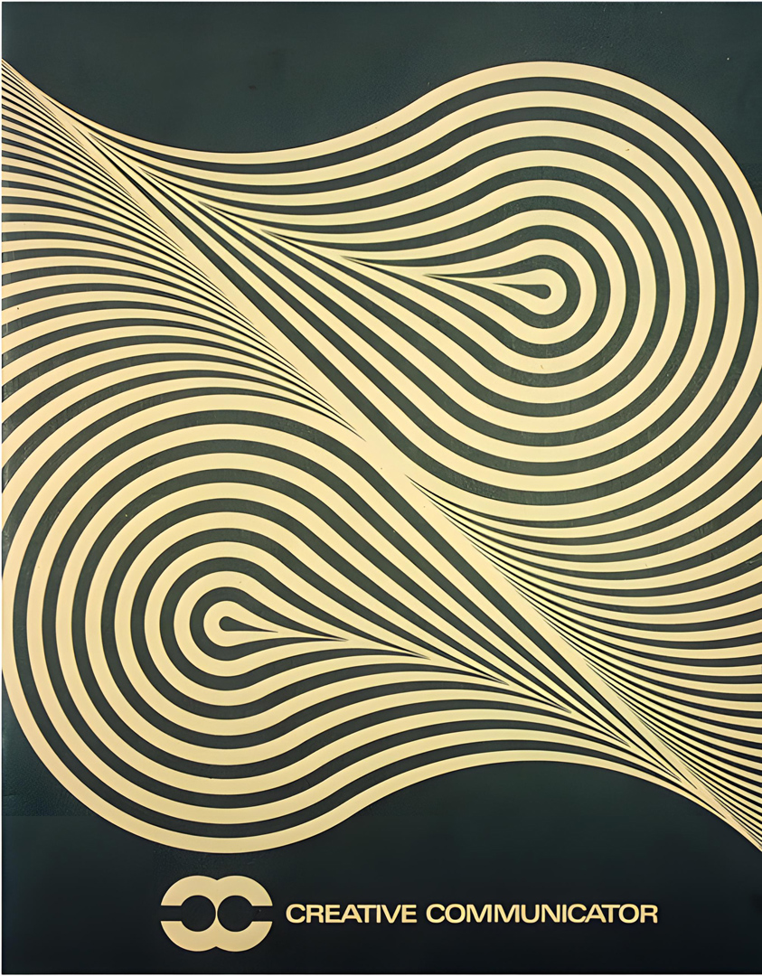
For his design of the Creative Communicator magazine cover, realised in 1973 (inspired by a cover for the HELITEX fabric sample book, Milan, same year):
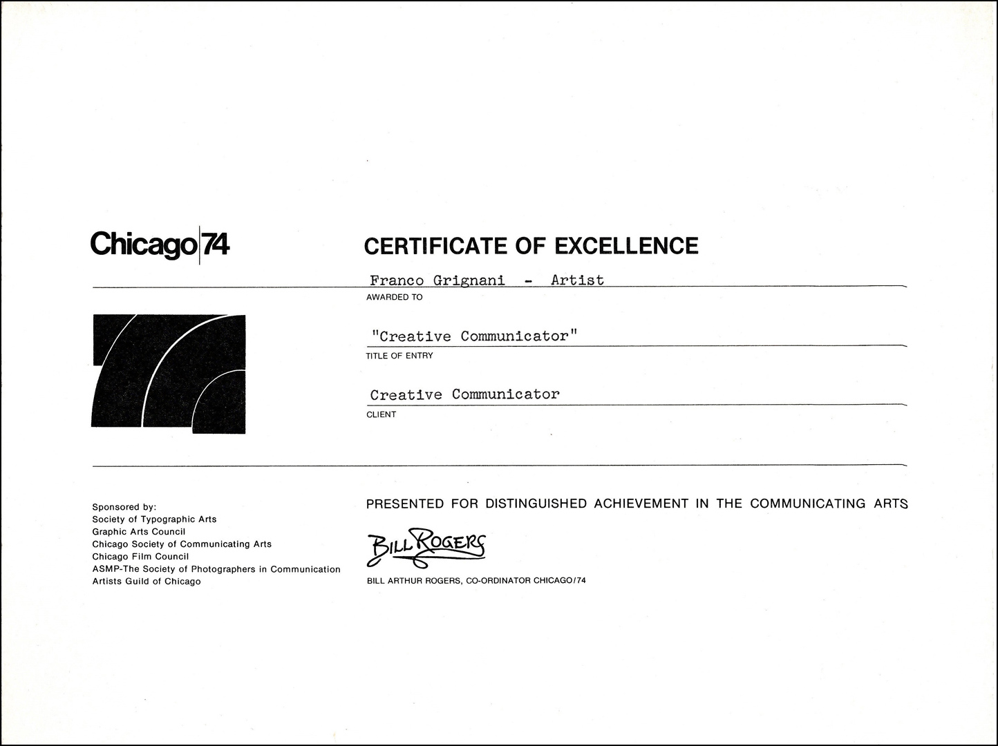
Grignani received in 1974 the Certificate of Excellence “for distinguished achievement in the communicating arts” within ‘Chicago-74’, the 7th Annual Exhibition of Midwest Communicating Arts held at the Hancock Building Center. Sponsored jointly by typographers, art directors, advertisers, photographers, filmmakers and others in the communicating arts (the Society of Typographic Arts, the Graphic Arts Council of Chicago, the Chicago Society of Communicating Arts, the Chicago Film Council, the Society of Photographers in Communication, and the Artists Guild of Chicago), the exhibition showcased an “interdisciplinary approach” [from Graphis issue n° 180, 1976]:
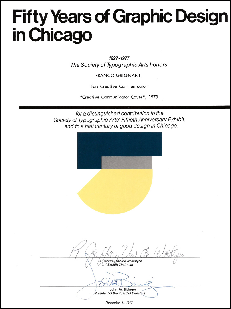
The STA honoured Grignani again in 1977 for the Fiftieth Anniversary Exhibit, recognizing his work on the cover of the Creative Communicator magazine:
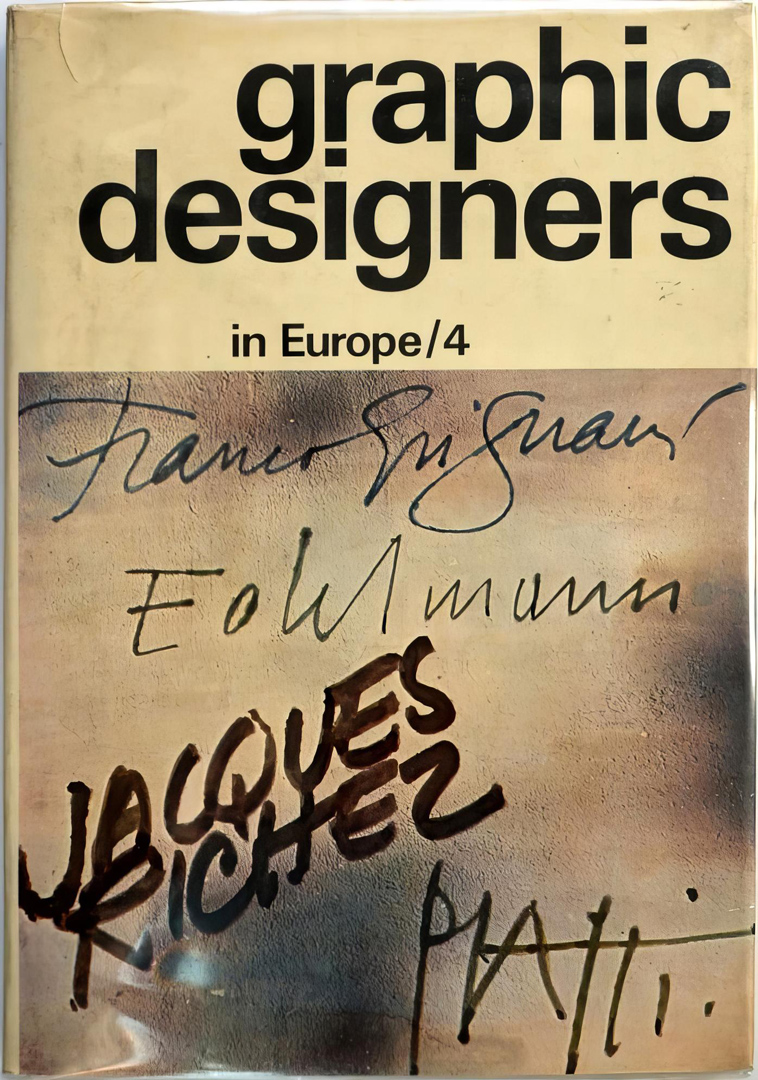
Another significant recognition came in 1973 when Franco Grignani’s works, including 75 pieces featured in 32 pages, were included in the fourth book ‘Graphic Designers in Europe‘. This publication, published by Universe Books in New York, showcased his contributions, particularly from Alfieri & Lacroix advertisements, various magazine covers, and exhibit posters. Grignani also provided a text presenting his work and his perspective on the profession. “This books will be invaluable to the students and the practising designer, since they show not only a cross section of the best work which has been created during the last decade, but also the important changes in style which have occurred” [from Graphis issue n° 155, 1972]:
The brief yet memorable experience in the United States in 1965 had a lasting impact. Upon his return to Italy, Franco Grignani granted a brief interview to Fabio Mataloni [I]:
«In Italy, the designer is an isolated professional. In America, on the other hand, he is the one who studies the whole of visualization: from writing paper to the point of sale. And when advertising intervenes, then it is the agency that uses the work done by the designer. Even TV advertising is sometimes solved by the external graphic designer or by an art director. In short, in America, the designer has the function of making real a thing that does not exist. […] Americans are nice. Which means they know how to sell themselves very well. The country is vast, it never ceases to amaze Europeans. […] The American order, American civilization, stops at the roadside. And it is rampant in the cities. […] But this American perfection, in my opinion, responds only to a deep need for defence.»
[from ‘Linea Grafica’, n° 6, Nov. 1965]
But Grignani’s success was not limited to the US, as he was also highly appreciated in Latin America.
It is worth remembering two solo exhibitions:
- Montevideo, Instituto de Cultura en Uruguay: 1971
- Caracas, Museo de Bellas Artes, “Franco Grignani. El sentido de una larga búsqueda”: February 1977
This exhibition, titled ‘The meaning of a long research’, was one of Grignani’s most significant exhibits. Over 40 days, 83 artworks, curated by Giulio Carlo Argan, were showcased in the new building of the Museo de Bellas Artes, directed by architect Marcos Miliani. This exhibition, commissioned by the Consejo Nacional de la Cultura (CONAC), was part of a cultural exchange: Grignani exhibited in Venezuela, and Venezuelan artist Omar Carreño, known in Italy for his presence at the Venice Biennale in 1972, exhibited at the ‘Marcon IV’ gallery in Rome. The event sparked a debate on Italy’s cultural exchange policies, given that Venezuela had to negotiate with a non-public Italian gallery and that “we are looking for masters abroad and here we have one [Grignani, Ed.] who, in the field of the research on vision problems, is second to none”. This discussion unfolded in the pages of the Italian-French magazine ‘arte e società,’ issue 9/10, 1977.
Some works are still on permanent display in the MACBA in Buenos Aires and the MACC in Caracas.
In 1973, in the magazine ‘arte e società’, issue 6/7, Franco Grignani declared: “many images published and republished all over the world, have influenced the «sign of our time». […] In 1970 a detail of one of my experiments, re-photographed from a magazine [Graphis issue n° 108, 1963, p. 301 – Ed.] by the Brazilian artist Moacyr Rocha, won the first prize for the poster of the Paulista Show of Contemporary Art” [Salão Paulista de Arte Contemporânea] – [II].
An interview with historical partners of the ‘Agens Publicidad’ advertising agency in Buenos Aires sheds light on how Grignani was regarded in Argentina during the 1960s: “At that time Franco Grignani was a very unique character here, all the young people looked at him in a very particular way. He was closer to us than the Swiss and much more than the Anglo-Saxons, his contribution seems transcendent to me.”
The truth is that the painting [by Franco Grignani] is arousing great interest due to the inclusion of completely new optical-visual methods for American op-art, and for its scientifically inspired language.
[from ‘Noticeap’, issue n°9, 1966 – “editada por el club de estudiantes de escuela de arte publicitario”, Buenos Aires, Argentina]
[the identification of the works exhibited at Gallery 303 in 1960 was possible thanks to the precious contribution of Greg D’Onofrio]
[some photos and posters from 500d Gallery in Chicago have been correctly identified thanks to the precious contribution of Marla McMackin, PhD Candidate & Teaching Assistant at The University of Illinois at Chicago]
[*] courtesy of Daniela Grignani
[a] courtesy of Milton Glaser Design Study Center & Archive
[b] from ‘Idea’ issue n° 47, June 1961
[c] from the Italian-French magazine ‘arte e società’, 6/7, 1973
[d] from the catalogue of the exhibit held at Centro Proposte in Florence, 1966
[e] from the catalogue of the exhibit held at Galleria San Fedele in Milan, 1969
[f] from the Italian-French magazine ‘arte e società’, 5/6, 1976
[1] graphéine
[5] Veder bene, courtesy of Bonifacio Pontonio
[6] GARADINERVI, courtesy of Robert Rebotti
[7] AIAP / CDPG Centro di Documentazione sul Progetto Grafico, courtesy of Lorenzo Grazzani
[8] MUSEONOVECENTO, courtesy of Silvia Penna
[14] Artribune & Galleria Gruppo Credito Valtellinese
[20] Paul Giambarba’s Typepad, courtesy of Paul Giambarba
[28] Christie’s Images Ltd. 2020, lot 1, courtesy of Sara Macdonald
[33] Martini Studio d’Arte, courtesy of Angelo Martini
[I] ITA original text from ‘Linea Grafica’, n° 6, Nov. 1965: “In Italia il designer è un professionista isolato. In America invece è lui che studia l’insieme della visualizzazione: dalla carta da lettera al punto di vendita. E quando interviene la pubblicità, allora è l’agenzia che si serve del lavoro svolto dal designer. Anche la pubblicità TV viene risolta talvolta da un grafico esterno o da un art director. In America il designer ha insomma la funzione di far diventare cosa una cosa che ancora non esiste. […] Gli Americani sono gentili. Il che vuol dire che sanno vendersi molto bene. Il Paese è sconfinato, non finisce di sorprendere l’europeo. […] L’ordine americano, la civiltà americana, si ferma ai margini delle strade. E dilaga nelle città. […] Ma questa perfezione americana, secondo me, risponde soltanto a un profondo bisogno di difesa.”
[II] ITA original text from the magazine ‘arte e società’, issue 6/7, 1973: “molte immagini pubblicate e ripubblicate in tutto il mondo, hanno influenzato il «segno del nostro tempo». […] Nel 1970 un particolare di un mio esperimento, rifotografato da una rivista, dall’artista brasiliano Moacir Rocha, ha vinto il primo premio per il cartellone del Salone Paulista di Arte Contemporanea.”
Last Updated on 04/02/2025 by Emiliano
