
The evolution of graphic advertising in Italy between the 1960s and 1980s was marked by a profound shift in the relationship between graphic designers and the advertising industry. Among the most critical voices of this transformation was Franco Grignani, who openly denounced on various occasions the progressive marginalization of graphic design in advertising and the loss of the designer’s central role in shaping visual communication.
In the 1950s and early 1960s, Italian graphic designers were the leading figures in advertising. According to Grignani, during this period, graphic design – while innovative – was not merely a technical tool but had to remain fully accessible to the public and serve the advertising message. It was a form of visual research meant to educate, stimulate, and refine visual perception without falling into self-referential excesses.
In 1959, advertising experts duly commended Franco Grignani’s graphic work for the advertising campaign for Necchi, a factory renowned for ‘good design’ in sewing machines, with the ‘Award to the Advertising Artist’ (gold medal), noting that it had “never degenerated into abstractionisms that were inessential to the purpose of the advertisement or not perfectly accessible to its public of potential buyers”.
In an interview with Rai (Italian radio and television), Vittorio Necchi declared:
«In the motivation of the jury of the National Advertising Award for the Palma d’Oro, there is a sentence that more than any other is a source of profound satisfaction for me: “Necchi advertising is constantly inspired by the criterion of constituting a loyal and useful guide for the consumer“. I have always wanted our actions to be inspired by this criterion. We have never abandoned this style and this measure, convinced that reality, even in information, is the moral basis of the relationship between those who produce and those who consume. So I think any commercial competition should be conducted.»
In the 1950s, the idea of advertising as a transparent and honest guide was still a credible goal.
However, by the 1970s and 1980s, the rise of the American-style ‘full service’ advertising agencies model (as Simona de Iulio and Carlo Vinti underlined, as well as Michele Galluzzo) gradually stripped designers of their control over advertising messages. These agencies, influenced by U.S. marketing strategies, placed greater emphasis on copywriting and photography, relegating graphic design to a secondary role. Recognizing this shift, Grignani was among the first to sound the alarm about the diminishing role of graphic designers. In the 1969 debate “Are graphic designers still protagonists?”, hosted by the magazine ‘Linea Grafica‘, he highlighted how graphic design had been overshadowed by the dominance of new advertising models [I]:
“But who, after all, are today’s graphic designers? They are poor souls crushed by colossal interests. What is our voice anymore? What value does our work have? In such a human context, little to none. The decision-making power lies elsewhere.”
Franco Grignani, “Are graphic designers still protagonists?”, ‘Linea grafica’, n° 2, March-April 1969
For Grignani, this transformation represented a betrayal of graphic design’s cultural function, which had once been a pillar of visual quality and brand identity. He argued that modern advertising had sacrificed the designer’s authorship in favour of a collective creative process, where photography and copywriting became dominant. As a result, graphic design was reduced to a mere layout tool, while advertising evolved into a discipline driven by market research and persuasive strategies [II]:
“Almost all of advertising creativity is transitory and ephemeral, but not the symbol which conquers time and use. […] to design a symbol is not work for everyone, but it is a work for that élite that can infuse the smallest, simplest sign with a lasting purity, a pleasant expressivity, an optical visuality, a physical objectivation, a symbol that will hold out against the consumption rate of our civilisation, proof moreover of victory over time.”
Franco Grignani, introduction to the 1967 volume “3x trademarks“, Total Design agency, Amsterdam
It is also worth mentioning Grignani’s 1965 lecture ‘From Art to Science: Design in Transition’, delivered at the Southern Illinois University of Carbondale, within “Vision 65: World Congress on New Challenges to Human Communication”. In this speech, Grignani anticipated many of the arguments he would later refine in the 1970s and 1980s: warning against the devaluation of graphic design in advertising, the rise of sensory saturation, and the growing dominance of marketing over visual integrity. Without rejecting modernity, he emphasized the need for designers to preserve their cultural and educational role, advocating for a structured yet forward-thinking approach to design amid an increasingly chaotic visual landscape [III]:
“Millions of advertising messages cover the walls, the streets, tables, hands, eyes…. All this requires perfect order, and experts of good order, who are–designers. […] Advertising is an enormous machine, thought out and built up so as to produce communications for the purposes of business interests. But if indeed this is its sole function, we must nevertheless draw up some day a list of its by-products in the form of vain flattery, erroneous assertions, and schemes promoted by an oligarchy of specialists. Rather, the repeated use of such systems in certain forms of advertising has aroused apprehensiveness and suspicion in many sensitive spirits. […] There is another kind of advertising, too: informative, precise, useful. It poses problems and solves them; it is an optimistic thing because it is wholesome and it lives in an honesty of communication; it is a rational type of advertising relying on intellectual appeal. The consumer is therefore no mere automaton, but can keep and defend his own personality and is aware of his power.”
Franco Grignani, lecture ‘From Art to Science: Design in Transition’, “Vision 65”, Southern Illinois University of Carbondale, 1965
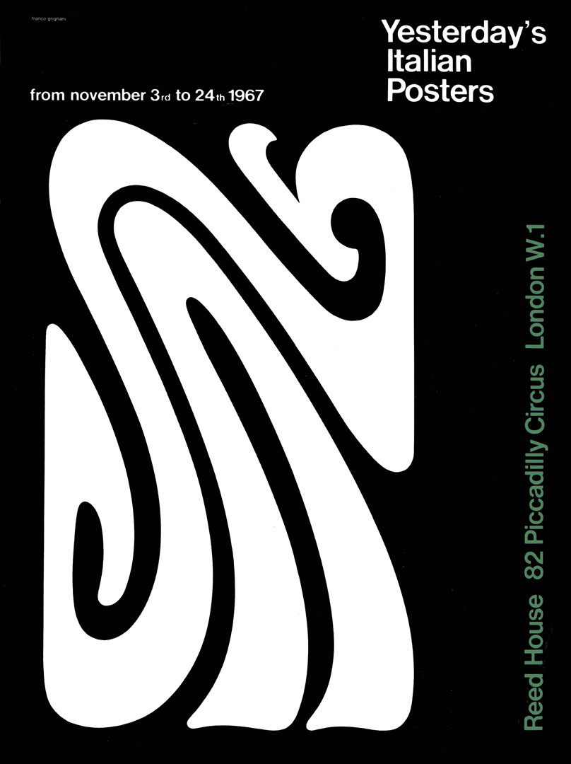
A significant exhibition during this transitional period for Italian graphic design was “Today’s Italian Publicity and Graphic Design“, held in London in November 1967. The event featured two posters designed by Franco Grignani. This international showcase aimed to highlight contemporary trends in Italian advertising graphics, emphasizing the contributions of several prominent designers of the time, including Grignani himself. The exhibition served as an effort to reaffirm the central role of graphic design in visual communication:

During the 1970s, Italian advertising was influenced by the “American Creative Revolution“. This new approach, characterized by irony, storytelling, and the synergy between art directors and copywriters, was embraced by younger advertisers but viewed with skepticism by traditional designers like Grignani. He believed that this shift led to a vulgarization of visual communication, where advertising no longer aimed to educate audiences in good taste but instead focused on provoking emotional reactions and stimulating consumer behavior. The graphic designer was no longer the author of the message but merely an executor in a marketing-driven creative process [IV]:
“Graphics found its first natural outlet in advertising. But, in my view, advertising, as it has arrived today, marginalizes graphics. It has become a description, that is, it operates a descriptive act to provoke certain stimuli. Where graphics still intervenes, it is only to arouse areas of particular visual interest, but it is no longer so significant, so crucial in the advertising composition, where, instead, the image, especially the photographic one, has become prominent. Graphics today is more useful elsewhere. […] great graphics today walks hand in hand with design.”
Franco Grignani, “Structure and decoration: a choice of graphics“, ‘Linea Grafica’, n° 1, January-February 1973
As this transformation unfolded, Grignani and other designers of his generation gradually distanced themselves from the advertising world to preserve their creative autonomy. A firm believer in graphic design as an intellectual and experimental discipline, he turned his focus to industrial design and auteur graphics, which he saw as the last remaining fields where designers could still exert full creative control.
Throughout his career, Grignani remained a staunch opponent of the standardization imposed by modern advertising, convinced that it had stripped graphic design of its educational and experimental role. However, his criticism was not enough to halt the rise of the Anglo-American model, which, by the 1980s and 1990s, had become the dominant global standard in advertising.
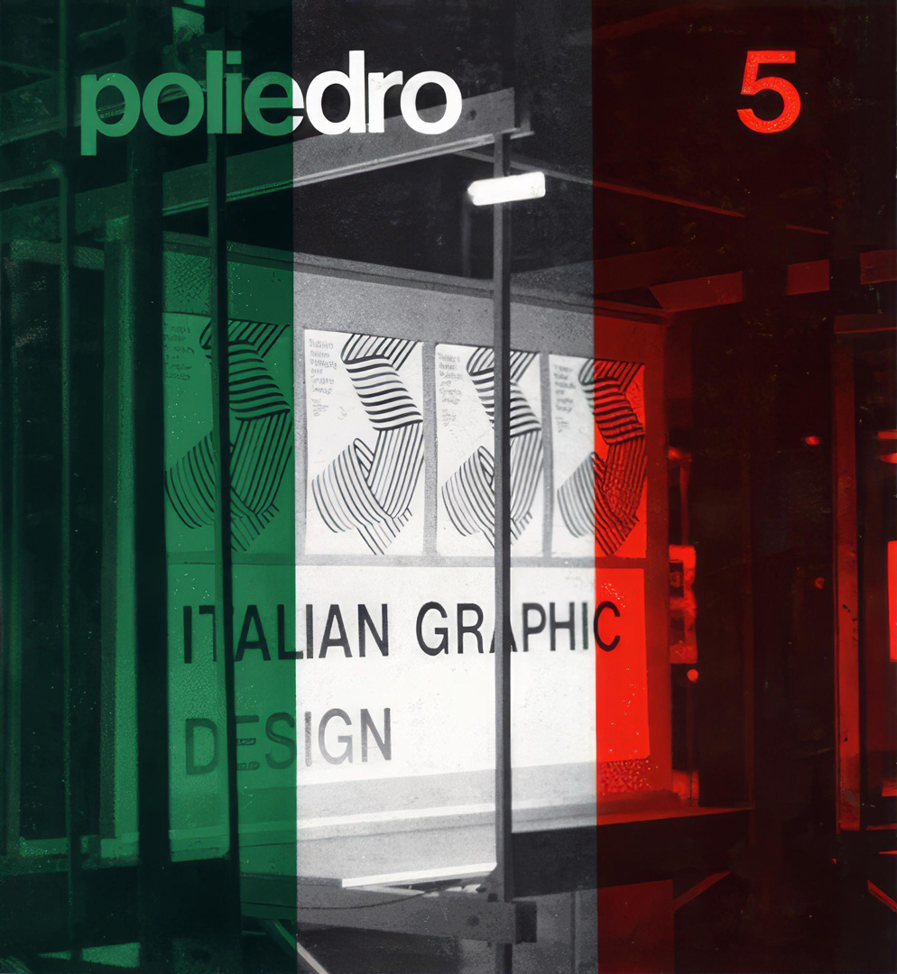
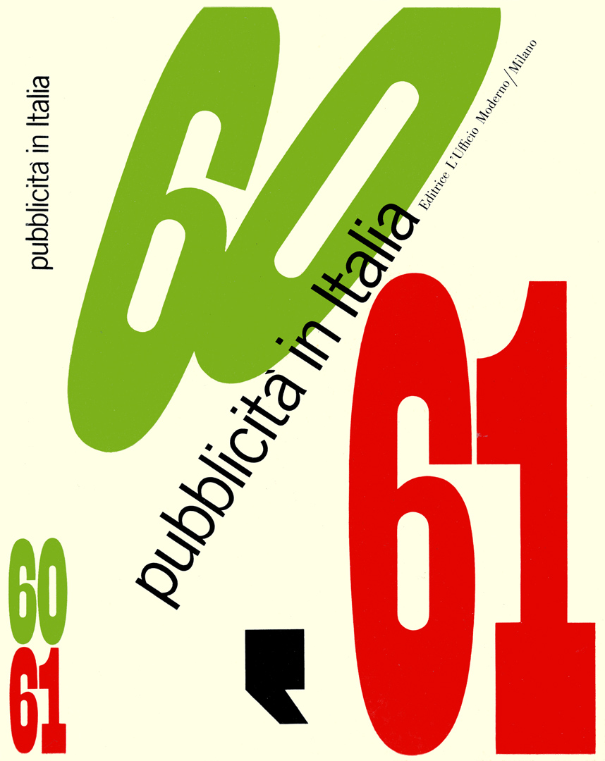
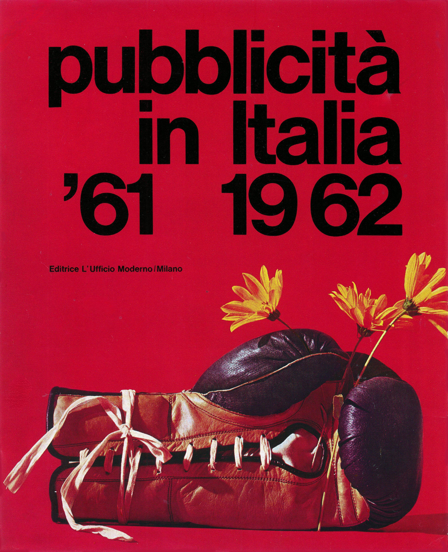
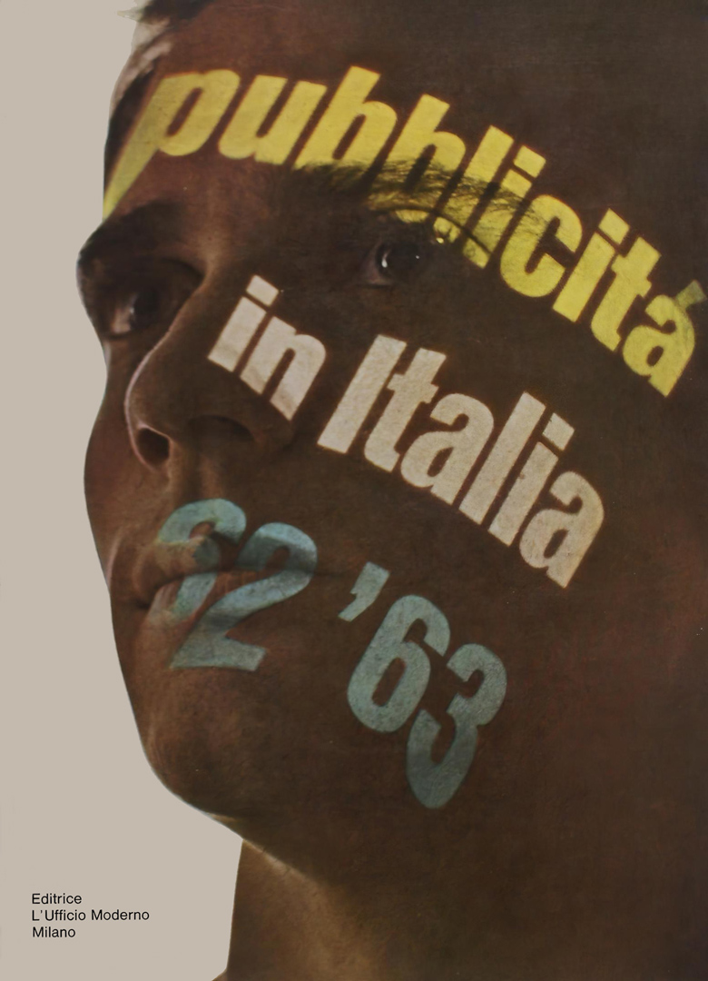
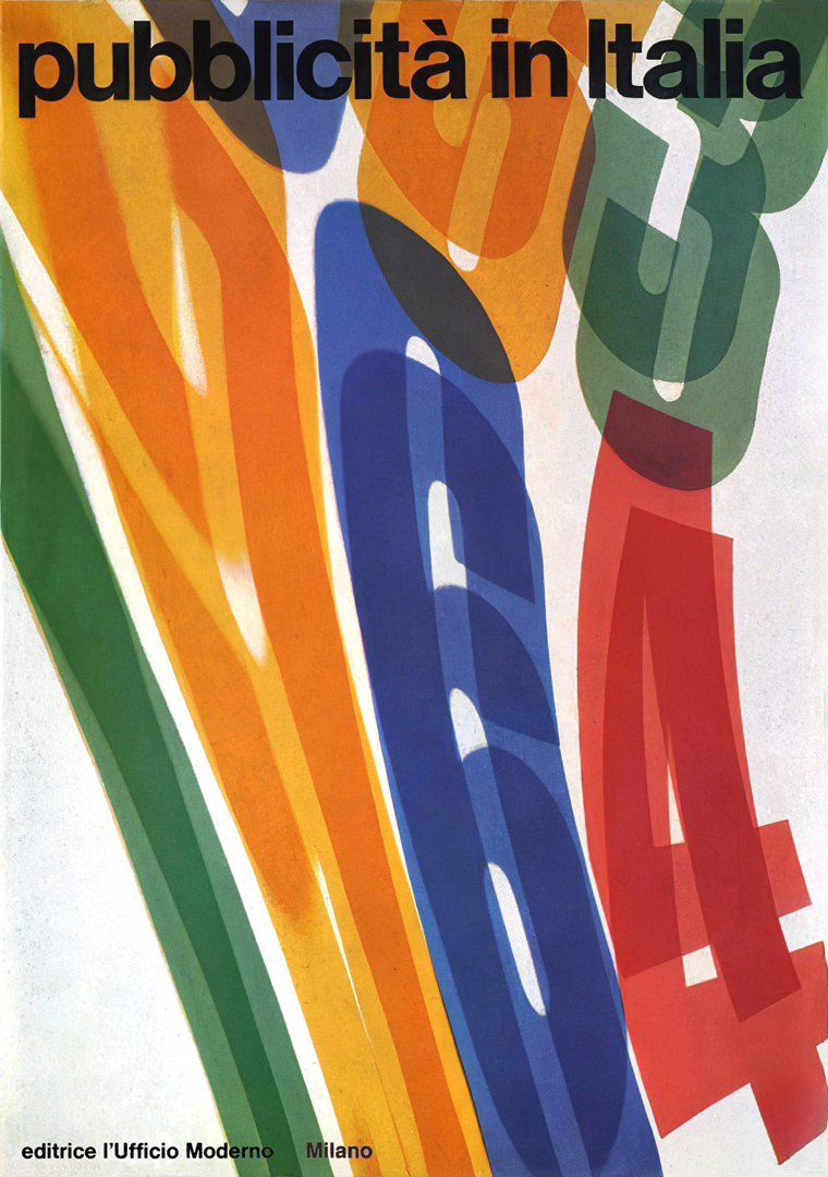
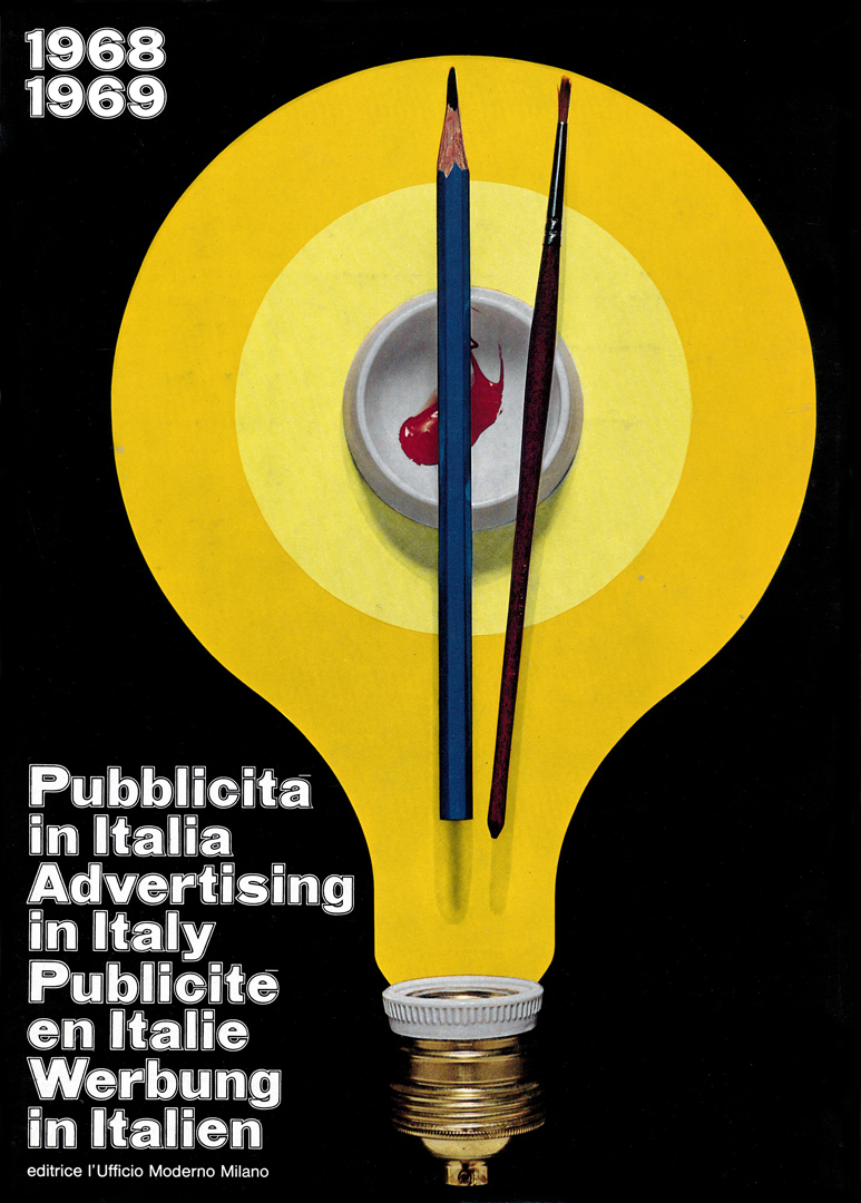
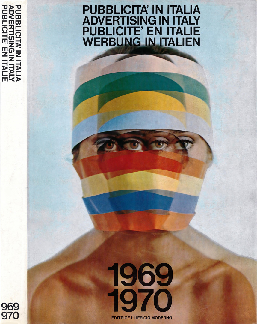
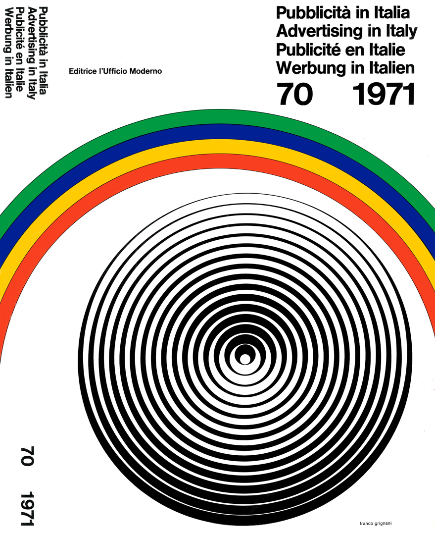
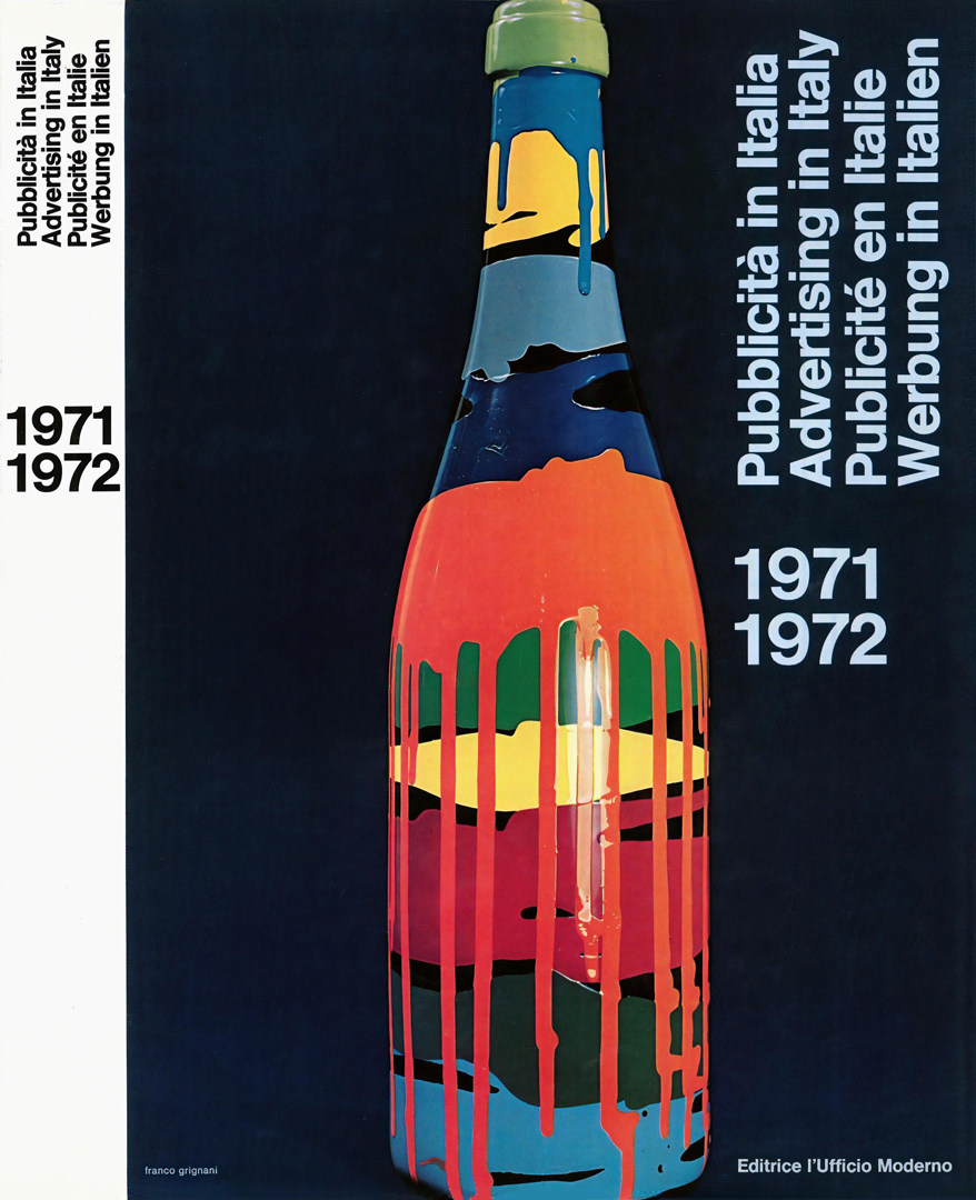
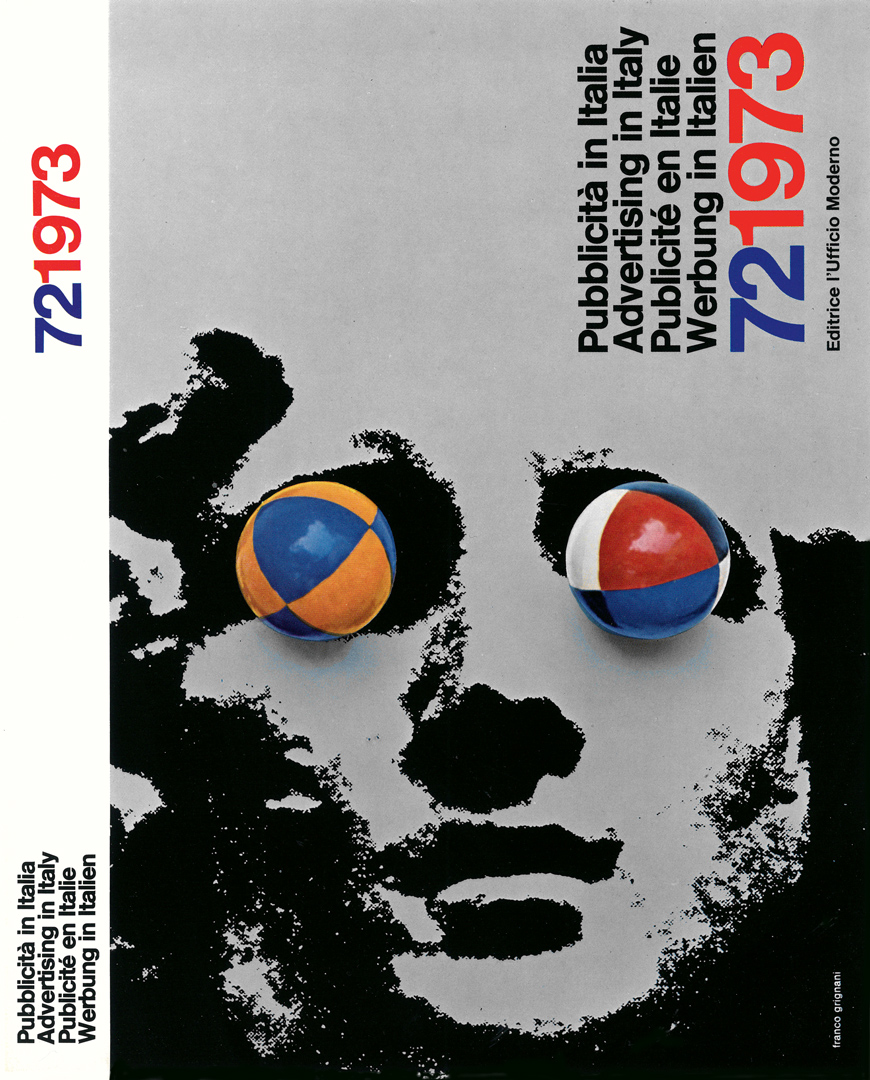
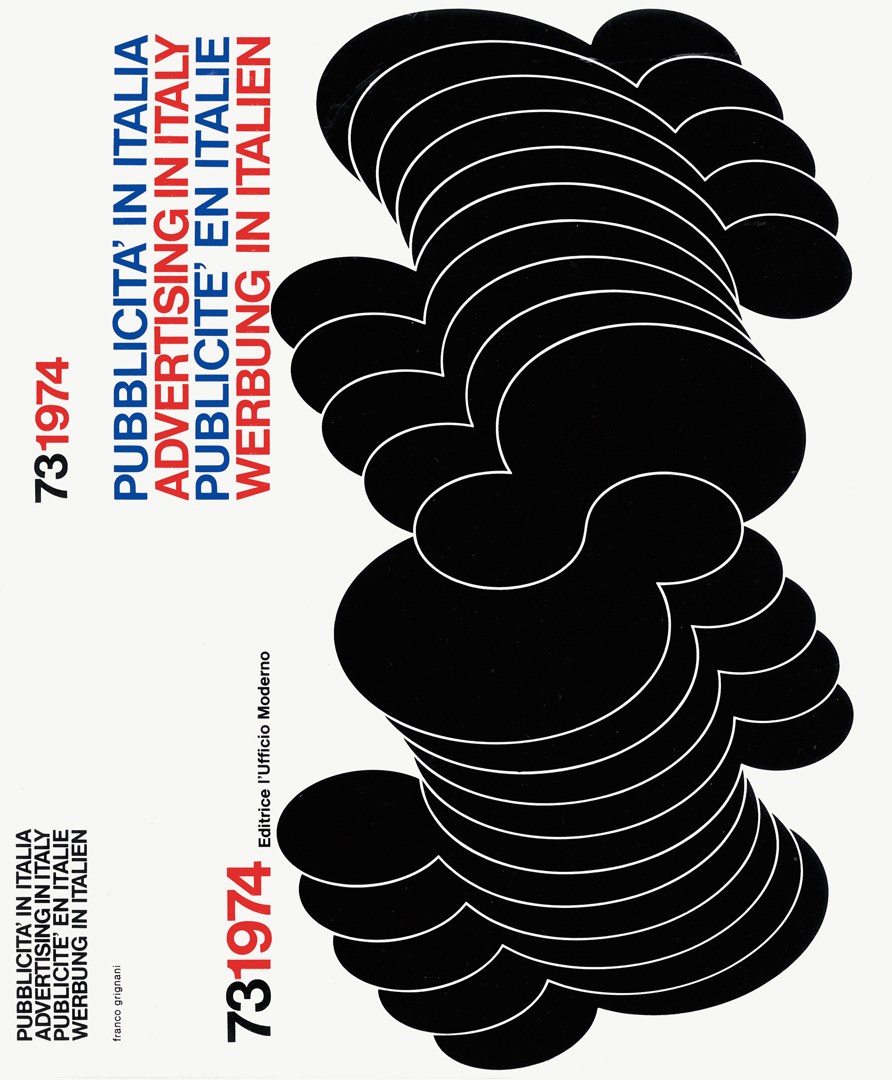
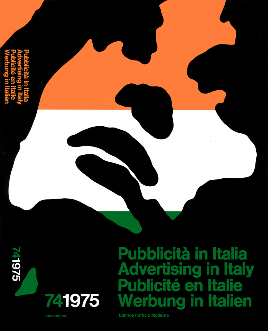
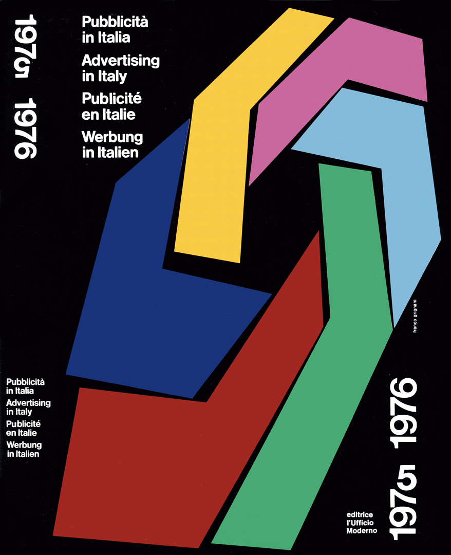
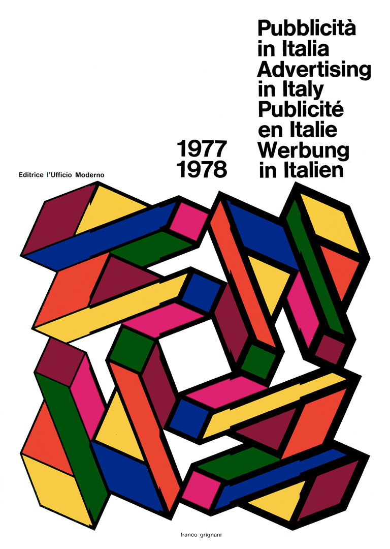
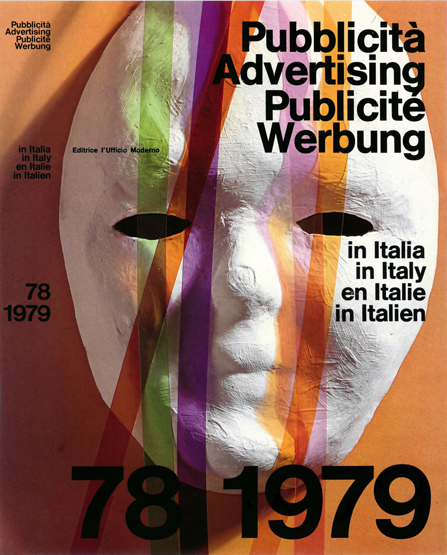
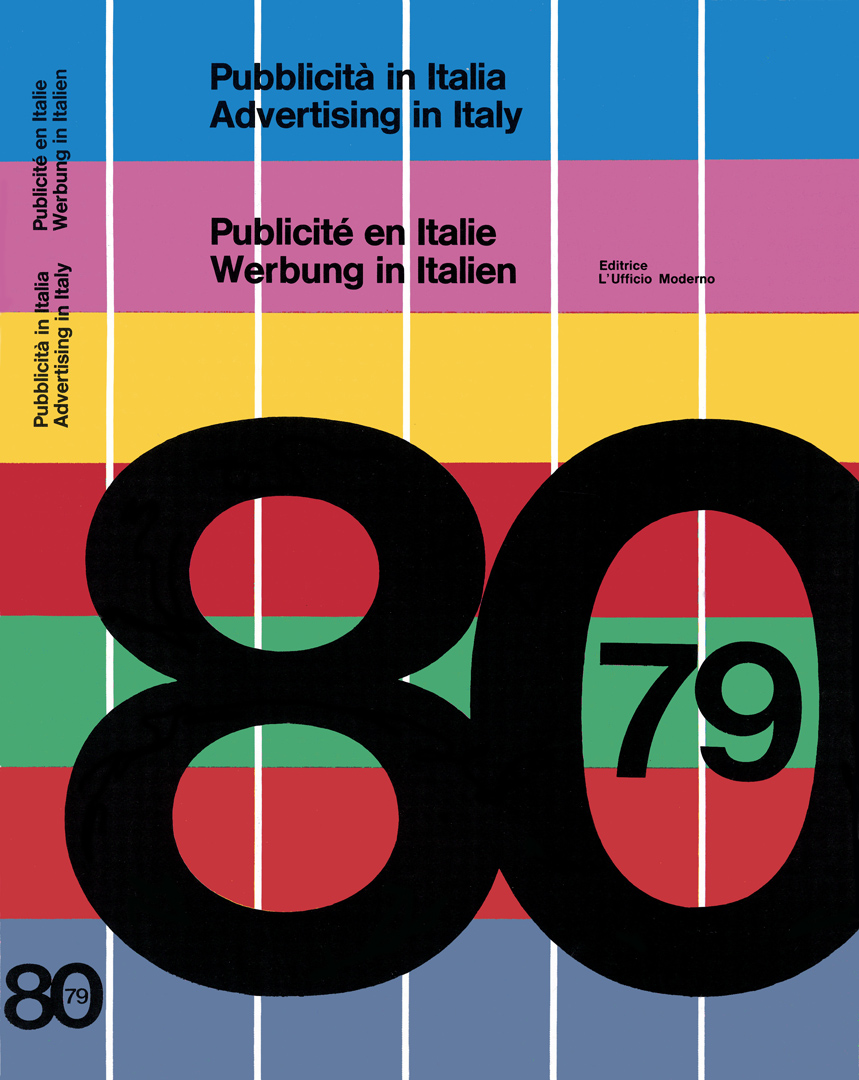
A witness to all these transformations was ‘Pubblicità in Italia’ (‘Advertising in Italy’), a publication that documented the evolution of advertising and graphic design, capturing the changing landscape of visual communication for over 30 years until 1987.
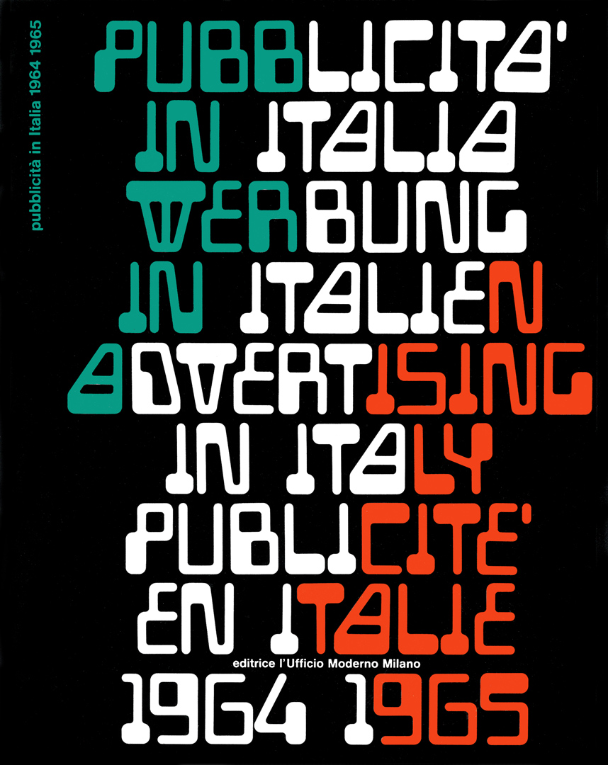
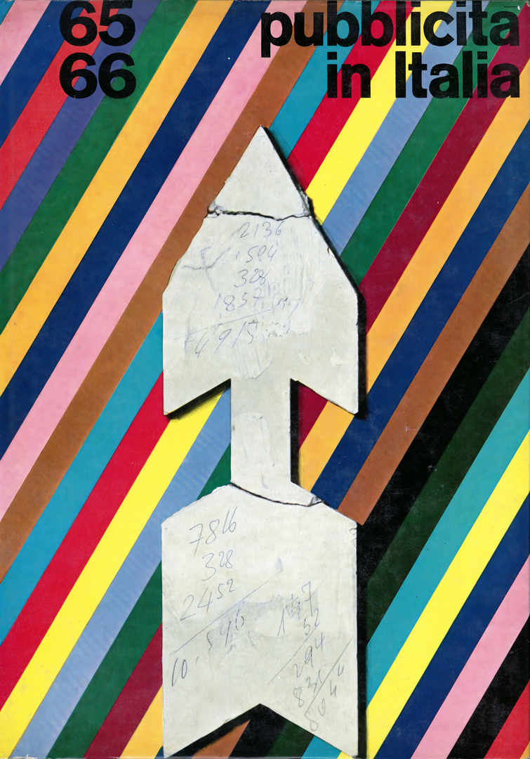
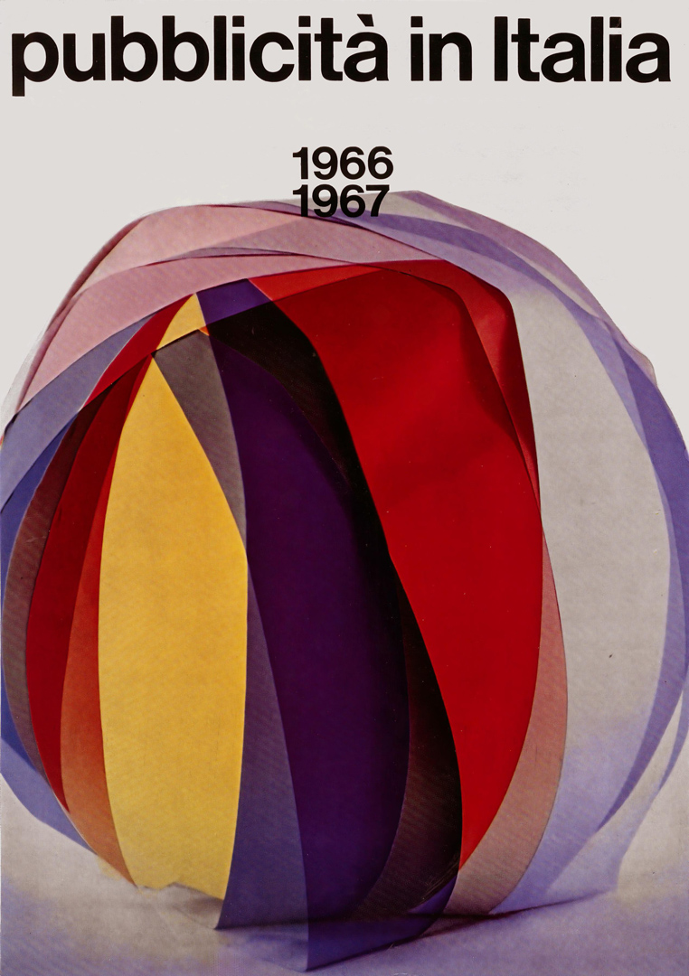
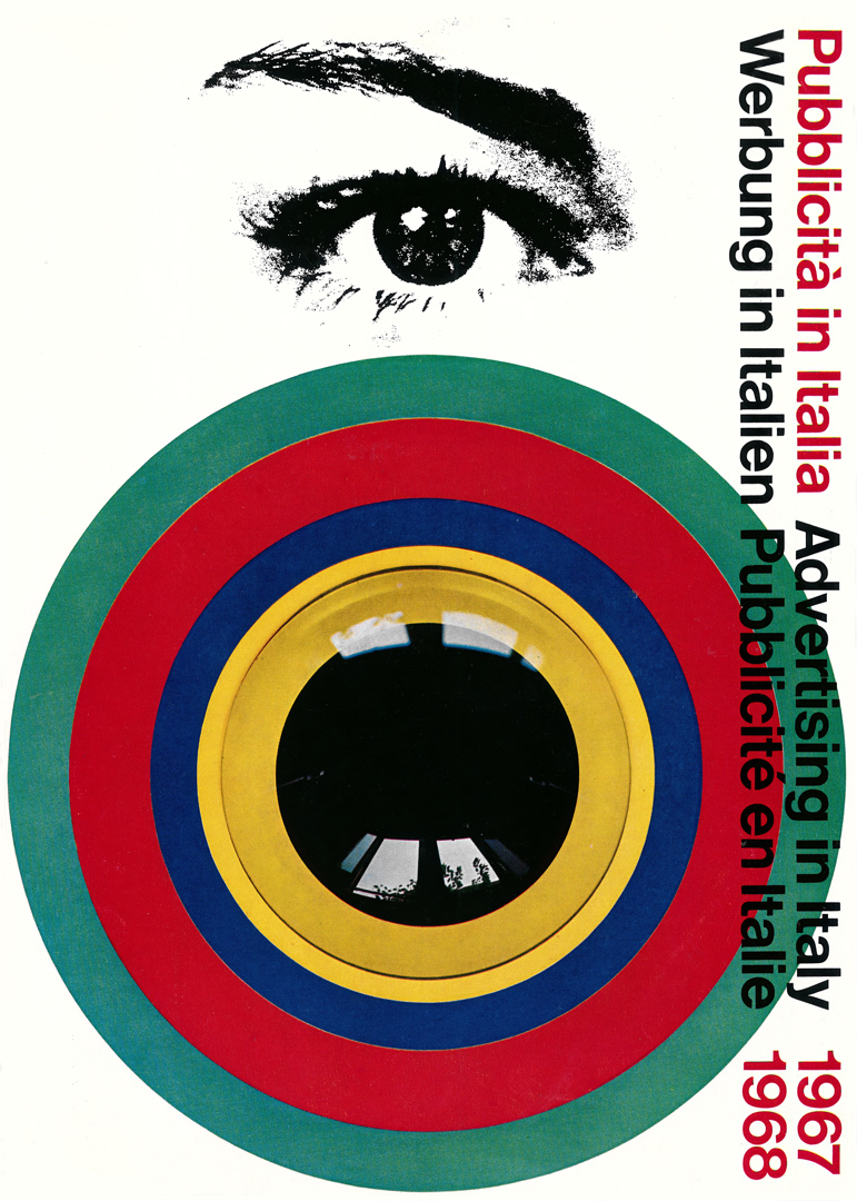
First published in 1953, ‘Pubblicità in Italia’ was conceived as a showcase of excellence, celebrating the central role of graphic design in advertising. Throughout the 1950s and 1960s, Italian advertising stood out for its elegance and artistic innovation, and the annual became both an industry benchmark and an archival record of the country’s finest visual communication.
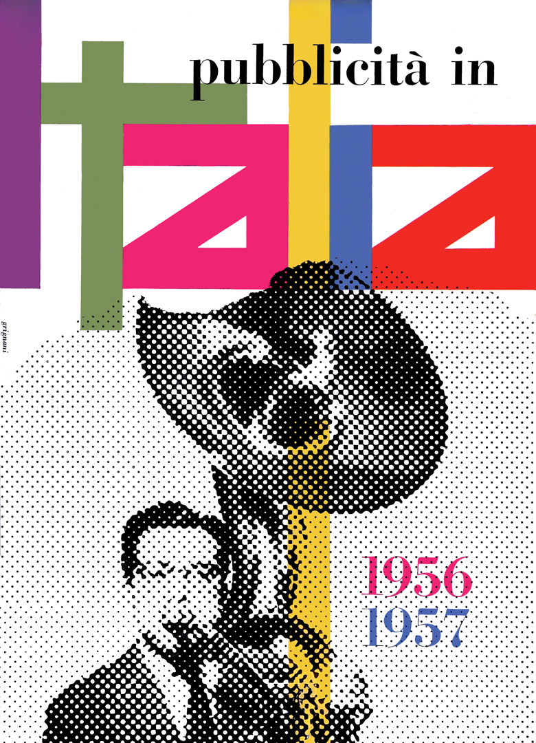
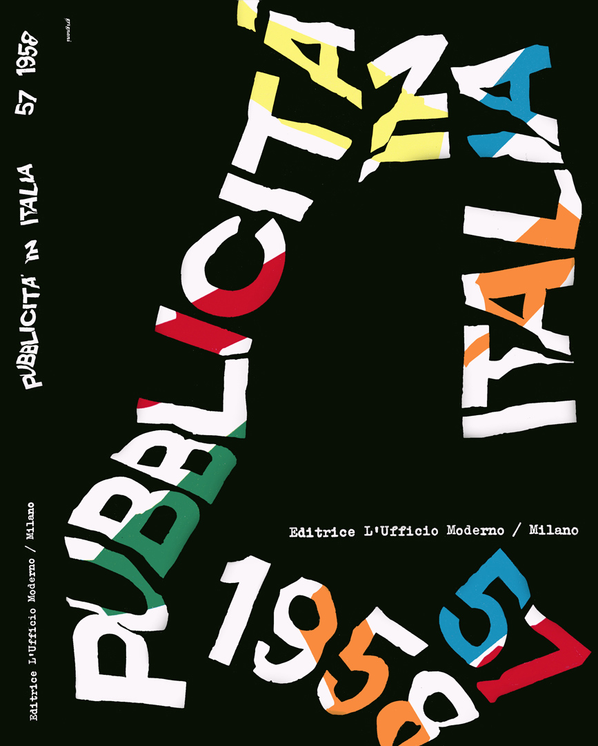
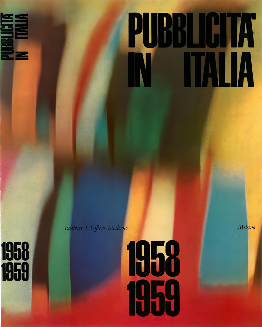
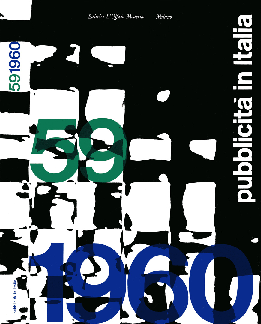
From 1956 under Franco Grignani’s artistic direction, who also designed the covers, the publication maintained exceptional visual and conceptual standards, serving as a cultural resistance tool that defended the importance of graphic design in an era increasingly dominated by marketing-driven advertising strategies.
By the 1980s, ‘Pubblicità in Italia’ had become an internationally recognized reference, embodying the distinctive creativity and craftsmanship of the “Made in Italy” brand. As computer graphics and photocomposition reshaped the industry, the annual continued to highlight Italian creativity, securing its place as a symbol of excellence in global visual communication.
For 26 years as art director, Grignani positioned ‘Pubblicità in Italia’ not just as an advertising showcase, but as a creative resource for designers, offering inspiration, education, and guidance for future projects.
From a witness to the golden age of graphic design to a critical reflection on its transformation, ‘Pubblicità in Italia’ was far more than a collection of advertising works. It stands as a testament to Italian graphic culture, preserving its identity and artistic integrity amid the ever-evolving landscape of commercial communication.
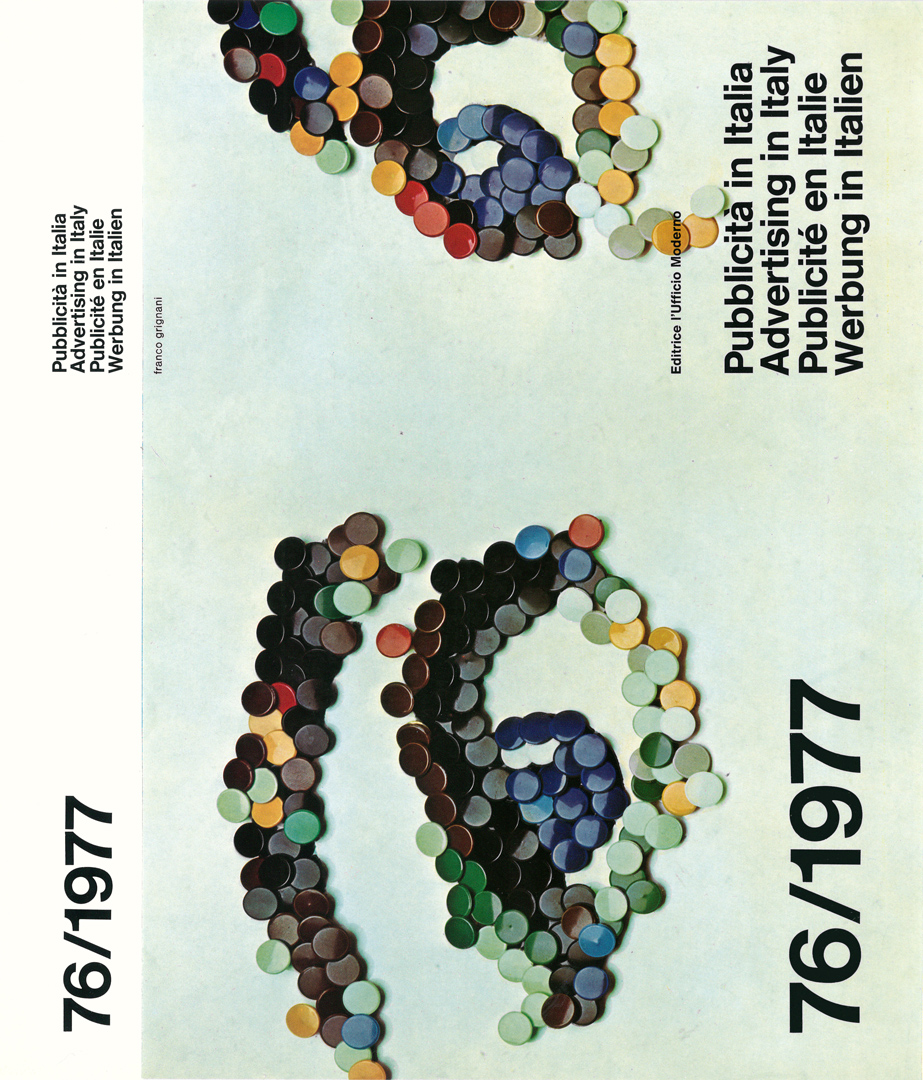
Some of these covers were displayed in exhibits in the US, notably at New York’s Gallery 303, “10 designers from Milan”, in March 1960, and at Chicago’s 500d Gallery, in April 1970 (Franco Grignani’s solo exhibition).
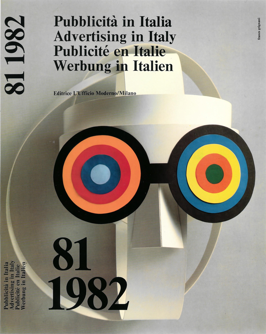
The following text by Franco Grignani was originally published in Italian, French, German, and English as an introduction to the volume ‘Pubblicità in Italia 1973/74’.
This text offers a critical reflection on the evolution of graphic design in advertising and its shifting role in visual communication. Grignani explores how graphic design, once a pure typographic practice, has transformed into a powerful communicative force, deeply intertwined with advertising. However, he warns of a crisis in the discipline, driven by the growing dominance of marketing strategies and the increasing standardization of creative roles.
He contrasts the American hierarchical model, where creativity is divided among specialized professionals (art directors, copywriters, photographers, and designers), with the Italian approach, which values individual artistic freedom. Grignani attributes the uniqueness of Italian graphic design to its roots in painting, emphasizing how early Italian designers were artists who turned to advertising out of necessity. This background, he argues, fostered a more personal and expressive design culture, but also limited the development of structured educational institutions.
Ultimately, Grignani sees Italian graphic design as a form of artistic resistance, striving to maintain its creative independence despite the pressures of commercialization. He acknowledges that this results in a more fragmented but highly inventive output, which, while less aligned with global trends, preserves the dignity and originality of the profession.

Originally and for a long time typography meant only printed words on a white ground. And this should be the starting point for a discussion on the crisis of the graphic design. It is a growth crisis, caused above all by the development of media upon which the graphic designers have been called to operate. A mere glance at our cities will make us discover an unconceivable series of glaring and aggressive prints. Thus, an inert material has been transformed into a powerful means of communication, drawing into its ascending spiral also that part of typographical transmission that can be defined as advertising graphics. It is in this sector that the graphics went the greatest distance from the technique, to become a very singular adventure in the field of expression. And the more a graphic design is tied to reproducibility, the more an adventure it is. A rehabilitating phenomenon from a certain point of view, and, in any case, a modifying one according to W. Benjamin as it redeems the graphic design from the particularly speculative aspect of advertising. A sign reproduced in a million of copies or shown on a screen before millions of viewers, is, of course, noted by millions of persons. The graphic idea, the creative power embraces here a precise cultural responsibility. The message is in service of the production, but at the same time it brings along a new language and new visual methods that enter as a matter of fact into the culture of a nation. This aspect can assume an essential importance in the evaluation of an advertising graphic design. It certainly is essential in the present work, if it is true, as it is true, that “Pubblicità in Italia” has been winning a growing popularity in recent years, reaching distant countries such as Formosa, Australia, the American Coast of the Pacific. “Pubblicità in Italia” seems to carry in itself the seed of something that is appreciated and sought-after and I believe to have identified it with a peculiar feature of the Italian advertising design. In our country we have always attentively followed any artistic movement that developed in the course of this century. But to this simple information one must immediately add a more specific and profound factor: the notion of the artist based on the idea of art conceived above all as freedom and dream, or as a dream of freedom. This conception has always been contrary to the American pattern where the artistic element i.e. the creative power in the advertising design has been arranged according to a precise hierarchy. In Italy, more than in any other place, the creative person is often his own art-director: designer, photographer, retoucher all in one. Such a situation appears more congenial to an inventive spirit that is rather frustrated than stimulated by working in a team, as the creativity of one individual invariably ends by colliding with that of other persons, sometimes bringing about new and unexpected results, but more often imposing mutual restrictions. The creativity is strictly bound to the faculty of the individual to perceive the truth of the world and to translate it in a given form. This fact is tied to the existence itself, to the struggle for life, and this alone gives the quality to a creative product. In Italy, the first advertising designers were actual painters, who, in need of earning their living, accepted to work for advertising. This autodidact with a strongly creative personality, remains a symbol, perhaps a flag, for the Italian advertising designer. We are often reproached with the fact that there are no qualifying schools in our structures. The school, however, has its specific importance, it supplies the tools, but does not give any artistic formation. According to my opinion it is not a case that the first of our masters were true painters. And it is not a case that our country did not establish a school tradition. It is indeed a rare case, that of artists working in a team, in Italy, contrary to what happens elsewhere. To be an artist in Italy means to enjoy a greater freedom. I believe that this necessity in an Italian artist originates from the family factors. The Italian family conditions, from a human viewpoint, stimulate very early the desire to become somebody, ending therefore in the love an artist always puts into his work. It’s a spur for a display of feelings, be it when only a commercial product is concerned. A number of messages published in this volume is typically Italian from an exquisitely emotional point of view. The independent, strong personality of the Italian artist must obviously be related to a particular culture, a particular historic artistic milieu. His evaluation of art is invariably in the superlative, as the artist here has always been subject to power or even to a superpower: the feudatory, the church, the industry. The dream of these artists is to be free from the constriction of the modern society tending to suffocate imagination, and to be able to face every problem individually. What is the result? A product that is not aligned — or is only partly so — with the main streams of the world graphic design, but follows side-roads and ramifications that mark, in their development, as many moments in which other graphic designers may easily find again the dignity of their work. It follows that the work of Italian artists appears to have a more explosive and free content, even if, productively, perhaps — a less important one: because of its becoming more and more a product of the artist’s own self.
In origine e per diverso tempo la tipografia era solo scritta in uno spazio bianco. Bisogna partire da qui, se si vuole aprire il discorso sulla crisi della grafica. E’ una crisi di fluidificazione, imposta soprattutto dalla evoluzione dei supporti su cui la tipografia è stata chiamata a operare. Basta un’occhiata alle nostre città per scoprire tutta una serie inimmaginabile di tipografie urlanti e aggressive. Così, una materia inerte è diventata comunicazione di grande potenza richiamando nella sua spirale ascendente anche quella parte della trasmissione tipografica definibile come grafica pubblicitaria. E’ in questo settore che maggiormente la grafica si è discosta dalla tecnica per diventare un’avventura assai singolare, nel campo della espressione. La grafica è tanto più avventura quanto più si lega alla riproducibilità. Fenomeno riabilitante da un certo punto di vista, in ogni caso modificante secondo W. Benjamin, perchè riscatta la grafica dall’aspetto peculiarmente speculativo della pubblicità. Il segno riprodotto in un milione di copie, o portato su uno schermo davanti a un milione di spettatori, viene osservato da un milione di persone. L’idea grafica, la creatività, si sposa qui a una precisa responsabilità culturale. Il messaggio serve la produzione, ma nel contempo propone nuovi linguaggi e nuovi metodi visivi che entrano di fatto nella cultura della nazione. Questo aspetto può essere fondamentale nella valutazione di una grafica pubblicitaria. Lo è certamente nella nostra, se è vero come è vero che l’opera che la compendia, “Pubblicità in Italia”, è andata allargandosi sempre più in questi anni, raggiungendo destinazioni sempre più lontane: Formosa, l’Australia, la costa americana del Pacifico. “Pubblicità in Italia” porta in sé il seme di qualcosa che evidentemente è apprezzato e ricercato e io credo di averlo identificato in una caratteristica peculiare della grafica pubblicitaria italiana. Nel nostro paese siamo sempre stati molto attenti ai movimenti artistici sviluppatisi nel corso di questo secolo. A questo dato puramente informativo bisogna però affiancare subito un elemento più specifico e profondo: il concetto di artista, che si lega al concetto di arte soprattutto intesa come libertà e come sogno, o come sogno di libertà. Questo concetto ha sempre urtato contro lo schema americano che nella grafica pubblicitaria ha schematizzato il fatto artistico, cioè creativo, secondo una precisa gerarchia. Da noi più che altrove è frequente il caso del creativo che fa l’art-director di se stesso: grafico, fotografo, disegnatore, ritoccatore. Ciò è più aderente allo spirito inventivo che nel lavoro di gruppo finisce con l’essere più frustrato che stimolato, poiché la creatività dei singoli finisce sempre con l’urtare contro la creatività degli altri, qualche volta ottenendo un risultato nuovo e imprevisto, più spesso bloccandosi e autolimitandosi a vicenda. La creatività è strettamente legata alla facoltà del singolo di estrarre la verità del mondo e di tradurla in una certa forma. Questo fatto è legato alla esistenza stessa, alla lotta per la vita, ed è ciò che dà la qualità del prodotto creativo. In Italia, i primi operatori grafici furono dei veri pittori che, avendo bisogno di guadagnare, si misero a fare della pubblicità. Questo modello autodidatta e fortemente creativo è rimasto un simbolo, forse una bandiera per il grafico pubblicitario italiano. Si rimprovera alle nostre strutture di non aver saputo dare delle scuole qualificanti. La scuola ha una sua importanza specifica, fornisce gli strumenti ma non dà alcuna formazione artistica. Non è un caso, a mio modo di vedere, che i nostri primi maestri fossero autentici pittori. Non è un caso che il nostro paese non abbia saputo darsi una tradizione di scuola. Da noi è raro l’esempio di artisti inseriti in un gruppo, come avviene altrove. ln Italia, fare l’artista vuoi dire godere di una libertà maggiore. Credo che questa necessità nasca nell’individuo italiano da fattori familiari. L’ambiente umano-familiare italiano condiziona presto il desiderio di essere qualcuno e sfocia, quindi, nell’affetto che un artista mette sempre nella sua opera. E’ una spinta a tirar fuori i sentimenti, magari per un prodotto. Certi messaggi pubblicati in questo volume sono tipicamente italiani da un punto di vista squisitamente affettivo. L’artista italiano, indipendente, personalissimo, nasce ovviamente anche da una particolare cultura d’ambiente. La sua valutazione del rapporto artistico è sempre superlativa, poichè l’artista qui è sempre stato agganciato a un potere o addirittura a un superpotere: il feudatario, la Chiesa, l’industria. Il sogno di questi artisti è liberarsi dalla costrizione della società moderna che tende a strangolare la fantasia, affrontando ogni problema in chiave individuale. Qual è il risultato? Un prodotto che non si allinea – o si allinea soltanto in parte – con i filoni maestri della grafica mondiale, ma segue vie traverse, diramazioni, che nel loro sviluppo vengono a costituire altrettanti momenti in cui gli altri grafici possono agevolmente ritrovare la dignità del proprio lavoro. Ne viene che il contenuto dei nostri artisti è più esplosivo, più libero, anche se produttivamente – forse – meno importante: perché diventa sempre di più un prodotto dell’io.
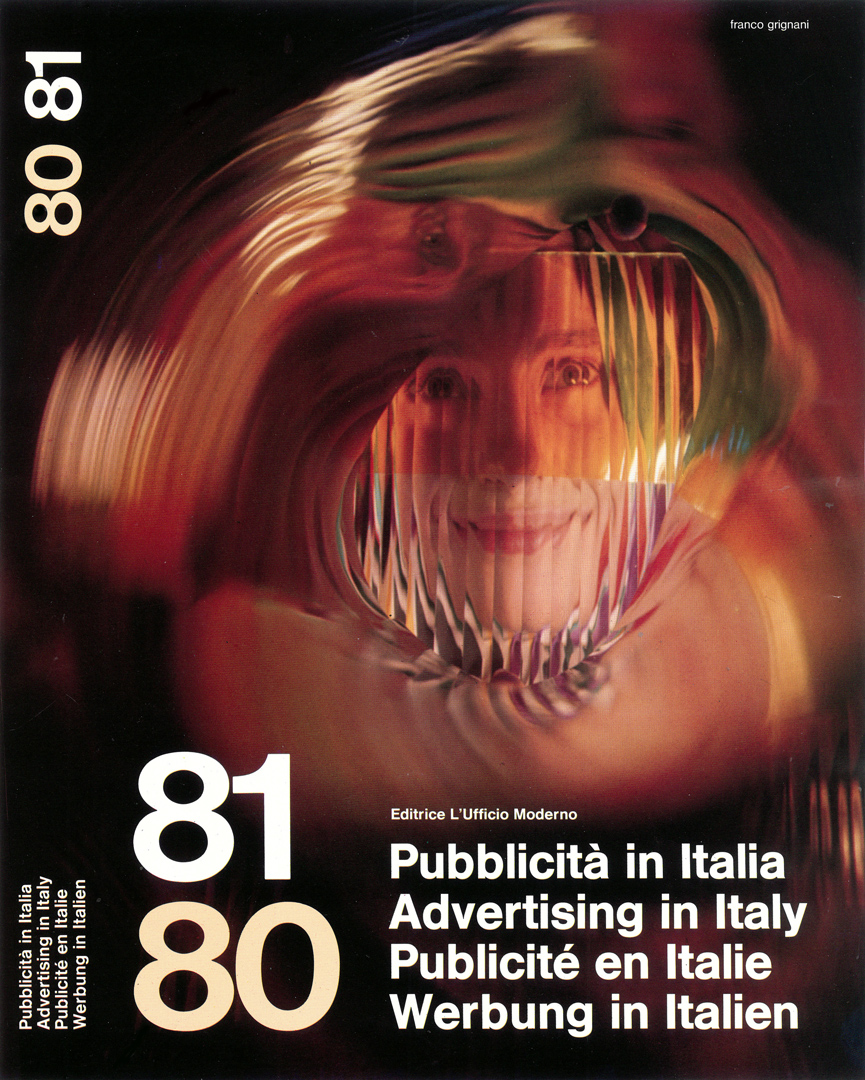
This other original text by Franco Grignani was published as an introduction to the volume ‘Pubblicità in Italia 1980/81’.
In this text, Franco Grignani examines the complex landscape of Italian advertising graphics, marked by competing creative groups, evolving schools of communication, and the struggle between artistic freedom and commercial demands. He highlights the tension between graphic designers seeking aesthetic innovation and clients imposing constraints that often dilute originality.
Grignani also explores the influence of modern science and art on graphic design. He underscores the role of printed media in shaping visual culture, suggesting that even in times of political and social turmoil, Italian graphic designers – often regarded as artists – continue to infuse advertising with creativity and optimism.

There are in Italy, in the area of the graphic advertising image, several contributions of working groups which sometimes are in disagreement about a creative priority and therefore fighting to claim its authorship. In Italy there are schools of advertising techniques, organized according to the schools in the United States aiming at total productivity. They believe in a new scientism able to recognize the needs of the Italian people through theoretical data of the science of communication, sifting and capturing the Mediterranean psychological emotions. It is likewise said that there are also schools in Italy for verbal communication able to express dream and illusions, to enflame desires and influence the young literature by lyrisms and a new expressiveness. These integrative contributions have to take into consideration the graphic designer who instead of producing only a service to the visualization of communication, demands freedom for his great longing for aestheticism. They are actually after the elevation of the sign and in search of the visible ‘beauty’ able by itself to be the ‘essential’ which absorbs and captures the eye. The graphic designer, always an experienced and fanciful interpreter, undertakes the task to elaborate projects which will be judged by a client who often is not an expert in these matters. So the graphic designer’s work has to be adapted to any, even if unforeseen changes and bear with additions and variations that may alter its original structure. These frictions cause tensions that increase the hard work of the graphic designer who is obliged to work under compulsion and against his previous and fresh originality. But in this exemplified diary of the graphic designer, the authorship of the illustration and suffered manual ability have still the cohesive force for achieving those human and positive data which exalt quality and are able to partake once more in evolution and creativeness. The graphic designer is attracted by the images and the pattern of modern sciences: for instance the structures of materials revealed by the electron microscope and coloured schematical diagrams. Furthermore he watches all the experiences of art and its evolutions, visiting exhibitions, meetings, discussing art-matters and reading books. He introduces in his experiments aesthetical elements outbranching visual communication. This ‘natural’ enrichment contributes to the transfer of symbols and also concepts which thanks to a widely circulated press, are observed and analyzed by the reader obtaining eventually the diffusion of a popularized culture. And if the common reader has eyes to see, he will find in the photographic document, be it objective or expressively lyrical, in the spatial rhythmic schemas of the type-setting, a cultural and aesthetical education discovering too, in this evocative tissue, attention, persuasion and conviction. The person who writes these lines comes from the graphic design and since more than 25 years has been assigned to ‘build up’ this book which is the documentation of what is created every year in Italy, therefore it is possible to make a typical radiography within this limited area: Here in Italy, since some ten years or more, we live dramatic times as a consequence of social tensions and political antagonism. Every day television enumerates kidnappings and ferocious attacks and the newspapers publish the most cruel pictures. The advertising that appears on the video and on the newspaper pages has become an antidote to this permanent crisis. Is this irresponsibility or reaction? No, the blood-stained documents are opposed by images of a rosy tenderness and the copy set tells in the melodious Italian language so little known abroad, the everlasting tale of life. We admit that the Italian graphic designer who is called here an artist, is still able to colour with hope the pages of the press-media. We have to acknowledge too that these images of faith that are created by a group of dreamers, show us the marks of a springtime we all crave for. We believe we have contributed to clarify a situation that for various reasons would never have been defined precisely. In this book full of fertile and selected documentation, we invite the reader to observe the quality, worthy anytime to be analyzed. This book now widely diffused is in itself a message of exchange and transfer of graphic culture. It creates relations which grow wider and wider to unite those who, every day have the task to communicate to people art and beauty by means of a code of signs, of words and illustrations straddled between cultural news and commercial information. Nevertheless, we do not cherish vain hopes.
Esistono in Italia, nell’area dell’immagine grafica pubblicitaria più apporti di gruppi di lavoro, talvolta in contrasto fra di loro, per una priorità creativa e che lottano per attribuirsene un’unica paternità. Si dice che in Italia esistono scuole di tecnica pubblicitaria fattesi sul modello nord americano e protese ai programmi per il rendimento totale. Esse credono ad un nuovo scientismo capace di individuare i bisogni degli italiani attraverso i dati teoretici della scienza della comunicazione, setacciando e imbrigliando i moti psicologici mediterranei. Si dice che in Italia esistano anche scuole per la comunicazione verbale capaci, con giuochi poetici e con gerghi espressivi, di cantare i sogni e le illusioni, spingere desideri e influenzare anche la letteratura giovane. Questi apporti integrativi devono però fare i conti con i graphic designers che, invece di produrre soltanto un servizio alla visualizzazione della comunicazione, reclamano, con ostinata astrattezza, libertà al loro grande desiderio di esteticità, sfrontato e teso alla sublimazione del segno e alla ricerca di un ‘bello’ visibile, capace da solo di essere ‘l’indispensabile’ che assorbe e cattura lo sguardo. Il graphic designer, sempre interprete di grande esperienza e fantasia, assume il compito di elaborare dei progetti che saranno, il più delle volte, processati dalla committenza che sovente ha una fragile competenza in questa materia. Questi elaborati devono adattarsi a tutte le varianti o aggiunte, anche improvvise, e a condizionamenti che ne alterano talvolta la struttura. Nascono così da questi attriti delle tensioni che aumentano la fatica del graphic designer, obbligato a lavorare in costrizione, a danno di una sua primitiva e fresca originalità. Ma in questo esemplificato diario del graphic designer, la paternità dell’immagine e la manualità sofferta hanno ancora il potere di coesione per alimentare il desiderio progressivo ed emulativo che ricarica il lavoro di quei dati positivi e umani in grado di riportare la qualità a partecipare ancora all’evoluzione e alla creatività. Il graphic designer viene attratto dalle immagini e dagli schemi delle scienze moderne: ad esempio le strutture rivelate nelle materie da microscopi elettronici e i colorati diagrammi schematici. Inoltre esso guarda tutte le esperienze dell’arte e le sue evoluzioni, frequentando mostre e dibattiti e documentandosi con libri. Anzi travasa con eccitato uso sperimentale elementi estetici ibridando il campo della comunicazione visiva. Questo arricchimento ‘naturale’ aiuta una traslazione di simboli e anche di concetti che, poi, diffusi dalle grandi tirature di stampa, vengono osservati e analizzati dai lettori contribuendo alfine alla diffusione di una cultura popolarizzata. E se il comune lettore ha occhi attenti trova nel documento fotografico oggettivo o espressivamente lirico o negli schemi ritmici spaziali delle tipografie una educazione estetica e culturale, scoprendo anche, in questo tessuto evocativo, attenzione e, persuasione e convincimento. Chi scrive queste righe proviene dal graphic design e da oltre 25 anni ha l’incarico di ‘costruire’ questo volume che è la documentazione di ciò che si crea ogni anno in Italia, perciò in questa area limitata è possibile questa radiografia tipica: qui in Italia, da una decina di anni, si vivono tempi drammatici a causa delle tensioni sociali e degli antagonismi politici. Ogni giorno la televisione enumera rapimenti e feroci attentati e i giornali pubblicano le fotografie più spietate. La pubblicità che si affianca sul video e sulle pagine è diventata un antidoto a questa permanente crisi. E’ reazione o incoscienza? No, ai documenti cruenti fanno cornice immagini di una tenerezza rosata e le tipografie impaginate come dodecasillabi raccontano nella musicale lingua italiana, così poco conosciuta altrove, la favola perenne della vita. Riconosciamo che il graphic designer italiano, che qui viene sempre chiamato artista riesce ancora a colorare di speranza le pagine dei giornali. Non si può non riconoscere che queste immagini di fede, che una classe di sognatori ancora fabbrica, ci mostrano i segni di una primavera che tutti aspettiamo. Crediamo di aver contribuito a chiarire una situazione che per tanti motivi non si sarebbe mai puntualizzata. In queste pagine piene di feconda e scelta documentazione invitiamo il lettore all’osservazione della qualità sempre degna di essere analizzata. Questo volume è esso stesso un messaggio di scambio e trasferimento di cultura grafica. Diffuso ormai in tutto il mondo, esso crea parentele che si allargano sempre più per unire quanti, ogni giorno, hanno il compito di comunicare a milioni di altri uomini per mezzo di un codice di segni, di parole e di immagini che stanno tra l’informazione mercantile e culturale, l’arte e la bellezza. Eppure non culliamo utopie!
original Italian text, written with his Olivetti Lexikon 80 typewriter:
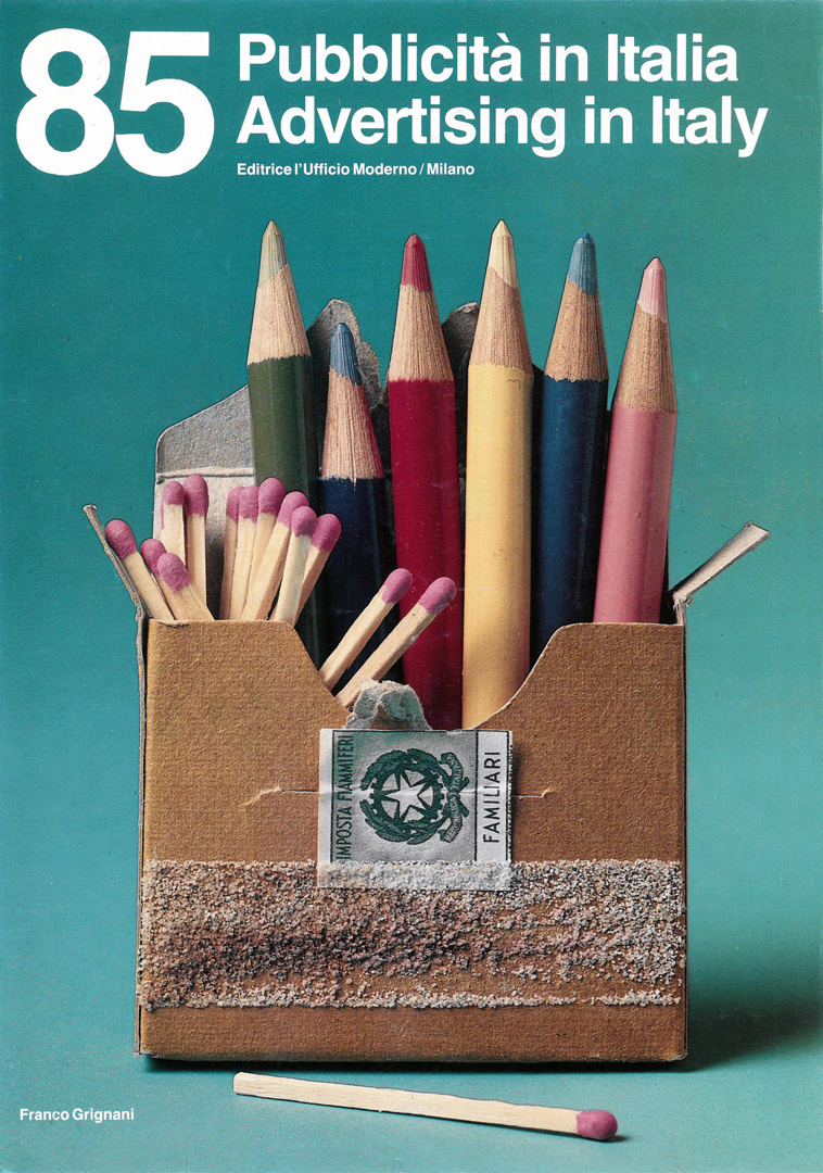
This last original text by Franco Grignani was published as an introduction to the volume ‘Pubblicità in Italia 1985’.
In this text, Franco Grignani reflects on the evolving role of graphic design in advertising and its deeper cultural implications. Using the issue’s cover design as a case study, he explores how graphic design is not merely a visual tool but a means of educating taste, balancing form, and shaping perception.
Grignani emphasizes the complex relationship between creativity and professional judgment, particularly in a field where designers constantly assess each other’s work. He argues that true graphic design should not rely on gimmicks but on a rigorous approach to composition, typography, and visual structure. Rejecting conventional typographic centrism, he advocates for an asymmetrical way of seeing and reading, designed to engage the viewer through visual tension and rhythm, much like musical counterpoint.

Cover story
Almost at the end of an article written by Aldo Colonetti on the “visual design” that Valdostana District is organizing for 1985 summer, I have been impressed by this phrase… “ro let reflect on the primary way of the visual communication… to and for whom communicate?”. Let me write on this subject… laying bare all implications and problematics around a well defined model: the front cover of the book “Pubblicità in Italia 1984-85” (Advertising in Italy 1984/85). The image which I suggest is a hyperbolic and ironical fable to draw the interest of the advertising world and to press to buy this book. In a certain sense I try to let advertised the advertising. To let you subject of the competition judgement is always a hard acting which has to be handled with care and caution particularly when this is up dated on the conscious use of the photographical techniques and contains in its memory a large collection of illustrative models seen and reseen in the graphical pubblications and general magazines. It is easy to think, as consequence, that someone could say and think: “I am able too…” Competitors never have to be offended with artful and conditioning gags which show to be useless for all markets. The book collection is a lasting property, it is a tool to produce another job and to make profits. Therefore my charge becomes a guide and enters into relation with the other graphics by means of quality shown through good taste education, proper proportions and equilibrium; elements which open all doors to the symphathy. A job made with high qualified professionality checking in particular way the “idea-image”/space and figure, colours between chromatical density and the neutrality of photographical background as silent still life. After all this long-winded yarn specifications, it could seem that this book had obtained the right for passport but it is wrong because it is also to be analized the position of this book on the space of the shop-windows at one or two meters — with the title to be properly read by means of the typegraphical position play directed to the high-low perimeter in the structural tension directed to attract all glances and revealing its style not yet entirely exploited. As designer I am in favour of the graphic-designers who, in their graphical quality, offer a fine cultural position in the visual world. Forgetting the wasted forms of typographical centrism, it shows and reveals an asymmetrical way to look at and read. Image is static and ready but it is waiting for the setting on fire of pencils just in the moment of the opening of the pages because the fire is already in the book, in its ideas, in its colours and illustrations. Everybody has to be anxious to discover, to look at, to learn and to copy so that the wish to buy becomes a real need. This book has to be placed in the library where it is easy to reach it as it is indispensable today and will be indispensable tomorrow and after tomorrow just like a support to the creativity which, as exercise, needs itself to be always feeded and not dragged. Up to date typography is called graphic now because it identifies itself into a complicated and universal image which besides hitting the mark has to solve the space rythmical problem and the equilibrium in crysis where the eyes wish to catch tensions like in the musical counterpoint. It never happened before now that typography and image had a close relation with our civilization, with such subjugated mechanization and the computerized photocomposition. I can not forget that since 26 years I have been art-director of this book and that ideally speaking I would like its stylistical continuity. This Annual-book will be today all over the world library markets because it contains strong creativity efforts of the Italian young advertising. Ambit contents which is mentioned in all specialized magazines with extensive hospitality and with the famous trend “Made in Italy”. What has been written up to now seems to be a justification but it is completely the contrary. It is only an explanation which has been done in accordance and following up direct experiences imagining all desires of my creative collegues. This is a report which could be certainly done by all of them because it is on “graphic model”.
Cover story
Sul “terminale” di un intervento scritto da Aldo Colonetti sul programma “visual design” che la regione valdostana sta organizzando per l’estate 1985, mi ha colpito questa frase… “far riflettere sul modo fondamentale della comunicazione visiva… comunicare per chi?” Scriviamone…, mettendo a nudo tutte le implicazioni e le problematiche attorno ad un modello ben definito: la copertina del volume Pubblicità in Italia 1984-85. L’immagine da me proposta è una favola iperbolica e ironica atta a captare l’interesse del mondo pubblicitario per l’acquisto di questo volume; in certo qual modo si tratta di fare pubblicità alla pubblicità. Esporsi al giudizio della concorrenza è sempre un atto complesso da trattare con cautela, specialmente quando questa è matura sull’uso sapiente delle tecniche fotografiche ed ha nella propria memoria una raccolta di modelli illustrativi visti e rivisti nelle pubblicazioni grafiche e nella stampa in genere ed è quindi facile pensare che a qualcuno scappi il fatidico “sono capace anch’io…”. I concorrenti non vanno mai offesi con trovate furbesche a sorpresa e condizionanti che non servono a nessun mercato. Il volume-raccolta è un bene durevole, uno strumento per produrre altro lavoro e altro denaro, perciò il mio incarico si fa guida, entra in rapporto con gli altri grafici attraverso la qualità espressa in educazione al gusto, proporzione, equilibrio, elementi che aprono le porte alla simpatia; un lavoro svolto con alta qualità professionale controllando l’idea-immagine, la composizione tra spazio e figura, il colore tra densità cromatica e neutralità del fondo fotografico da natura morta silente. Sembrerebbe, dopo tutta questa tiritera di puntualizzazioni, che questa illustrazione abbia diritto al passaporto, e invece va ancora analizzata la posizione del volume nello spazio-vetrina a uno, due metri, con il titolo da leggersi attraverso il gioco compositivo tipografico teso al perimetro alto-basso nella tensione strutturale che capta lo sguardo e rivela il suo stile non ancora consumato. Io progettista sto dalla parte dei graphic-designers offrendo nella qualità grafica una sottile posizione culturale nel mondo del visivo, che, dimenticando le consumate formule del centrismo tipografico mostra e rivela un modo asimmetrico di guardare e leggere. L’immagine è statica, pronta, ma attende che si incendino le matite proprio nell’istante in cui si aprono le pagine, perchè il fuoco è già nel volume, nelle idee, nei colori, nelle illustrazioni, e che ognuno con l’ansia di scoprire, vedere, imparare, copiare, faccia scattare il desiderio di acquistare. Questo volume ha bisogno di un posto a portata di mano nella biblioteca dello studio perchè servirà oggi, domani e dopodomani come supporto alla creatività che, come esercizio, anch’essa, ha bisogno del proprio pane se non del traino. La nuova tipografia oggi è chiamata grafica perchè si identifica in una immagine complessa e universale che oltre al segno deve risolvere il problema ritmico spaziale e l’equilibrio in crisi dove l’occhio vuol cogliere tensioni, proprio come nel contrappunto musicale. Mai prima d’ora la tipografia e l’immagine hanno avuto un così stretto rapporto con la nostra civiltà, con la conquistata meccanizzazione modulare e la fotocomposizione compiuterizzata. lo non posso dimenticare che per 26 anni sono stato l’art-director di questo volume e che idealmente ne desidero la continuità stilistica. Questo Annual che sarà oggi su tutti i mercati librari mondiali porta lo sforzo creativo di una ancor giovane pubblicità italiana, materiale ambito e citato da tutte le riviste di categoria con un’ampia ospitalità e con il famoso marchio “made in Italy”. Sembra, quanto scritto, una giustificazione, e invece non è così, è solo esplicazione che si fa con l’ausilio dell’esperienza diretta immaginando i desideri dei creativi miei colleghi. Un discorso che poteva essere fatto da ognuno di loro perchè è a “misura di grafico”.
[6] GARADINERVI, courtesy of Robert Rebotti
[7] AIAP / CDPG Centro di Documentazione sul Progetto Grafico, courtesy of Lorenzo Grazzani
[all the other pics: courtesy of Daniela Grignani]
ITA original texts:
[I] from Franco Grignani, “I grafici, sono sempre protagonisti?”, ‘Linea grafica’, n° 2, marzo-aprile 1969: “Ma chi sono in fondo i grafici del giorno d’oggi? Sono dei poveretti schiacciati da interessi colossali. Cos’è più la nostra parola? Che valore ha il nostro lavoro? In un simile contesto umano, poco o niente. Il potere decisionale è altrove.”
[II] from Franco Grignani, “Progetti di grafica e comunicazione visiva. La riscoperta di un protagonista della grafica italiana“, Aiap, Milan, 1995: “Quasi tutta la creatività pubblicitaria ha un aspetto transitorio ed effimero. Il marchio no, vince il tempo e l’usura […] disegnare un marchio non è lavoro di tutti ma è il lavoro di quella élite che sa trarre dal più piccolo, semplice segno l’oggettivazione più carica, più fisica; la sua purezza più durevole, la sua espressività più simpatica, la sua visualità più ottica, segno che forse rimarrà dai filtri del consumo della nostra civiltà, segno e simbolo ancora della vittoria sul tempo.”
[III] from “Franco Grignani – pitture, sperimentali, grafica – Ricerca come arte”, exhibition catalogue, Rondòttanta Centro culturale, Sesto San Giovanni, 1979: “Milioni di messaggi coprono i muri, le strade, i tavoli, le mani, gli occhi … Necessita l’ordine, necessitano gli specialisti dell’ordine: sono gli uomini del disegno. […] La pubblicità è una macchina enorme, pensata e costruita per produrre comunicazioni ai fini di interessi. Ma, se tale è la sola sua funzione, noi dovremo un giorno elencare i suoi sottoprodotti in lusinghe, affermazioni errate, tranelli promossi da una oligarchia di specialisti. Anzi, il ripetuto uso di tali sistemi in certe forme pubblicitarie, ha fatto nascere nei più sensibili la diffidenza ed il sospetto. […] Esiste anche un’altra pubblicità commerciale: informativa, precisa, utile, che pone problemi e risolve dubbi, ottimista perché sana e vive nel programma della fiducia: una pubblicità razionale che si appoggia alla sfera mentale; il fruitore non è dunque un automa ma ha e difende la sua personalità e conosce le sue azioni.”
[IV] from Franco Grignani, “Struttura e decorazione: una scelta della grafica”, ‘Linea Grafica’, n° 1, gennaio-febbraio 1973: “La grafica ha trovato il suo primo sbocco naturale nella pubblicità. Ma, a mio modo di vedere, la pubblicità, dove è arrivata oggi, emargina la grafica. La pubblicità è diventata descrizione, opera cioè un atto descrittivo per provocare determinati stimoli. La grafica, dove ancora interviene, è solo per suscitare delle zone di particolare interesse visivo, ma non è più così in evidenza, così determinante nella composizione pubblicitaria, dove invece l’immagine, soprattutto quella fotografica, è diventata preminente. La grafica è oggi più utile altrove. […] la grande grafica oggi cammina col design.”
Last Updated on 28/03/2025 by Emiliano