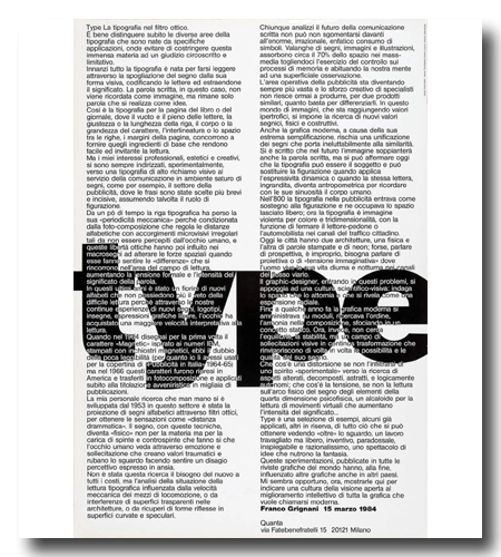
The poster showcased in the image above, with a dimension of 70 x 100 cm, was a special commission by Franco Grignani for Heinz Waibl (1931-2020). It was created for Waibl’s ‘Comunicazione Sperimentale TYPE‘ exhibition, consisting of 30 works, held at the Quanta Gallery in Milan in 1984 (’50 years of aesthetic photography experience’). Interestingly, Grignani opted not to design the poster for his own exhibition and, instead, included a sort of ‘programmatic speech’ on the poster, a decision they both agreed upon. Heinz Waibl proudly displayed this poster in his home, as can be observed in two monographs by designverso).
Franco Grignani and Heinz Waibl initially crossed paths at the Salto brothers’ bookstore located via Santo Spirito in Milan, a popular gathering spot for artists to connect and stay updated on art, graphic design, and industrial design during the 1950s. In 1974, Franco Grignani, serving as the president of the Italian section of the Alliance Graphique Internationale (AGI) from 1969 to 1981, recommended Heinz Waibl for AGI membership. Later, Heinz Waibl assumed the role of president of the Italian AGI section from 1995 to 2003. In 1988, Grignani authored an essay titled “The poster artists began” (“Cominciarono i cartellonisti”) for Heinz Waibl, detailing the origins and progression of modern graphics.
Franco Grignani’s exploration of typography extends beyond mere legibility to become a powerful visual and communicative tool. This text delves into the evolution of typography, particularly in the context of advertising and experimental design, where letterforms transcend their traditional function to become visual symbols. Grignani examines the impact of optical filters, technological advancements, and the ever-changing landscape of visual communication. By analyzing typographic innovations and their role in modern graphic design, he highlights how typography can evoke emotion, alter perception, and redefine the way we interact with the written word.
The following is an unpublished translation from the original Italian text:

Type. The typography in the optical filter.
It is crucial to immediately distinguish between the different areas of typography that have arisen from specific applications, in order to avoid constraining this vast subject with a limited and restrictive judgment.
First of all, typography was born to be read through the stripping of the sign away from its visual form, codifying letters, and extracting their meaning. The written word, in this case, is not remembered as an image but remains only a word, realized as an idea.
The same is true for the typeface for a page of a book or newspaper, where the emptiness and fullness of the letters, the alignment or length of the line, the body or size of the type, the interlining or the space between the lines, the margins of the page, combine to providing those basic ingredients that make reading easy and inviting.
However, my professional interests, aesthetic and creative, have always been directed, experimentally, towards a typography of highly visual appeal in favour of communication in an environment saturated with signs, such as, for example, in the advertising sector, where the sentences have been chosen to be short and impactful, sometimes assuming the role of figurative representation.
For some time now, letterpress has lost its ‘mechanical periodicity’ because it is conditioned by the photo-composition which regulates the alphabetic distances with irregular micro-visual adjustments that are not perceived by the human eye. These optical freedoms have also influenced the macro-signs, altering the spatial forces when they make you feel the ‘differences’ that chase each other in the area of the reading field, increasing the formal tension and the intensity of the word’s meaning.
Over the last few years, there has been a flourishing of new alphabets that no longer suffer from the limitation of difficult readability because, through our continuous experiments with new graphical elements, logos, signs, and free graphic expressions, the eye has gained greater interpretative speed in reading.
When in 1964 I designed the ‘Magnetic’ typeface for the first time, inspired by the IBM numbers, printed with magnetic inks, I was doubtful about its lack of legibility (even though I had used them for the cover of ‘Pubblicità in Italia’ 1964-1965) but by 1966 these characters were picked up in America, transferred to photocomposition and immediately applied to the futuristic titling in thousands of publications.
My personal research, which has gradually developed since 1953 in this field, has involved the projection of alphabetic signs through optical filters, to create the sensation of ‘dramatic distance’. With these techniques, the sign becomes ‘physical’ not through materiality but through the charge of thrusts and counter-thrusts that cause the human eye to see through emotion and stress, creating traumatic values and drawing the gaze, making one feel a perceptive discomfort expressed in anxiety.
This research was not driven by the need for innovation at any cost, but by an analysis of the situation of typographical reading influenced by the mechanical speed of the means of locomotion, or by the interference of transparent surfaces in architectures, or by the recovery of forms reflected on curved and mirror surfaces.
Anyone analyzing the future of written communication can hardly fail to be dismayed by the enormous, irrational, emphatic consumption of symbols. Avalanches of signs, images, and illustrations absorb about 70% of the space in mass media, depriving us of the ability to control memory processes and accustoming our minds to superficial observation.
The operational area of advertising is becoming increasingly vast, and the creative effort of specialists is no longer capable to produce enough to differentiate two similar products. In this world of images, which is reaching hypertrophic values, the search for new physical and constructive sign values is essential.
Even modern graphics, because of its extreme simplification, risk a unification of the signs that inevitably leads to similarity. It has been written that in the future the image will replace the written word, too, but today we can assert that typography can be the subject and can replace figuration when it applies dynamic expressiveness or when the letter itself, enlarged, becomes anthropometric, recalling the human body with its curves.
In the 19th century, typography entered advertising as a support for the figuration, occupying the space left vacant; now typography is a violent image in terms of colour and three-dimensionality, with the function of stopping the reader-pedestrian or the motorist in the city’s traffic channels. Today cities have two architectures, one physical and the other made up of printed words and neons; perhaps, talking about perspective is inappropriate, we need to speak of a projective or ‘imaginative tension’ where man lives his day and night life in the channels of the street flow.
The graphic designer, dealing with these problems, relies on a scientific-visual culture: he investigates the space around him, which reveals itself as a radial expansion.
Until a few years ago, modern graphics was managed through modules, seeking order, harmony in composition, resulting in a static concept. Now, however, it is not looking for balance, or stability, but for a field of visual stimuli in a continuous transformation that revitalizes the possibilities and qualities of its sign.
What is distortion if not the infiltration of an ‘experimental’ spirit towards the search for altered, decomposed, abstract, and logically autonomous elements? What is tension, if not reading on the physical arc of the sign of the elements of the fourth psychophysical dimension, an alkaloid for reading virtual movements that increase the intensity of meaning? …
Type is a selection of examples, some already applied, others in reserve, of everything that can be achieved by seeing ‘beyond’ the gaze, a laborious yet free, inventive, paradoxical, inexplicable, and highly rational effort, a show of ideas that nourish the imagination.
These experiments, published in all the graphic magazines, have, in the end, influenced other graphics in other countries as well.
It seems appropriate to me now to show them here to indicate a culture of vision open to the intellectual improvement of all graphics that want to be called modern.
Franco Grignani, March 15, 1984
Quanta, via Fatebenefratelli 15, 20121 Milan
original Italian text, written with his Olivetti Lexikon 80 typewriter:
transcript:
[featured pic from: AIAP / CDPG Centro di Documentazione sul Progetto Grafico, courtesy of Lorenzo Grazzani]
Last Updated on 16/02/2025 by Emiliano
